So to actually example what the title means:
Before hitting this hurdle I used this blog https://www.thedataschool.co.uk/sophie-higson/what-is-the-difference-between-count-and-count-distinct to get rid of the 'greying out' when clicking on a graph.
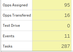
After adding the 'dummy' field action highlight to each worksheet and the dashboard, I created another dashboard action highlight filter, which would allow the 'Method of Contact' chart to filter all the other charts:
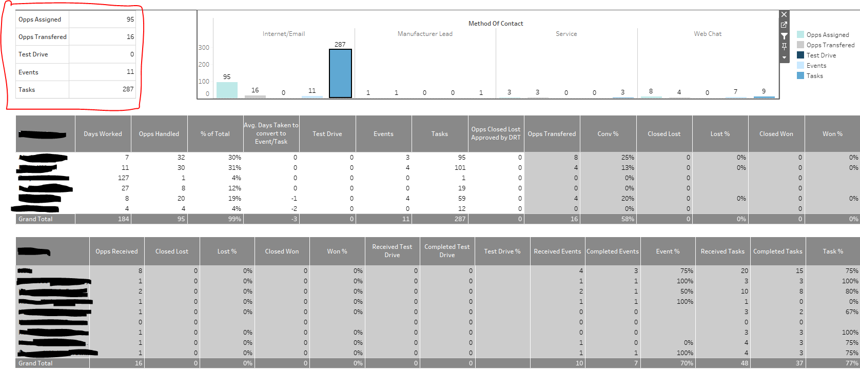
However, when I used the 'Method of Contact' filter I saw that the chart on the top left changed to a yellow highlight:
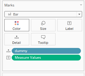
In order to remove this you, navigate to that charts and select the Marks type to be Bar:
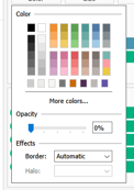
Then you will need to change the color to be white and the opacity to be 0%:
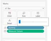
and also update the size to the smallest possible:
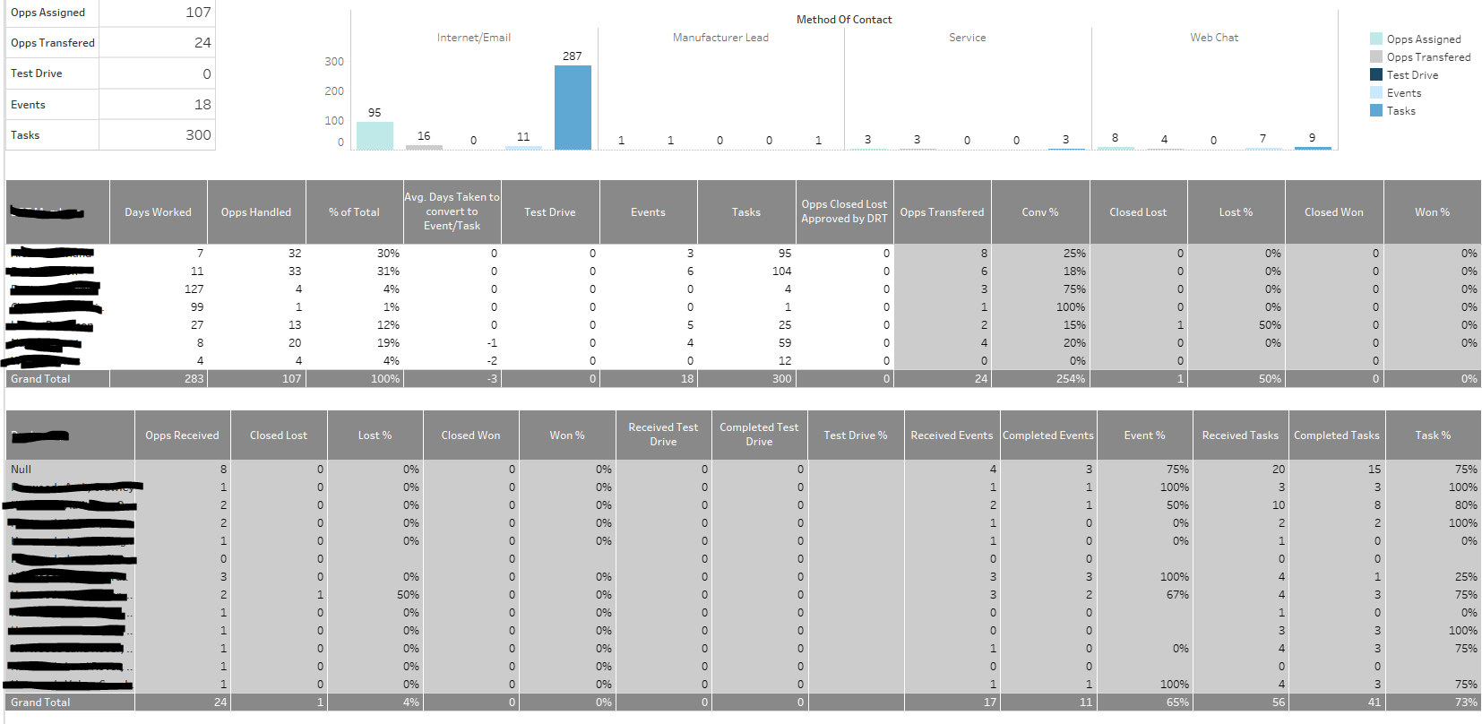
Now back on the Dashboard, when you use the 'Method of Contact' filter this chart will no longer have the yellow highlight: