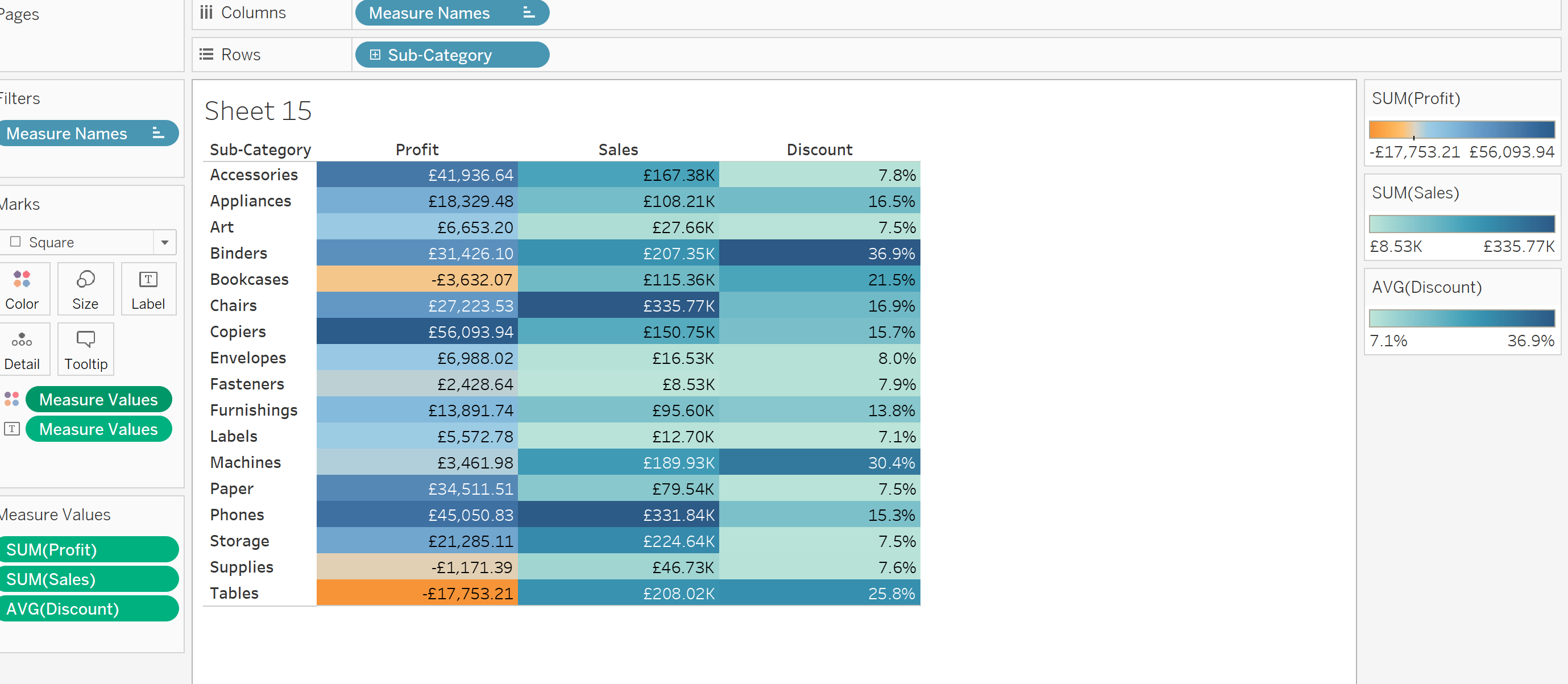
A useful Tableau technique we learned today is how to use different colour legends for different Measure Names in a table.
Step 1: Create a table with multiple measure names.
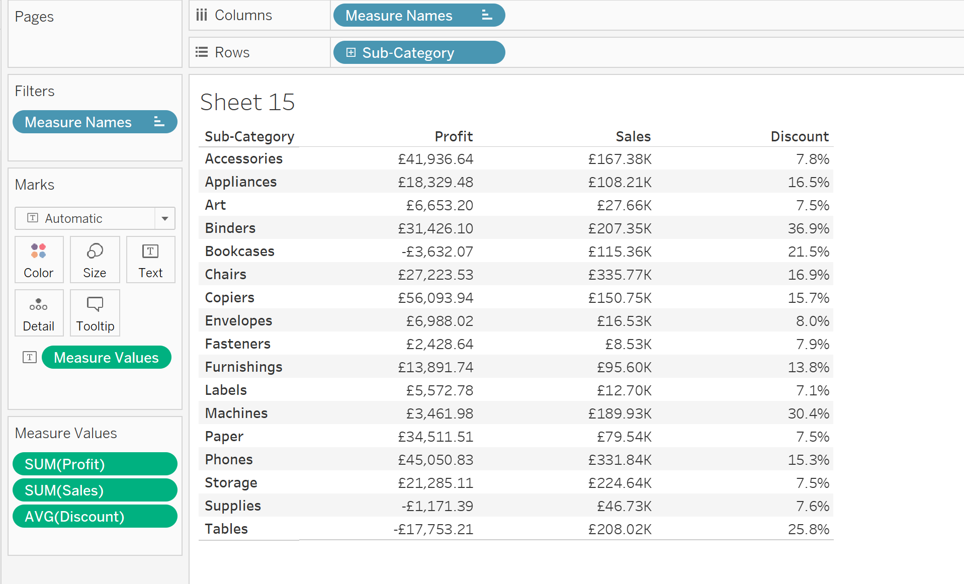
Step 2: Change Mark Type to square, and drag Measure values to colour. This now creates a highlight table with one gradient.
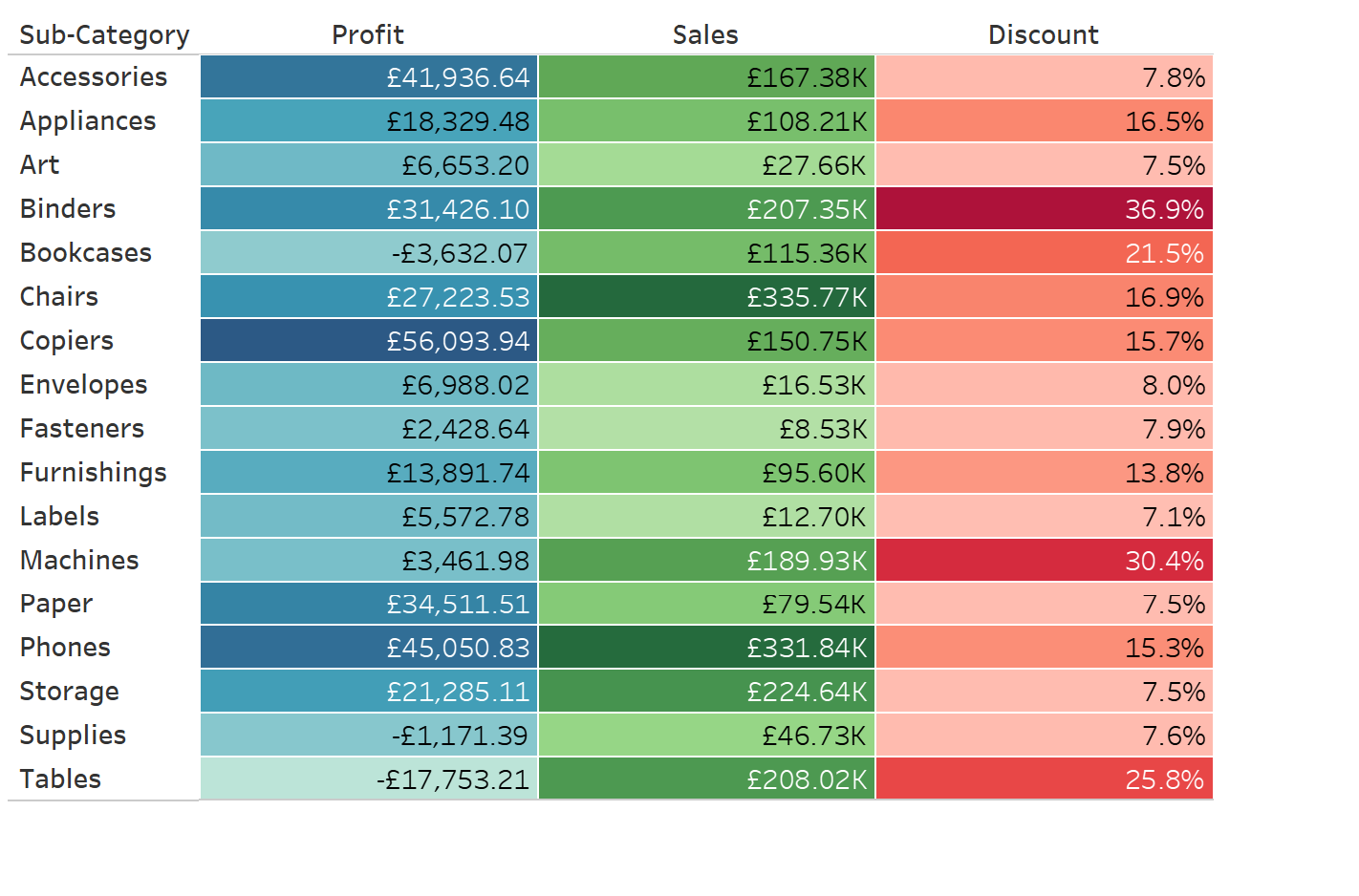
In this particular table, it would be beneficial to use a different gradient for 'Discount' and 'Sales/Profit' since 'Discount' is a percentage. Sales and profit also have a different range, so its good to separate.
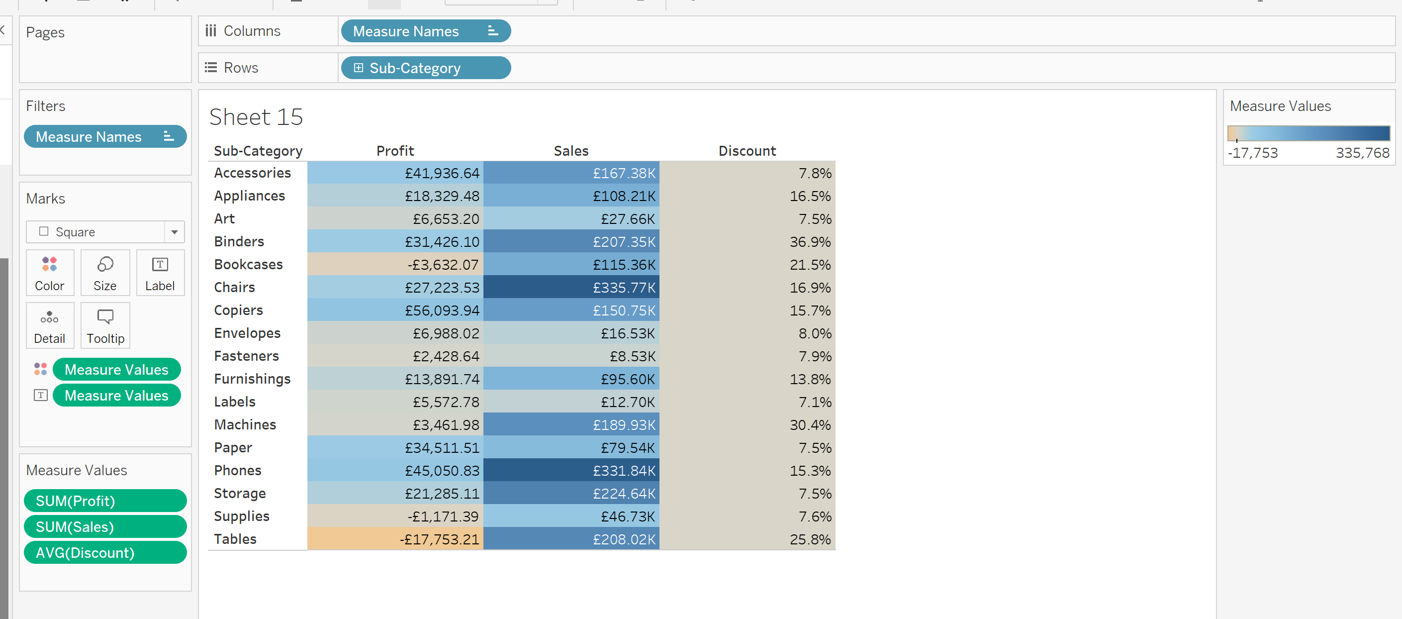
Step 3: Left click on the Measure Values Colour Mark bar.
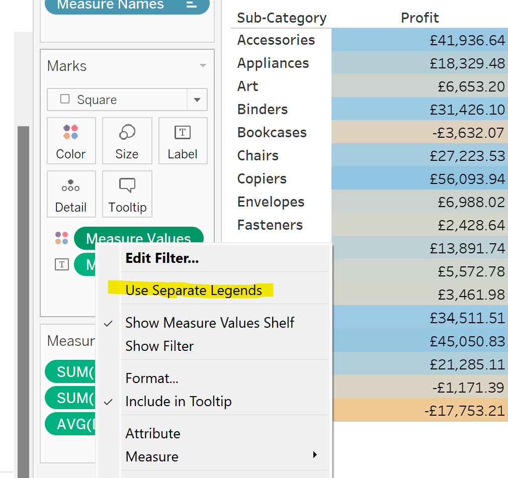
Step 4: Choose your colours.
Tableau has now given each column a new gradient. Right click on each legend to choose your colours.
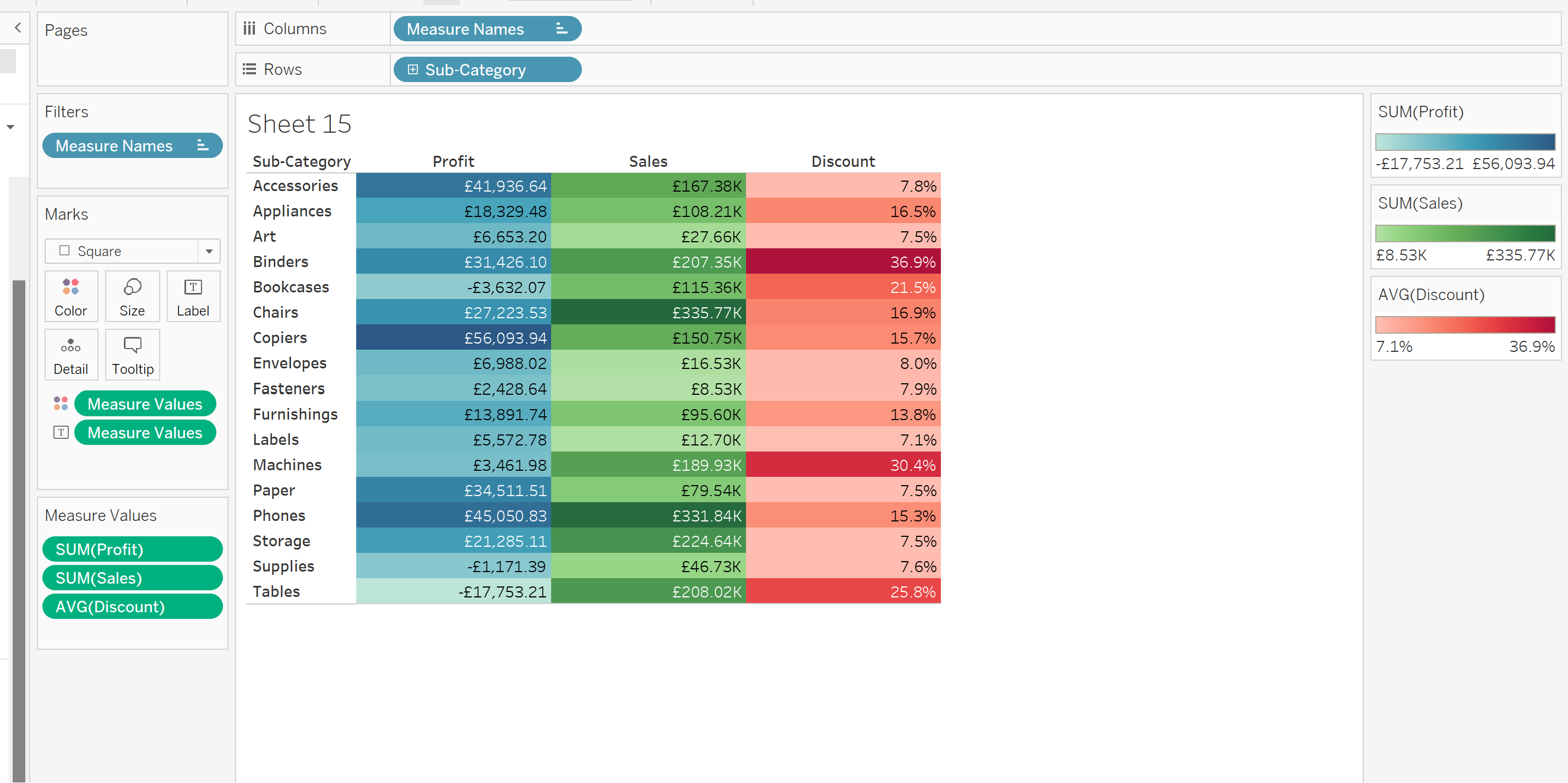
Ta da!
A good habit to have is to add a border to each cell, which makes the table easier to read.