


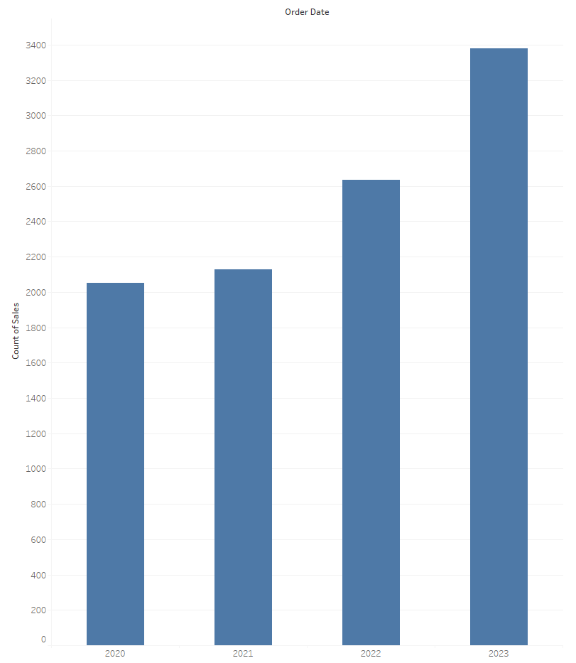
A stacked bar chart, as compared to a traditional bar chart, shows two categorical variables. One variable is shown along the entire length of the bar while the other variable is represented by the stacks within each categorical bar. For example, using Superstore data or any sales data in general, we might want to look into the number of products sold each year.
However, let’s say we want to view a breakdown of the number of sales by category type, we can create a stacked bar chart by dragging category to label or color in the marks card (or both, so it’s easier to tell at a glance what the bars and segments are showing us):
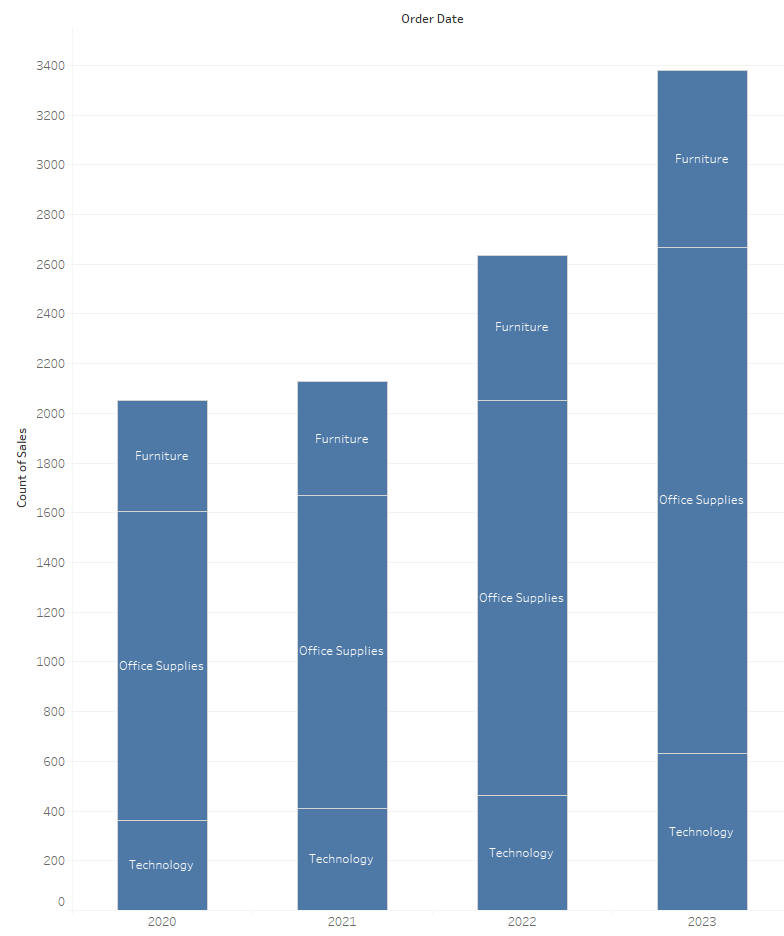
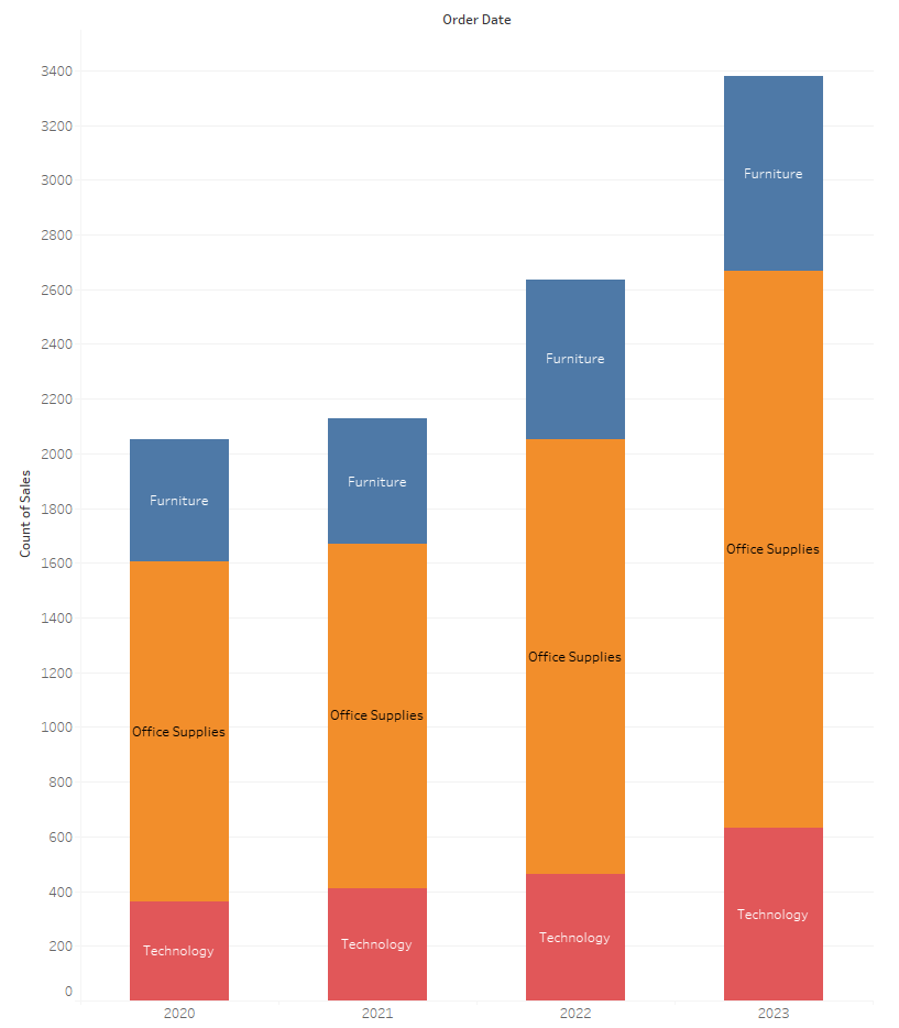
From the chart above, we can see that there’s been an increase in sales overall each year. And within each year, we can see that there are more sales in office supplies than furniture and technology. We can also see that the sales for technology has been increasing year after year and is likely to increase next year as well.
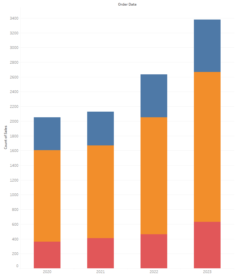
One thing that we have to look out for when using stacked bar charts is comparing the segments to each other across the data. When it comes to the bottom piece which in this case is technology, it will be the easiest to compare across the data because each piece starts at 0, whereas the other segments start at wherever the bottom piece tops off, making it more difficult to compare the heights of the other segments. As a result, it’s best to put the most important segment (as it relates to your analysis like if we’re focusing on technology for example) at the bottom.