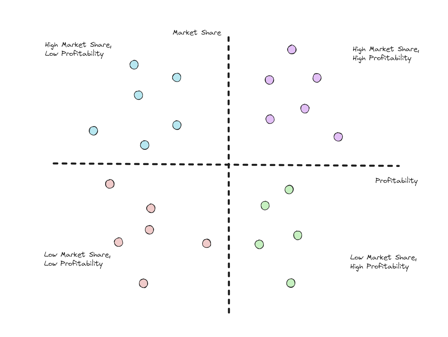
Quadrant segmentation is the process of dividing a chart (usually a scatterplot) into four sections. Depending on the applications, the four quadrants can take on a range of values. One application of quadrant segmentation is in business. If a business had data looking at profitability against market share, they might want to divide the data into the four categories: ‘high market share, high profitability’, ‘high market share, low profitability’, ‘low market share, high profitability’ and ‘low market share, low profitability’ so that they could see where they rank against competition.
Recently, DS43 were involved in a sports project where we had various metrics on athletes. Our client wanted to know how the athletes ranked against each other on a combination of different test results. I tackled this in PowerBI which was a little different to how we’d create the same chart in Tableau.
Let’s use the profitability against market share example and assume that ‘low’ values are below the average for each variable and ‘high’ values above it.
Creating the chart:
Example of DAX code to create averages and colour/split quadrants:
[Average Market Share] = AVG[Market Share]
[Average Profitability] = AVG[Profitability]
VAR CurrentX = 'Table'[Market Share]
VAR CurrentY = 'Table'[Profitability]
VAR AverageXValue = [Average Market Share]
VAR AverageYValue = [Average Profitability]
RETURN
SWITCH(
TRUE(),
CurrentX < AverageXValue && CurrentY > AverageYValue, "Low Profitability, High Market Share",
CurrentX < AverageXValue && CurrentY < AverageYValue, "Low Profitability, Low Market Share",
CurrentX > AverageXValue && CurrentY < AverageYValue, "High Profitability, Low Market Share",
CurrentX > AverageXValue && CurrentY > AverageYValue, "High Profitability, High Market Share",
"#000000"
)

