


Here is a link to an example dashboard which uses this technique.
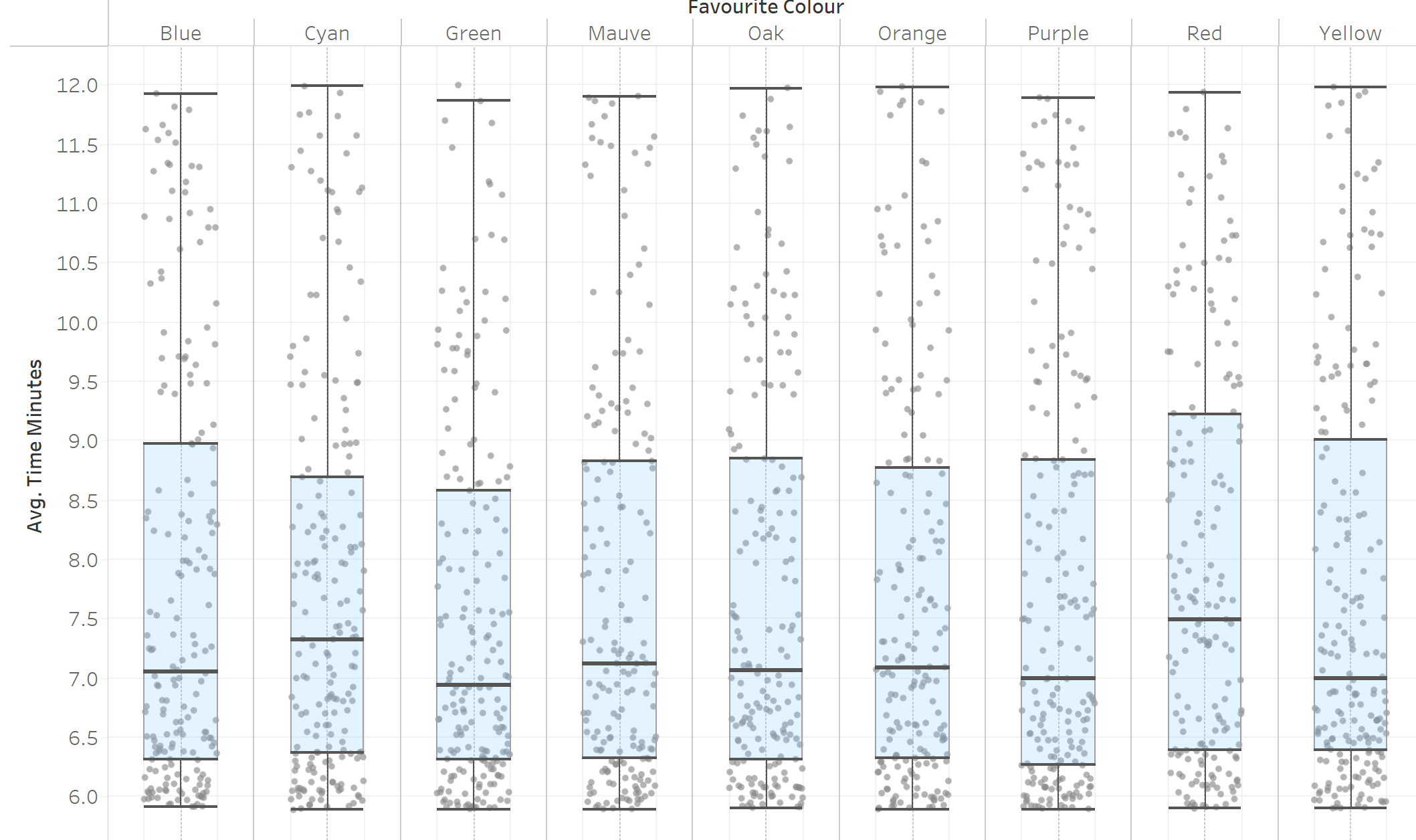
Jitter plots are useful to visualise lots of points in one chart. A jitter box plot, however, can be tough to align properly.
First build your box plot graph
The easiest way to do this is to:
- Drag the measure you want to visualise onto the rows shelf
- Drag what you want each dot to represent onto detail in the marks card
- Change Marks type to Circle
- Change size and colour of circles to make them more visible - I also changed my axis to not start from zero for clarity
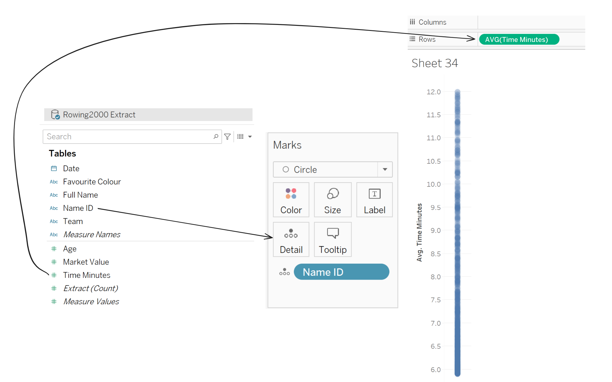
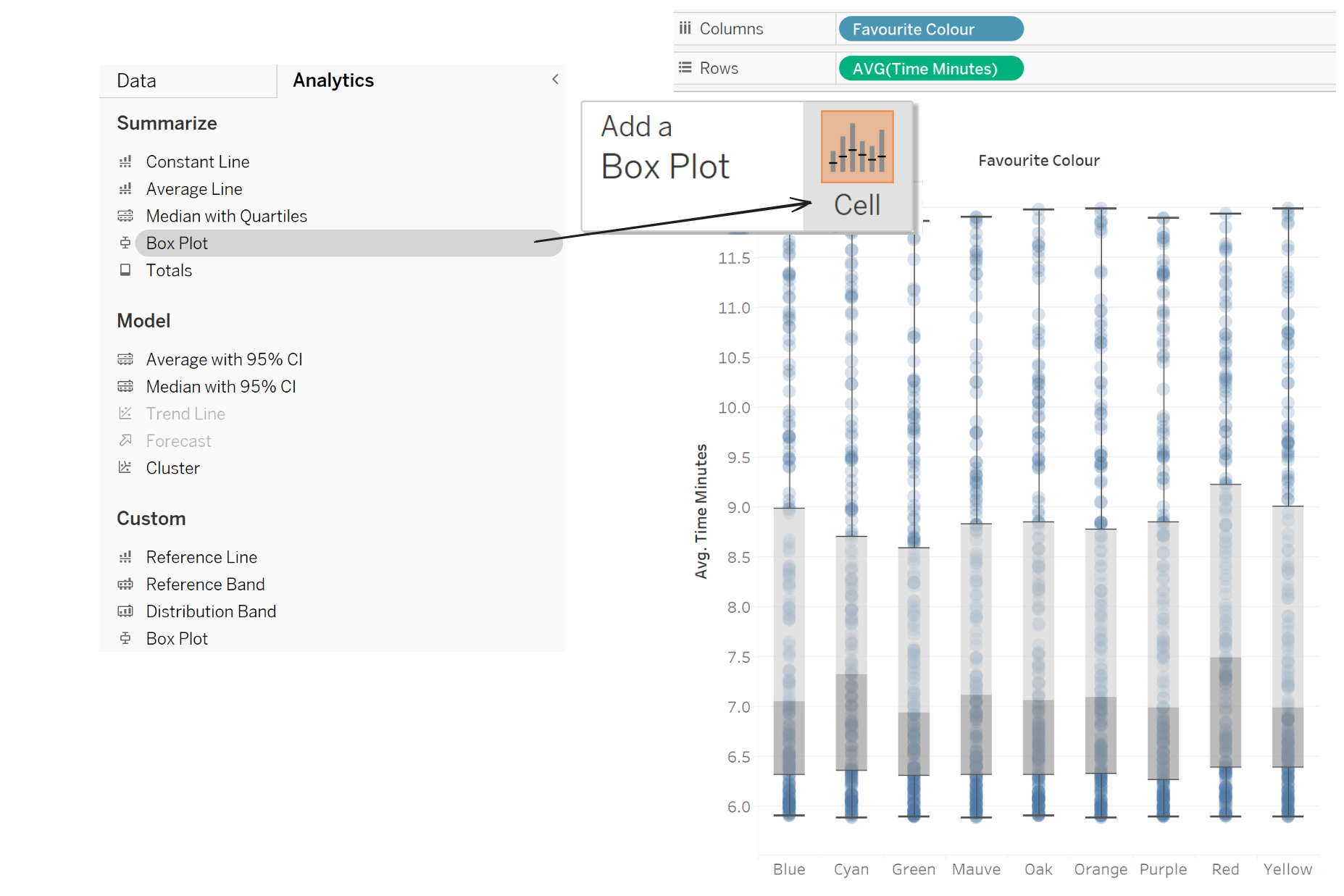
- (Optional) Add a dimension onto Columns to break down the view
- From the Analytics pane, drag Box Plot onto the graph
Then Jitter
To go from your box plots to jitter box plots, only a few more changes are needed.
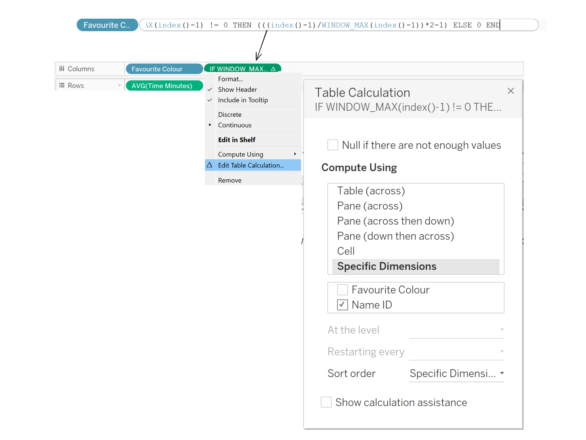
- Double click an empty space in the Columns Shelf
- Copy and paste the following magic formula
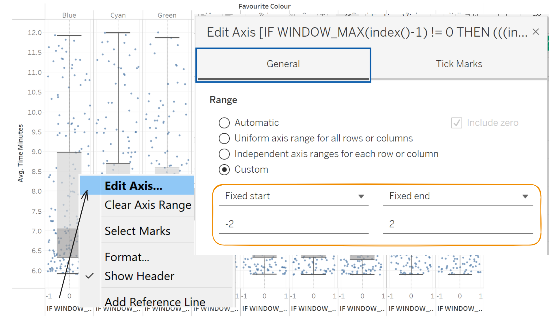
IF WINDOW_MAX(index()-1) != 0 THEN (((index()-1)/WINDOW_MAX(index()-1))*2-1) ELSE 0 END
- Right click the created measure in the Columns shelf and click Edit Table Calculation
- In the Edit Table Calculation window, Click Specific Dimensions and make sure everything is ticked except for whatever dimensions are in the column shelf
At this stage, the jitter box plots are almost finished. The only annoyance is that the dots extend past the box plots.
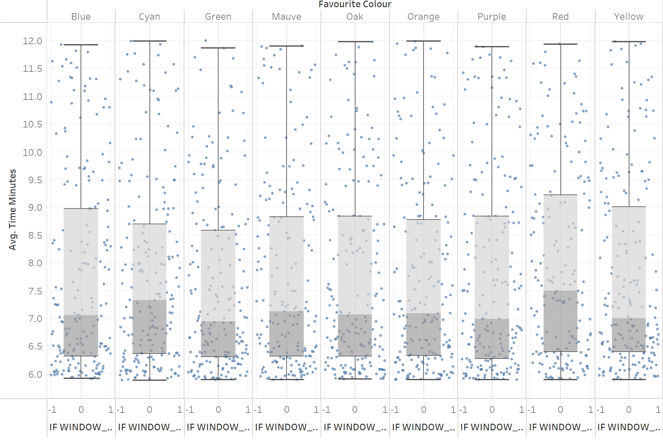
The calculation was created to be between -1 and 1 to allow for easier adjustment. To finish, we only need to edit the x axis.
Formatting
- Right click the x-axis and click Edit Axis
- Set Range to Custom, and alter the fixed start to be -2 and the fixed end to be 2. This can be adjusted to fit your desires
- Right click the x-axis again and untick Show Header to hide the jitter axis
- Format as desired - note that you can change the box plot settings by right-clicking it
Final product: