It is useful to be able to create mock data. I wanted to create mock data so that I can share techniques that I learnt during client work, without using their data. The mock data will be for 2000m rowing. The final dashboard I made from this data can be found here.
The five main tools I use for this are:
1: Simulation Sampling
Allows to generate lots of numbers which distributed in a chosen way. This makes it easy to create physically reasonable data.
2: Multi-Row Formula
Can be used to create trends in data, and also can be used to create ID fields.
3: Join
A way to combine multiple mock data fields together into one dataset.
4: Formula
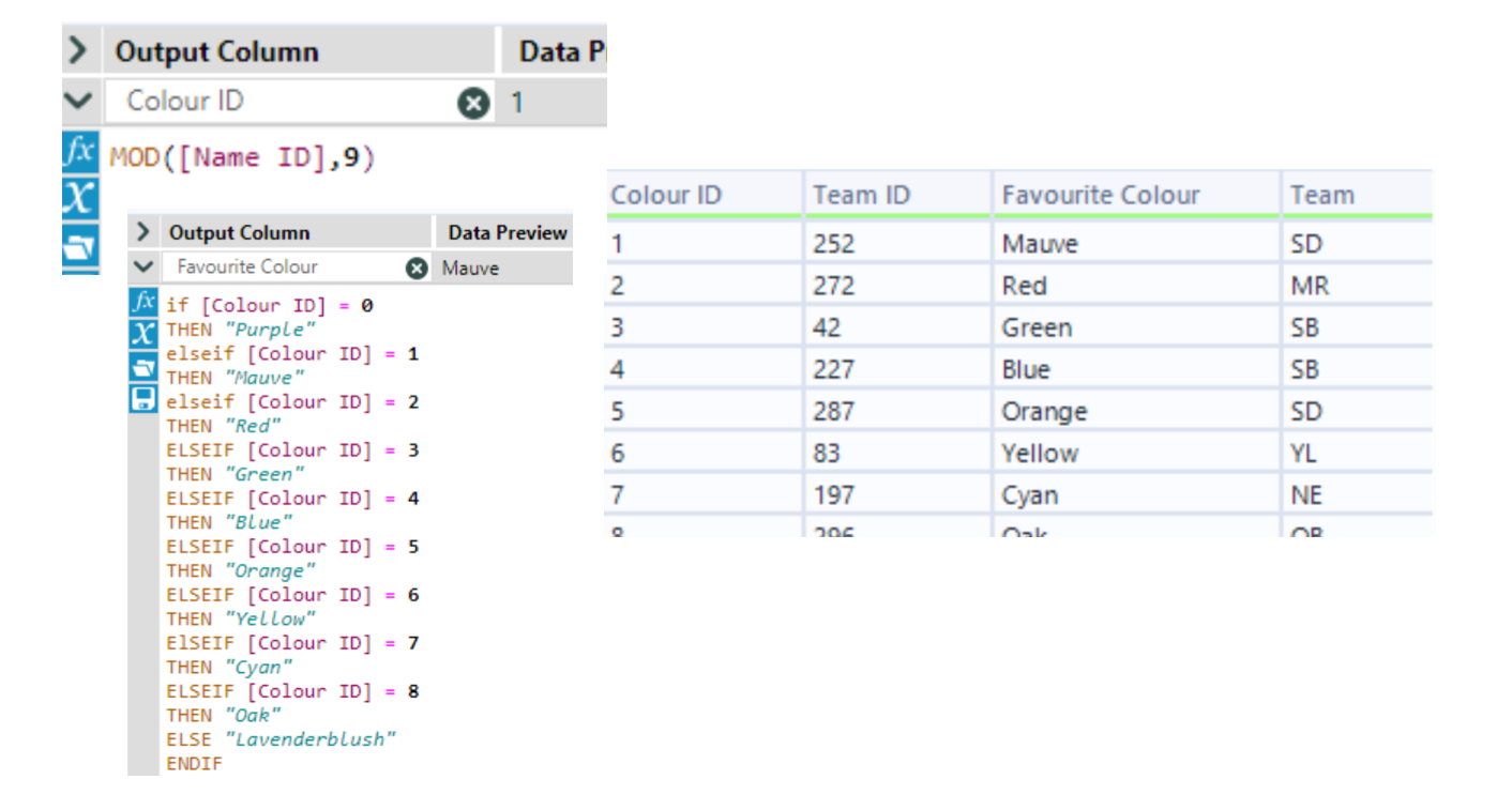
Can be used to re-label fields to be more relevant to the mock data you are creating. I like to use the MOD function to easily choose how many categories I want.
5: Generate Rows
A way to mock extra data points for the existing rows - for example, making extra years of data.
Making fake names
I started with a list of first names - I chose a list of modern baby names.
Steps:
- Make another column with different first names via sorting and joining
- Alter the second column of first names to sound more like a last name via the Mod function and an if statement
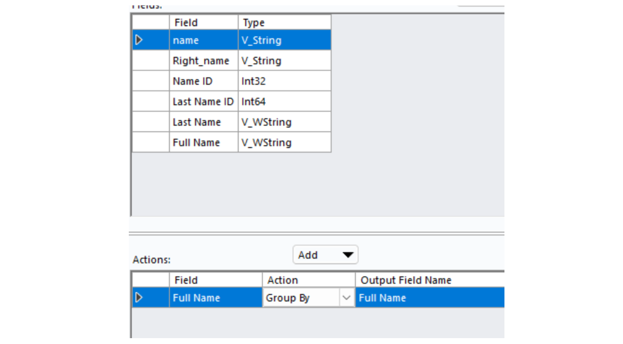
- Remove duplicates via Summarize
First step:
I used Multi-Row Formula tools to make a simple row ID (you could also use a Record ID tool), and I used a sort tool to reorder the dataset before joining the sorted and unsorted versions together on their row IDs.
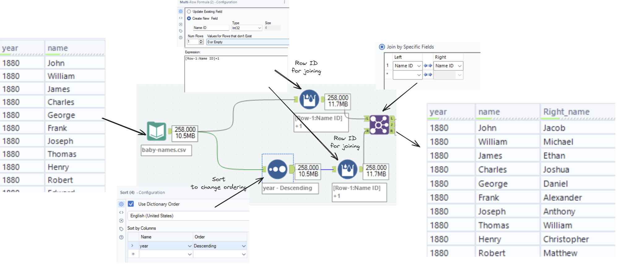
This gives me a dataset with two first names.
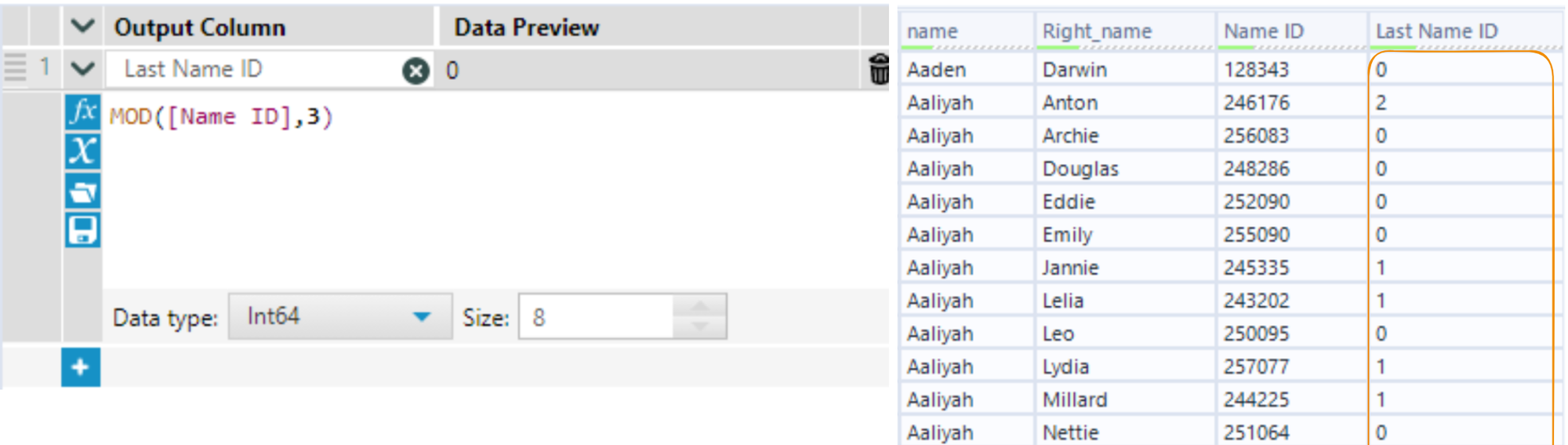
Second step:
The Mod function takes in two numbers, a and b, and gives you the remainder of a divided by b. For example, Mod(7,6) = 1 and Mod(8,6) = 2. I use the Mod function to take many numbers and return a smaller amount of numbers, which I can relabel later to my choosing. You can use a row ID as the input, and then the second number will be the number of different values that will appear:
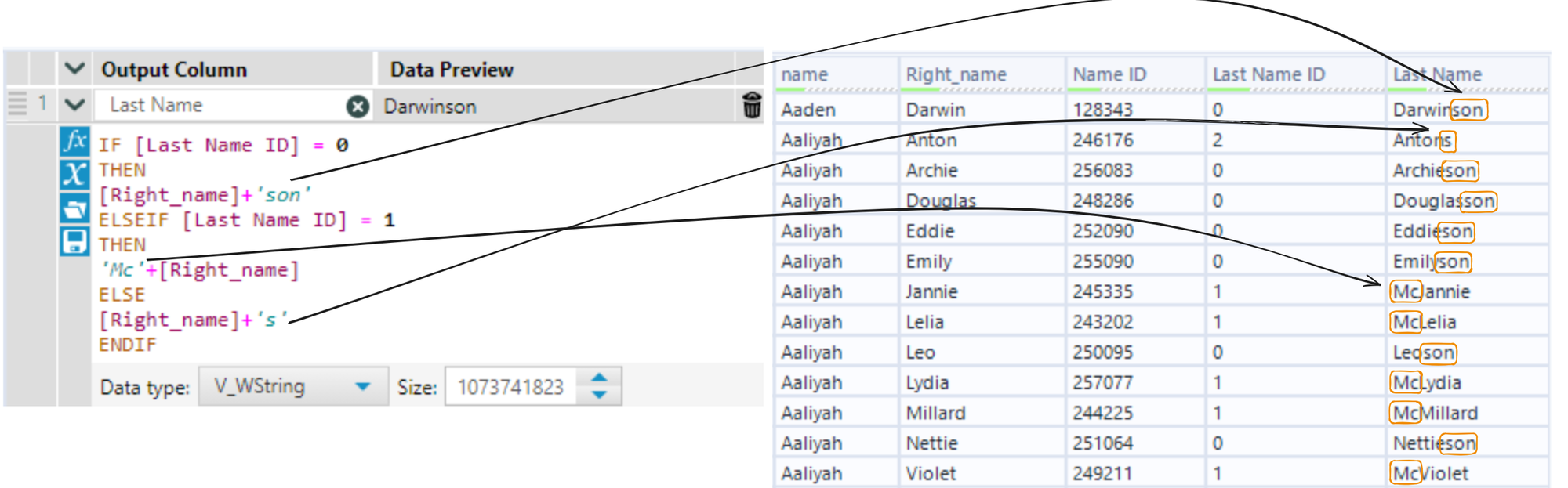
I then altered the second name based on the new field to sound more realistic:
Third step:
You can remove duplicates using a Summarize tool, with the columns you want to de-duplicate set to Group By
Simulation Sampling Tool
This is a powerful tool which can generate data from probability distributions.
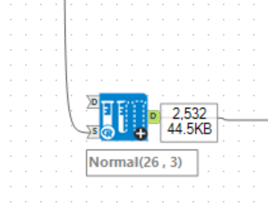
Here is an example that I used to generate reasonable ages for my dataset, which I wanted to include 2000m rower's competition data and some demographics about the athletes. I started by generating reasonable ages for such athletes by using the Simulation Sampling Tool:
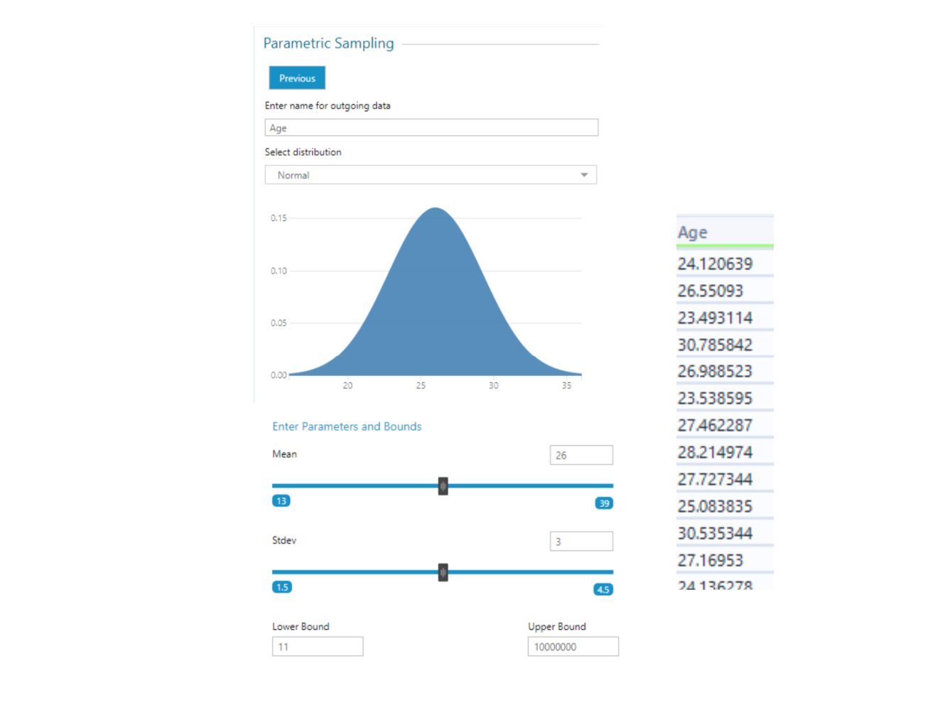
This is making sure that most of the ages are around 26, and also ensuring that most of the ages are between 23 and 29. I made sure to put my fake names data into the 's' anchor to ensure I get the same number of rows as my dataset.
Now that it has the same number of rows, we only need to add a row ID and join back onto the original data's row ID as before the new data is appended.
I did this two more times to get the following fields:
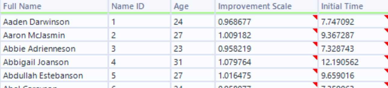
The field "Improvement Scale" will be used to build in some trends later on.
Making fake categories
I did this with the same technique as making fake names; I first made a "category ID" field using the Mod function, and relabelled to get categories.
Making more rows of data
The Generate Rows tool can be used to duplicate rows of data. I wanted to add three years of fake monthly data to my fake rowing data. To do this, I duplicated each row so that I have 36 copies, which will be my three years of monthly data.
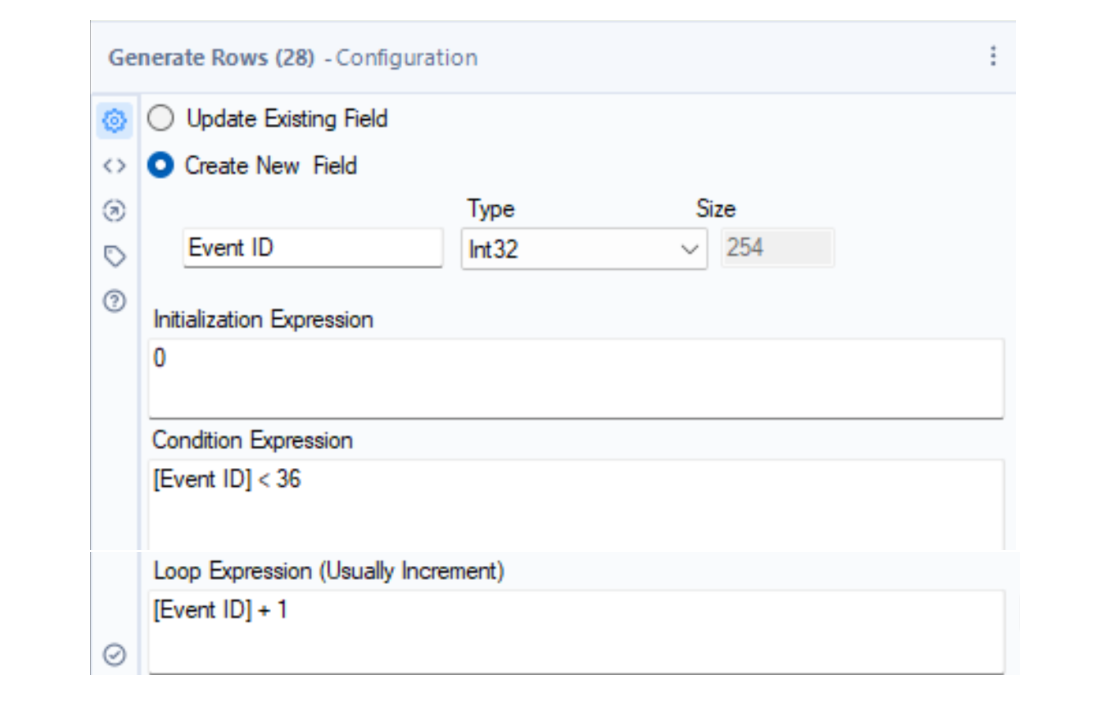
This creates an additional field called "Event ID", which is simply the numbers from 0 to 35.
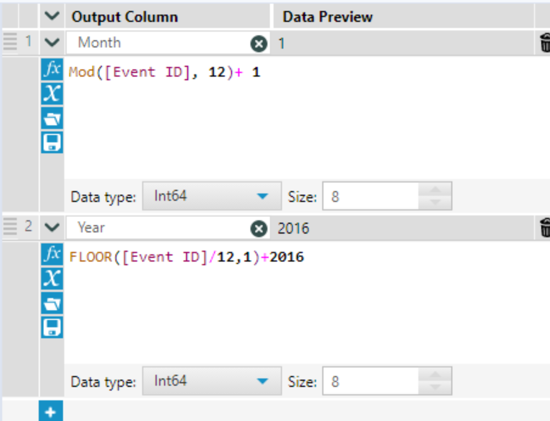
To make the Event ID field into a date field, I used the following two formulas, which convert my 0 to 35 numbers to month numbers and year numbers separately. Alternatively, you could use a DateTimeAdd function to achieve a similar result. I then used this month and year to create a date field.
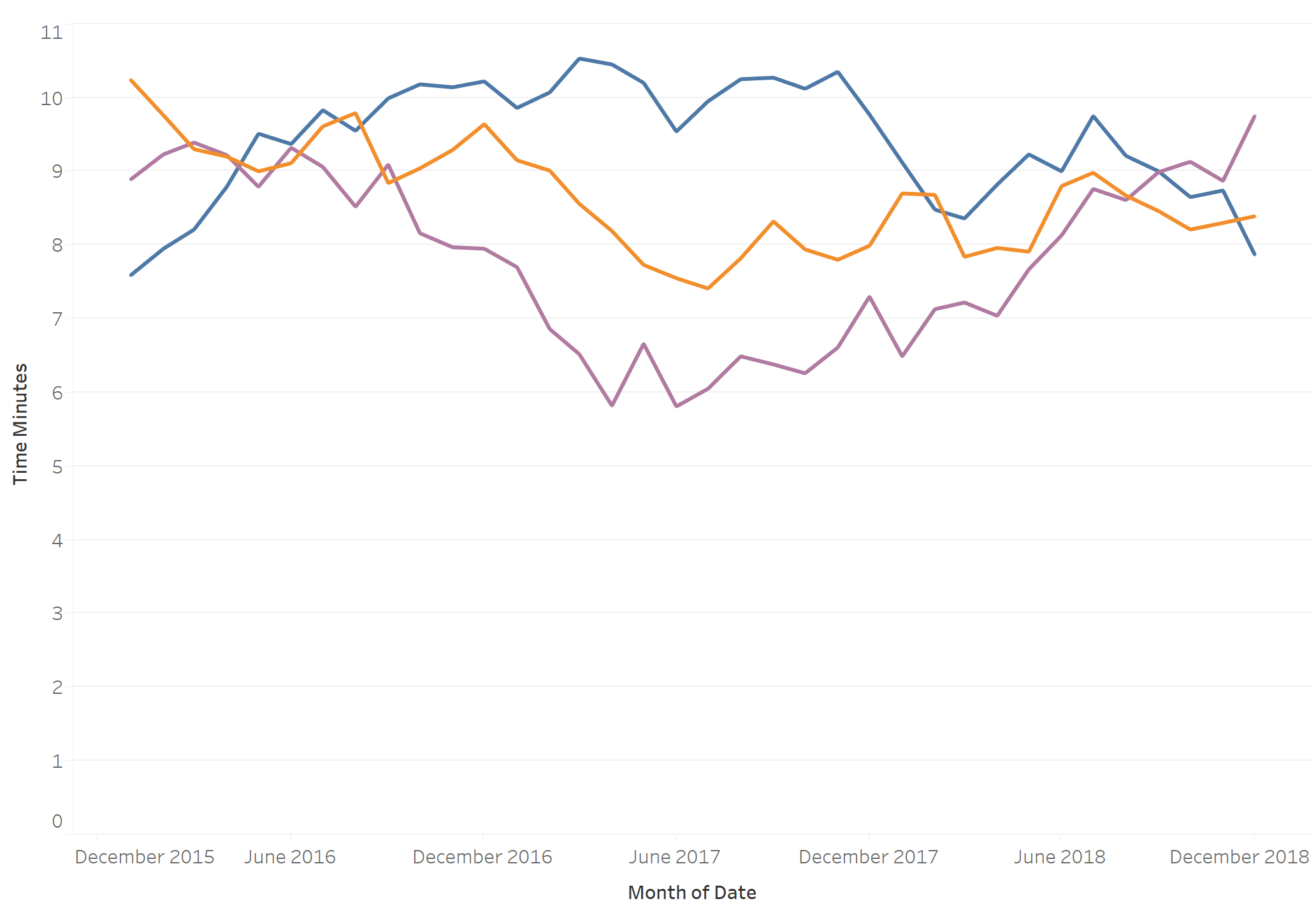
Building trends into the data
I wanted to enforce that the athletes are improving or getting worse in a reasonably realistic way. I wanted to make it so that there is a quick improvement initially which slows down over time.
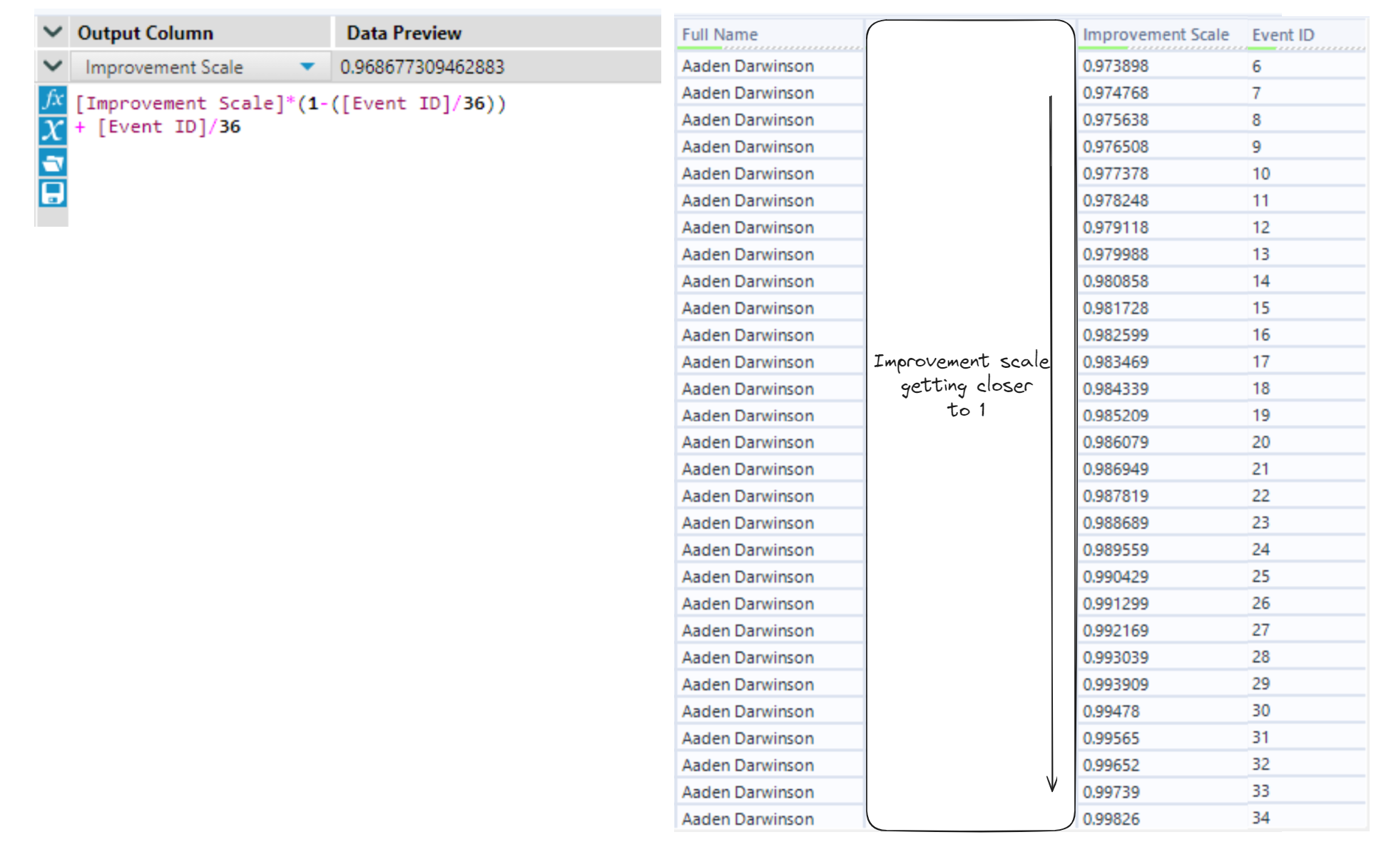
The way I will do this is by starting with an initial time, and multiplying it by a number close to 1 (like 0.95) to get a slightly faster time (5% faster in this case). I will call the multiplying number the Improvement Scale. Instead of doing this each month, I wanted the improvement scale to be less significant each month so that people do not improve endlessly.
I made use of the Event ID field which ranges from 0 to 35 to change the Improvement Scale to become closer to 1 as the Event ID gets closer to 35 using linear interpolation.
To use the Improvement Scale field to build a trend, I used a Multi-Row Formula tool to repeatedly apply the scaling.
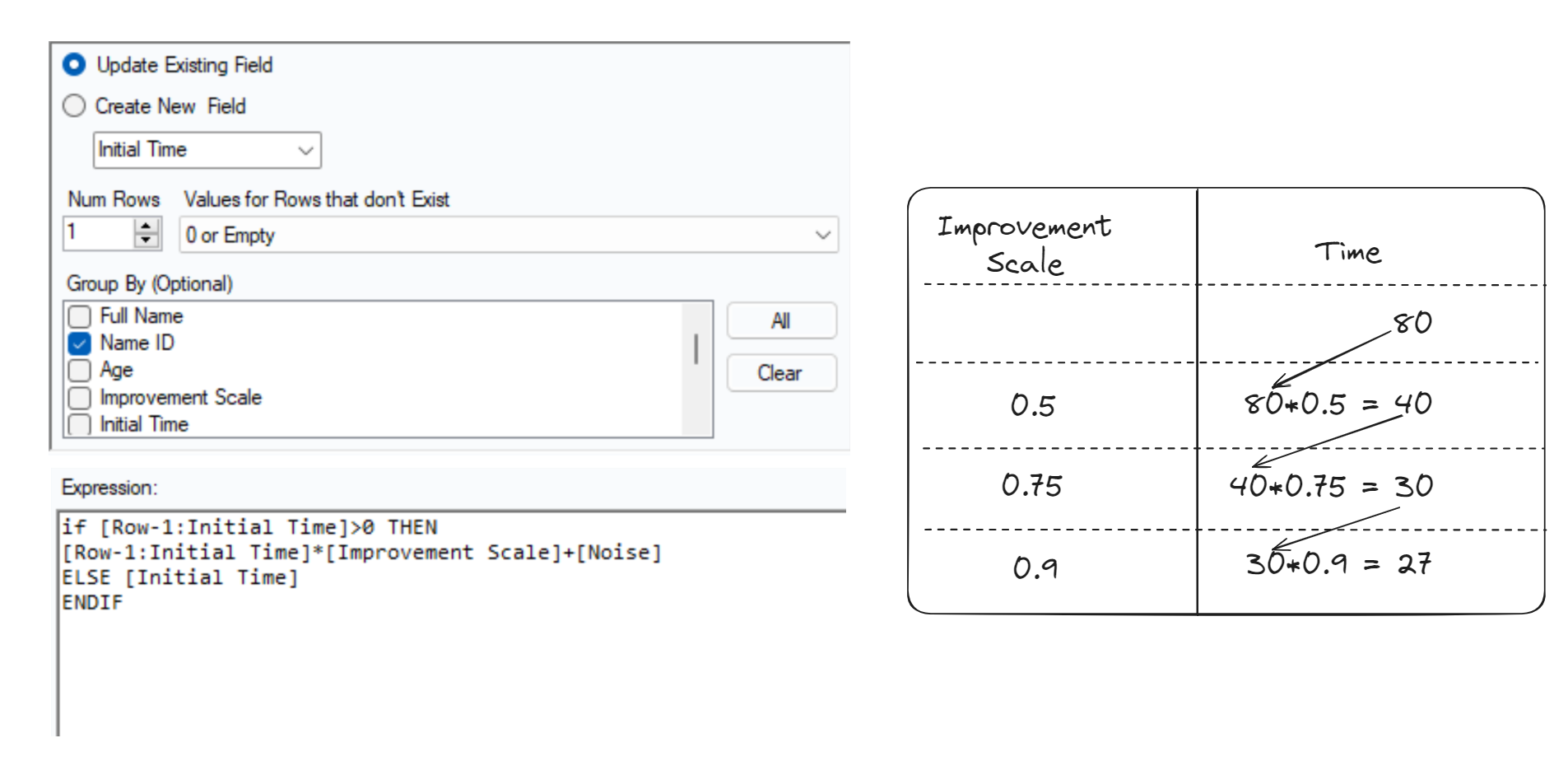
Note that I added a [Noise] field, which is a small random number. This makes it so that the trend is not perfect.
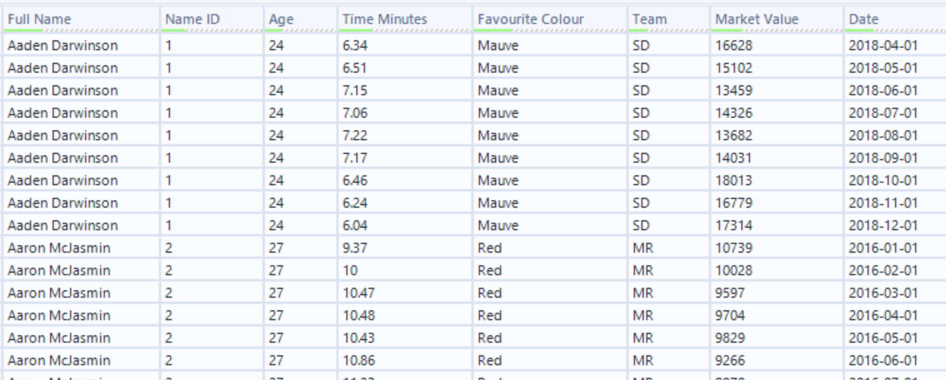
The final dataset
I repeated the above techniques to finally create my mock 2000m rowing data with demographic information and market value. I made sure that the market value is related to the time field - faster time usually means higher market value.
Here are some time trends for three of the athletes: