


Today we were tasked to connect to and prepare data via SQL, and then produce a Power BI report around a topic of our choosing.
Discovery
Step 1 was to understand the data given. To get a high level overview, I visited all of the tables using:

This will allow me to figure out how the fields are structured so that I can join the tables later.
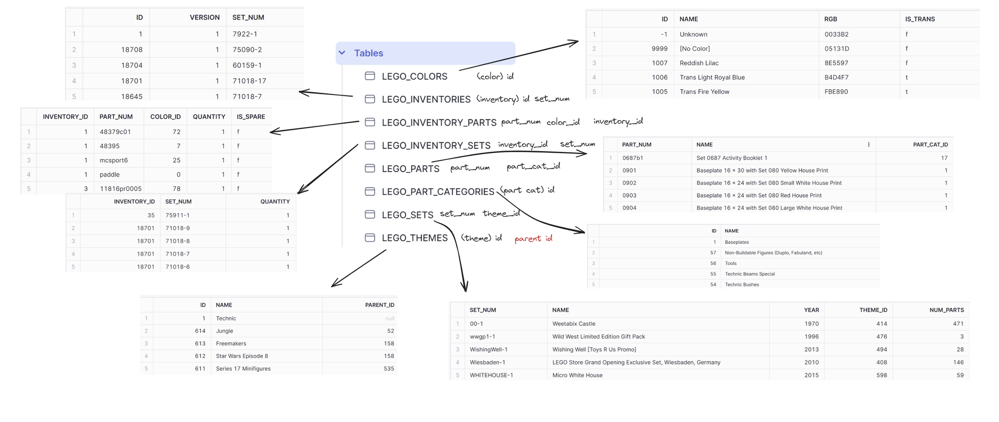
I have also marked all of the ID fields for my convenience later. Now I am able to scope what the report might look like and focus on.
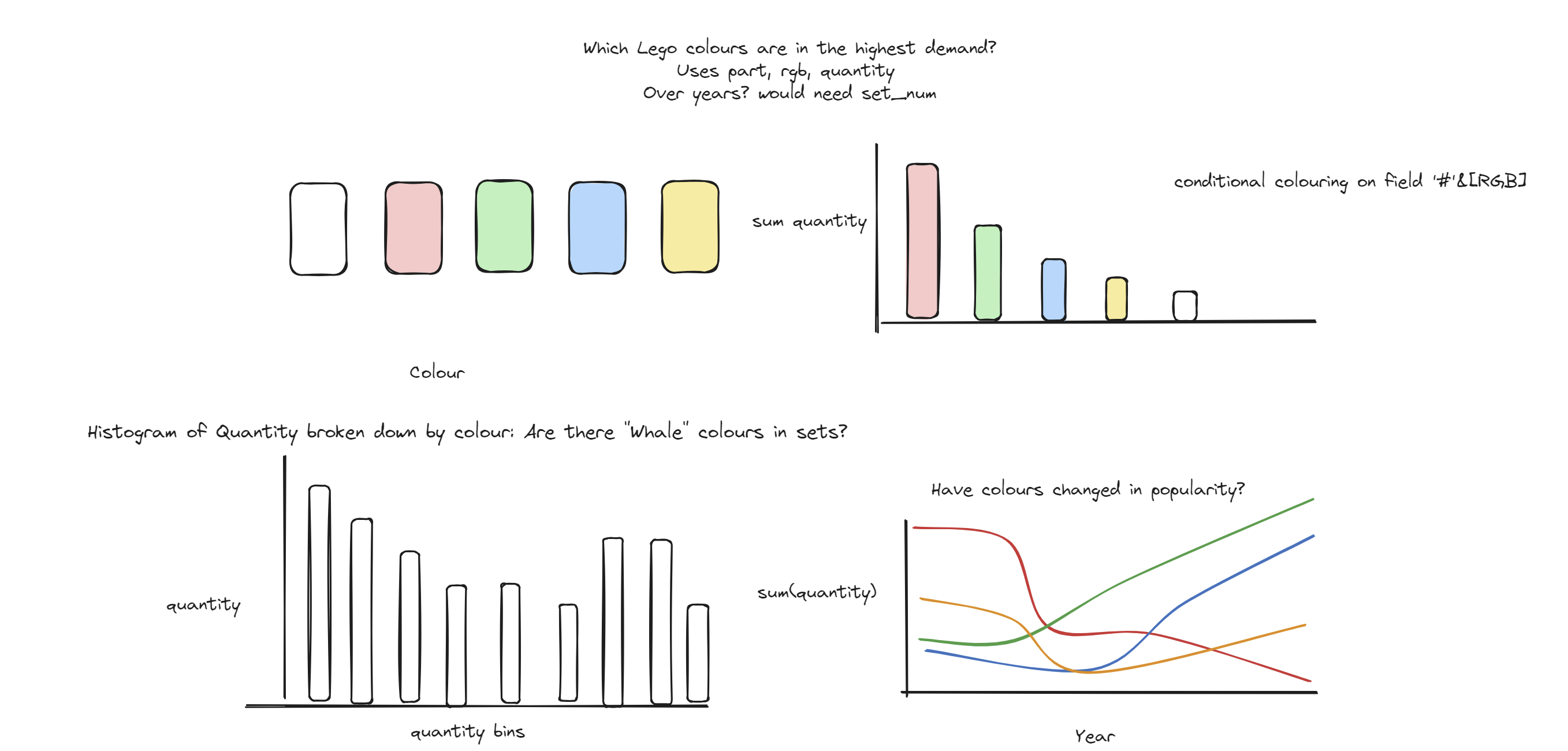
I wanted to make use of the RGB field in LEGO_COLORS and Power BI's conditional formatting capabilities to analyse demand of Lego colours over time. I chose to measure demand with the (inventory) quantity field since stores (if run well) should stock up on pieces which are in high demand - there should be a direct positive correlation between (inventory) quantity and demand.
Joining and Granularity
Before joining, it is useful to check the granularity of each table. I used a similar method described in a previous blog post of mine to find the granularity using aggregation, and comparing the number of rows before and after.
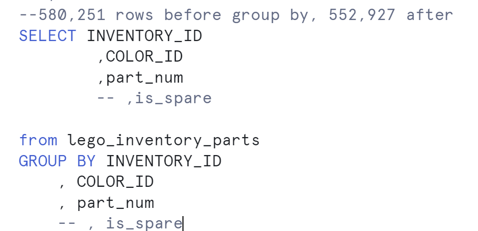
For example, it turns out that the LEGO_INVENTORY_PARTS table has granularity set by four columns!
After going through each of my desired tables, I created the following schema:

The issue is that, as it stands, joining LEGO_INVENTOR_PARTS onto LEGO_INVENTORY_SETS would be a many-to-many join which explodes the number of rows (since neither of the joining fields are primary keys). We do not want to do this! To account for this, we will need to
- Join LEGO_INVENTORY_SETS and LEGO_SETS
- Aggregate the joined table to the level of INVENTORY_ID
Only then can we join onto LEGO_INVENTORY_PARTS.
CTEs
I will go about aggregating and joining via CTEs, a temporary table created inside of an SQL query. I execute the two steps above in a CTE, and then join onto the rest of the tables by referring to the prepared table via a CTE. I chose to also join the leftmost PART tables in a CTE for convenience
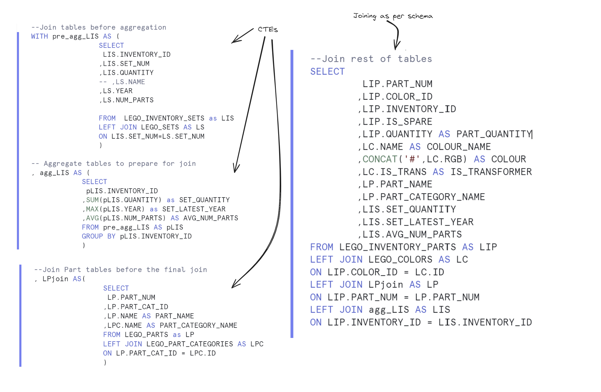
Now the data is ready to access in Power BI
Power BI
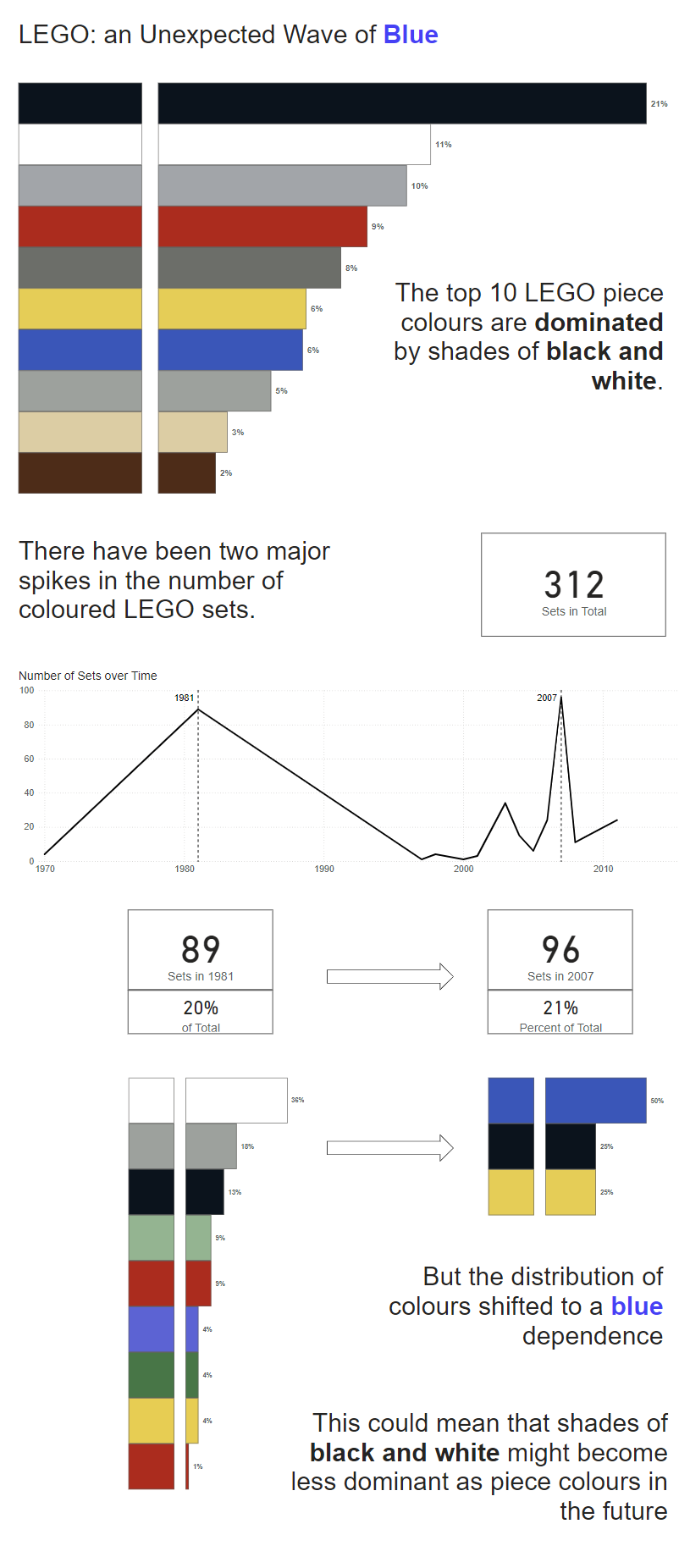
Upon exploring the data further and building my sketch, I found that set colours are dominated by blue - this is in contrast to the shades of grey which take up most of the piece colours. Because of this, I decided to create an infographic-style report exploring the changes in set colours in comparison to piece colours.
Here is a screenshot of my report:
Here is an embedded version of the report: