


...have multiple colour palettes for your measures?
Well, the answer is yes! Here's how you can do it:
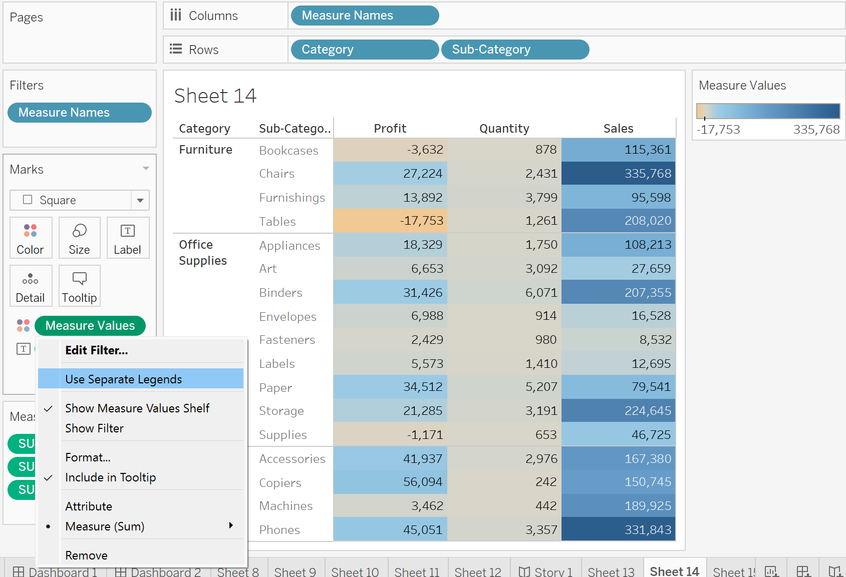
Please go ahead and try to replicate the highlight table below using the Sample Superstore dataset.
- Start by placing the Category and Sub-Category dimensions in the Rows shelf
- Double-click on Measure Values in your data pane. You will see all your measures under the Marks pane
- To simplify the view, keep only Profit, Quantity, and Sales. You can do this by dragging the other measures away from the view or by using Measure Names as a filter
- Change Marks type to Square
- Drag your Measure Values again onto Marks, but this time, drop them onto the Color shelf
- Right-click the Measure Values pill in the Color shelf and select 'Use Separate Legends'
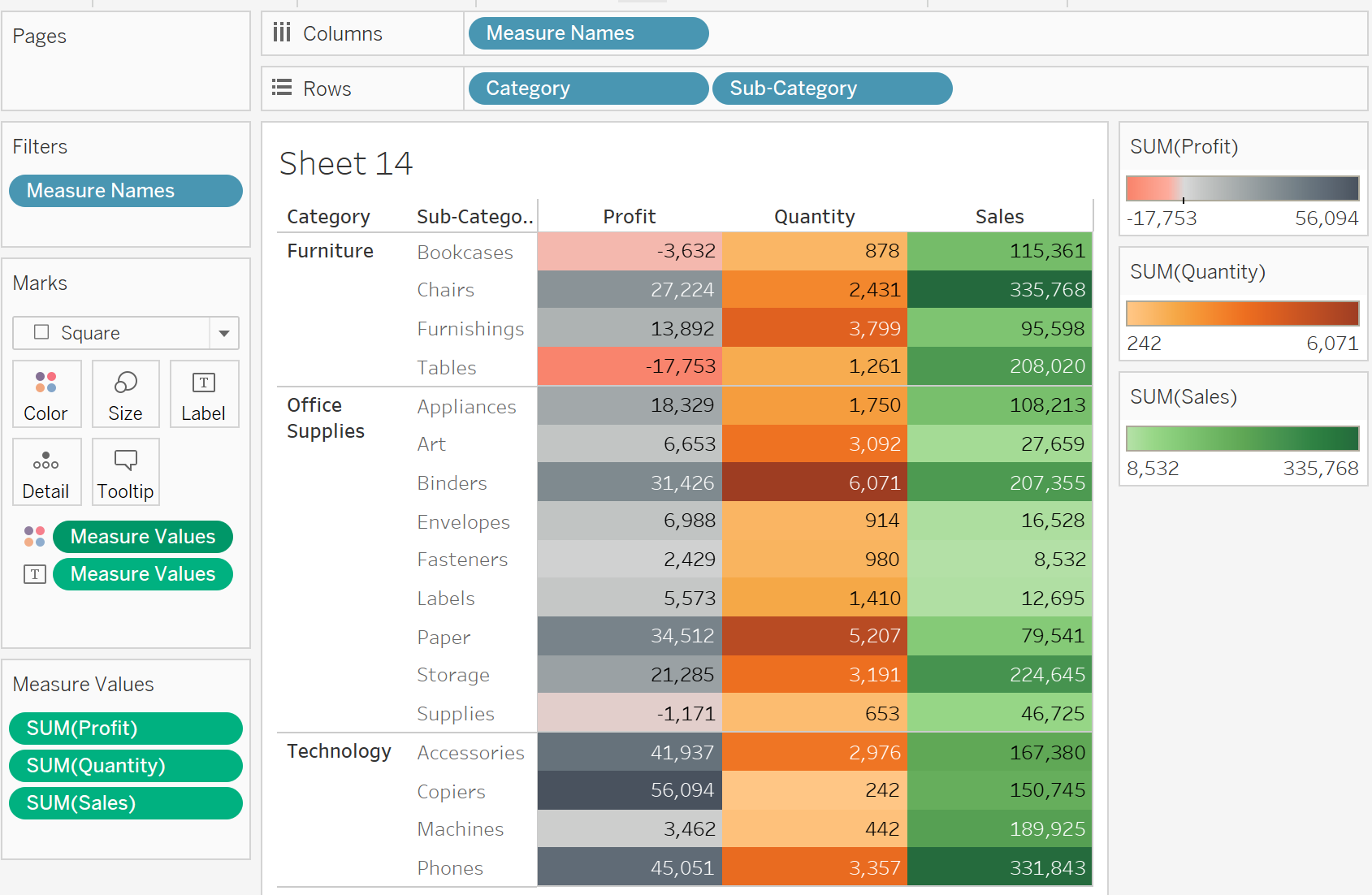
It's important to note that you can always switch back to using only one color legend if you prefer. Simply right-click on Measure Values in your Color shelf again and click on 'Combine Legends'.
That's it! Now you can create dynamic and visually appealing charts in Tableau with multiple color palettes for your measures.