The past week built upon last week's introduction to Power BI and its core features. It was quickly learned that Power BI is more than just a visualisation tool; it can be used for data preparation, modeling, and interactive reporting. This post is a recap of the week, from cleaning raw data to building dynamic dashboards.
Part 1: Data Preparation with Power Query
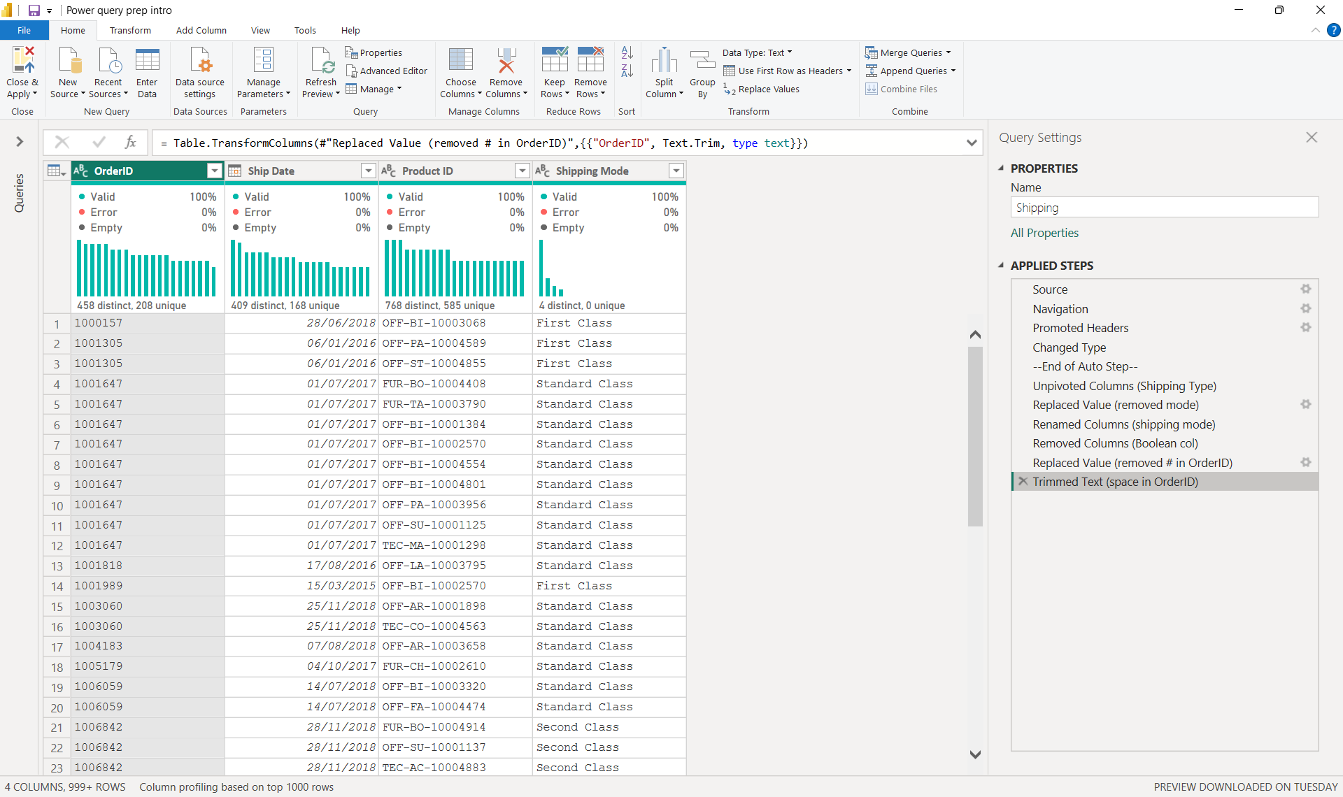
The first step was to get the data clean using Power Query. The data must be prepared before loading into a report to ensure it is suitable for analysis and presentation. The focus was on essential tasks like changing data types, handling missing values, and splitting columns to get the data into a usable format. This stage reinforced the lesson that clean, well-structured and documented data is the foundation of any good analysis.
See below - Power Query interface with the applied steps documented.
Part 2: The Data Model: Building Connections
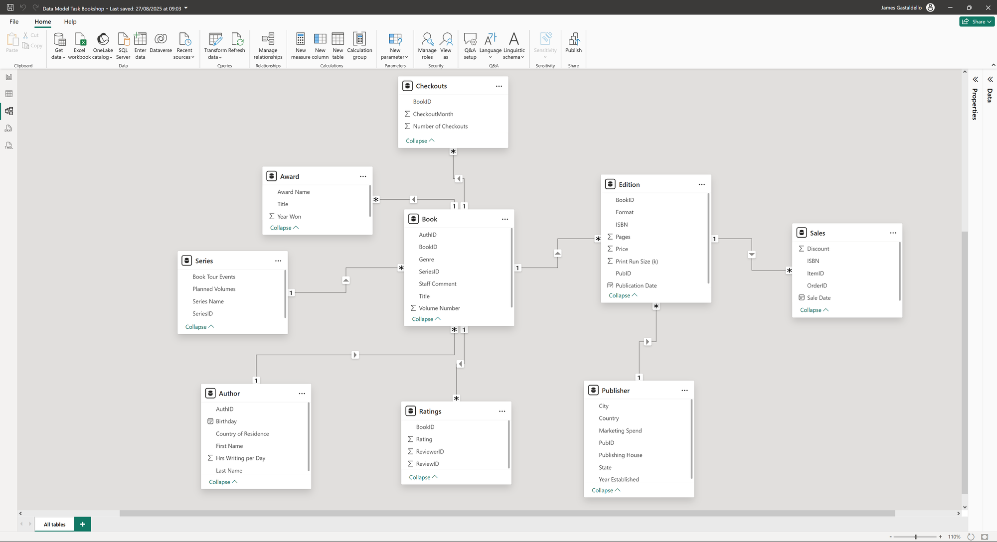
Once the data was clean, the next step was to connect the tables in the Model View. This is where the concepts of fact and dimension tables is applied. The tables were identified as either holding the metrics (fact tables) or the descriptive attributes (dimension tables). Relationships were then established between them, primarily one-to-many, to create a schema as seen below. This process is crucial because it allows Power BI to efficiently filter and aggregate data.
Understanding the relationship types and filter direction was a key learning point, as it determines how data flows and how visualisations respond to filtering.
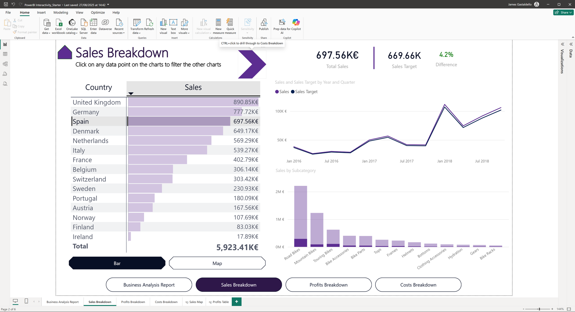
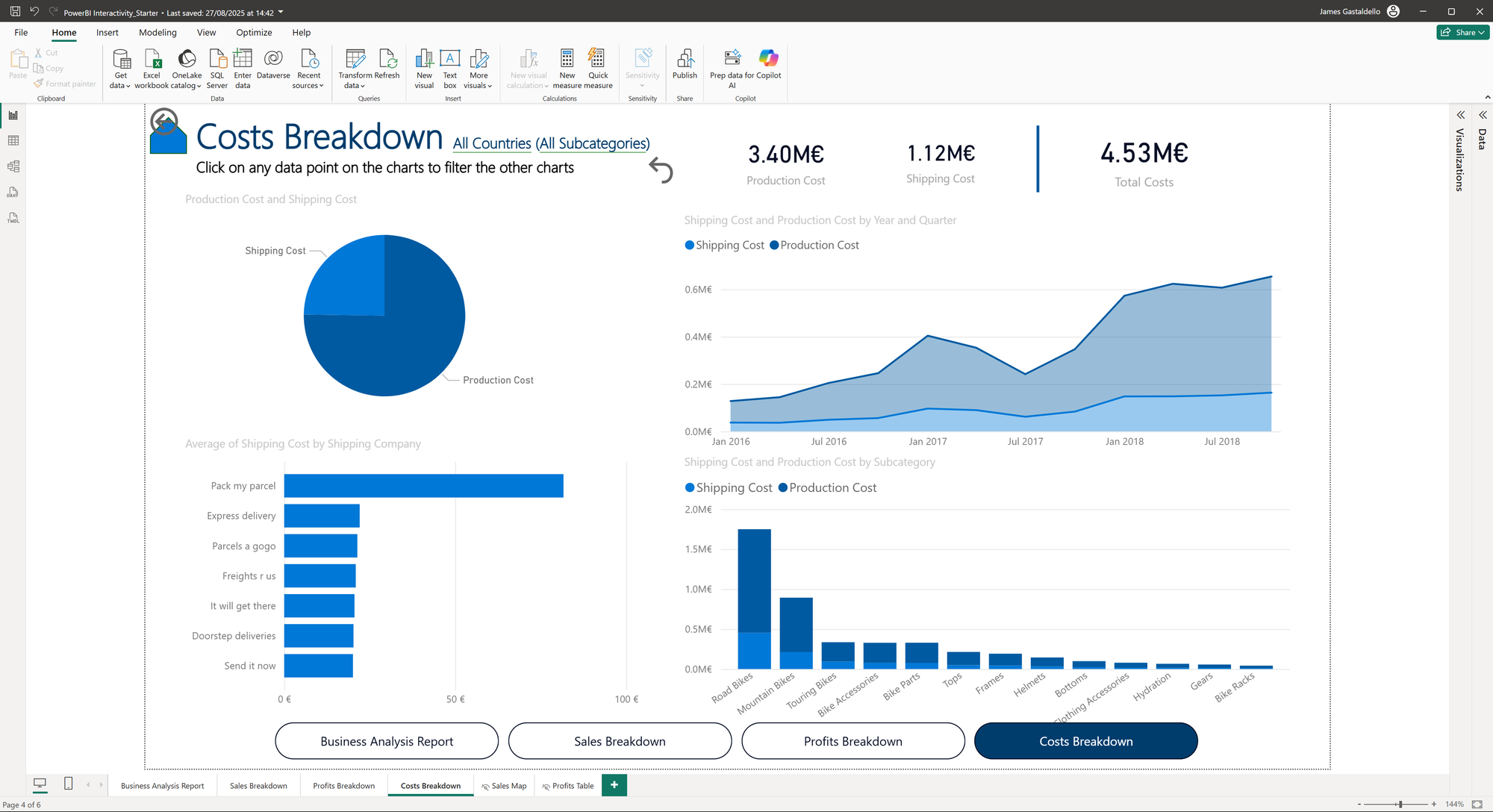
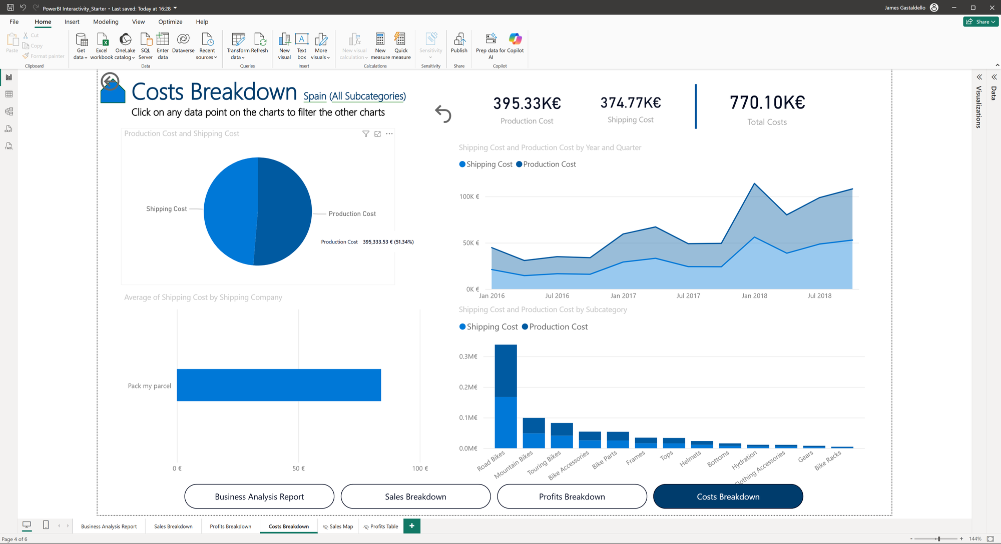
Part 3: Creating Interactivity
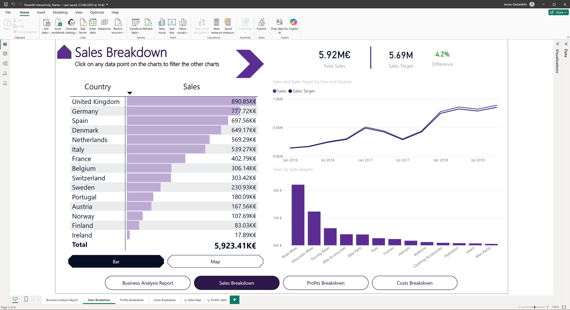
With a solid data model in place, the focus moved on to building the report itself. The goal was to create an interactive experience for the user to explore levels of the data analysis. Buttons and bookmarks were used to allow for easy navigation between different pages and views of the report. Drill-through filters were also implemented, which allow a user to select a category on one page and seamlessly filter a different, more detailed page based on that selection.
See below for the before and after views of pages with filters and buttons. The Sales Breakdown page filters the Costs Breakdown page by selecting a country/subcategory and clicking the arrow to switch to the filtered view of the Cost Breakdown page.
Part 4: Visual Polish and Dynamic Filters
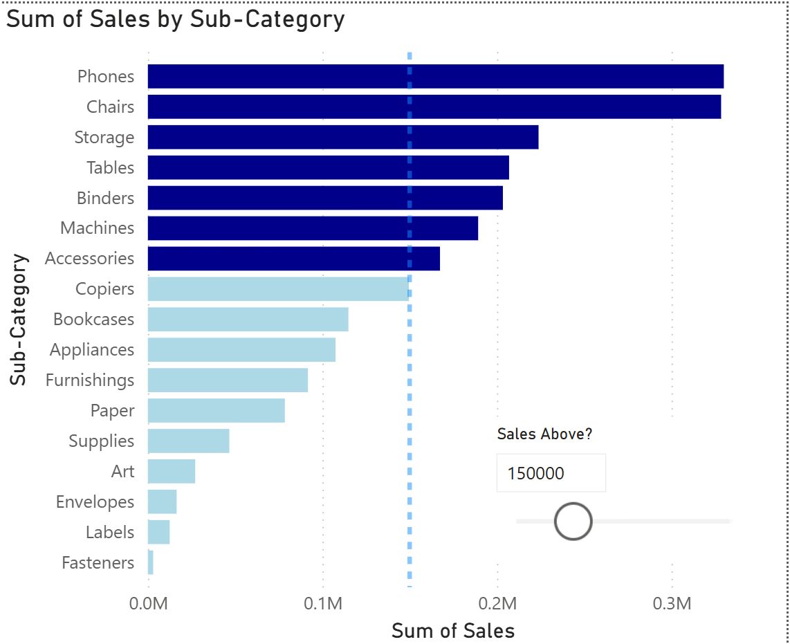
To make the visuals more impactful, more advanced techniques were explored. Conditional formatting allowed for using color to highlight key insights based on rules, gradients, or field values. Different types of filters were also used to give users more control, including a slicer button, Top N filters, and filtering directly by selecting fields on a chart. A particularly interesting technique was creating a dynamic constant line that could be controlled by a slider, making it easy to compare data against a user-defined benchmark.
See below for an example of a slider and conditional formatting. The colour of the bars will change depending on whether or not the value is above the defined sales line.
Part 5: The DAX Deep Dive: Measures vs. Calculated Columns
The final day was all about DAX, the formula language of Power BI. A key learning point was understanding the difference between a calculated column and a measure.
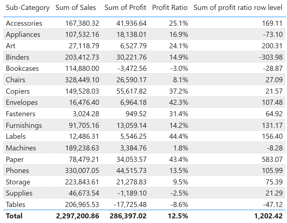
- A calculated column works at the row level. It computes a value for every single row in the table, and any aggregated result (like a sum) is simply the total of all those row-by-row calculations. This can lead to incorrect results for ratio calculations.
- A measure works on the aggregated level of the visual. It performs its calculation on the total of the data shown in the visual.
Let's look at an example to clarify. If the goal is to calculate the profit margin for a sub-category, a calculated column would first compute the profit margin for every single product within that sub-category and then sum all those individual margins together, which is mathematically incorrect.
In contrast, a measure would correctly sum the total profit for the sub-category and divide it by the total sales for the sub-category, giving the correct overall profit margin.
This distinction is crucial for getting accurate results and is a foundational concept for anyone looking to master Power BI. See the table below showing the Profit ratio calculated with a measure compared to the calculated column (Sum of profit ratio row level).