


Rounded containers can help to give your dashboards a nice and polished look. Here's a quick guide on one method you can use to achieve this effect. This method details how to create these without using a graphic design tool like Figma and focuses on Tableau's in-built functionality.
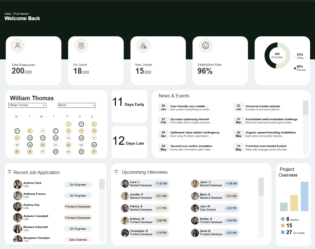
Create a Dummy Field
In a new worksheet, create a dummy field [""] and drag it to your labels card.
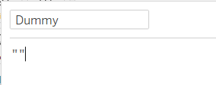
Annotation
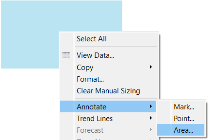
Annotate your field that's in the view with an area annotation. Don't write anything in this annotation. Then, simply format this annotation and change the 'corners' option to your desired level of rounding. Format your worksheet background colour, and the finally, change the view to 'Entire view'.
Dashboard
You can then drag this container into your dashboard view and set up your dashboard's background. You can create new annotations inside this worksheet (make sure you right click on the worksheet and not the original annotation). This will let you make multiple sections.
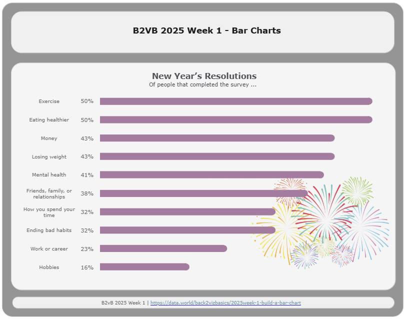
You can then float your dashboard objects into the correct containers, using the grid (press the 'G' key) to align them effectively.
Downsides
There are a few downsides to this technique. Since everything must be positioned manually, it can be time-consuming and a bit fiddly to get layouts perfect. This makes it less suitable for business dashboards that need to scale or update frequently. However, for design-led or portfolio dashboards where visual polish is a priority, this is a quick and effective trick that can make your work stand out.