Seasonal trends are an integral part of time series analysis, helping analysts model and forecast temporal trends. Sometimes these cyclic trends are easily identifiable; retail sales spike during the holiday season, ice cream sales peak during the summer months. Some cyclic trends are a bit more hidden, making them even more valuable. One example that comes to mind is trends in fashion, where styles return to massive popularity after years of irrelevance.
The fashion example is also a great way to remember that although cyclic patterns are often called "seasonal", they are not restricted to being annual. Seasonal cycles can be as granular as within the hours of a day, or as broad as centuries (such as in climate change data).
As impactful as seasonal trends can be, they can be difficult to identify in raw data. The typical method is to apply the "eye-test" to a line chart and see if there happen to be spikes in regular intervals. This catches the extreme examples, but can miss more subtle underlying cycles. For a more quantitative approach to finding seasonal cycles, we can apply the concept of autocorrelation. Autocorrelation is like correlation, but comparing a time series to itself! If December sales are closely correlated with sales from previous Decembers, that part of the time series is considered to be strongly autocorrelated.
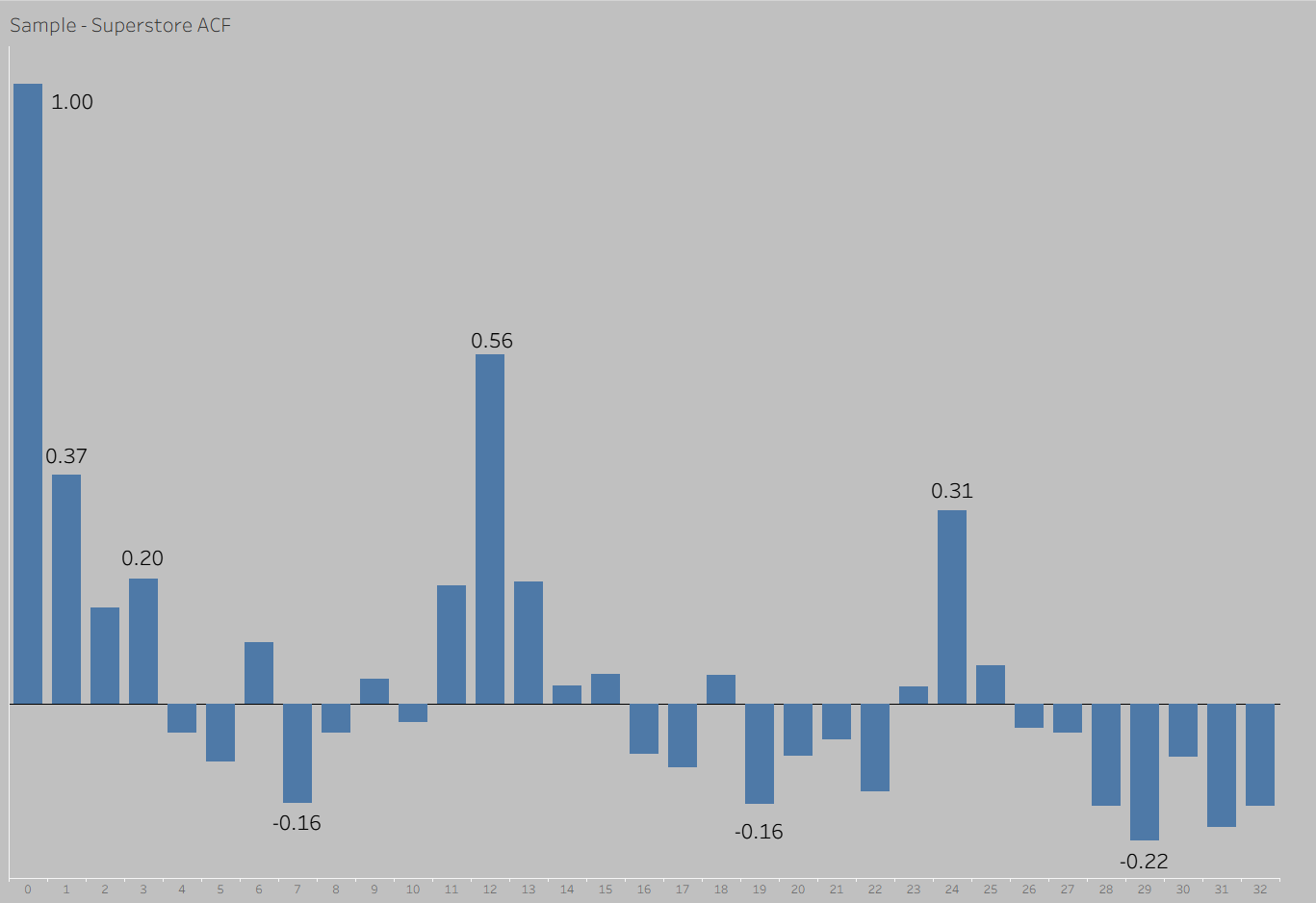
The autocorrelation function (ACF) does this same process but at all possible lags from the present. Starting from 0 steps (which always has a correlation of 1.0), an ACF goes through each possible lag distance and has bars with values reflecting the correlation levels at that lag. Large positive values indicate close correlation, and large negative values indicated negative correlation (we would expect an opposite outcome that many steps back).
ACFs tend to decay from left to right as the lags get larger, which makes intuitive sense (results that are closer in time are more correlated). Seasonality can be identified by finding spikes in the ACF, which can either be done statistically (not the feature of this particular blog) or with visual inspection (still way more precise than eyeballing the line chart).
As far as I know, an ACF has not been officially built in Tableau in the past. One way to achieve the effect in Tableau is by connecting with R using RServe. Implementing in Tableau was a bit cumbersome, but still achievable!
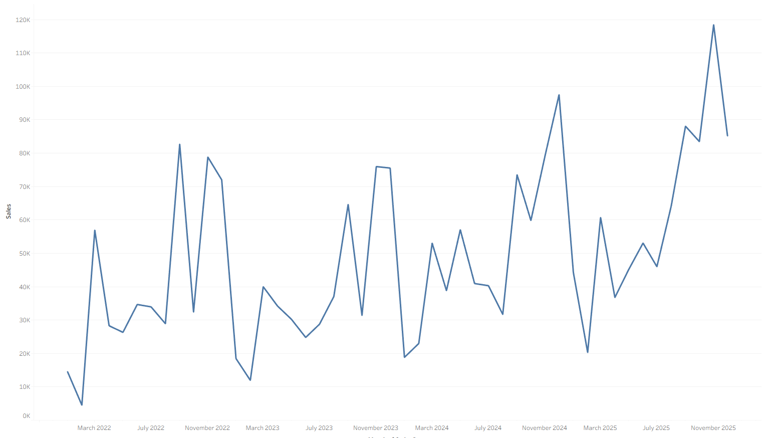
Using the Sample - Superstore dataset in Tableau, I chose to analyze the monthly seasonality in total sales:
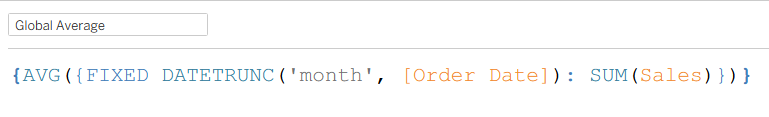
The first calculation this process required was an LOD to get the average total sales in a month, across the months present in the dataset:
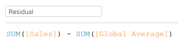
Once I had that calculation, I calculated the residual for each month, or the difference between the total sales in that month and the average monthly sales across all of the months.
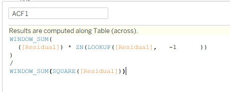
Last, I computed the lag-1 ACF value using the following calculation, which multiplies the present residual by the lagged residual, then divides by the sum of squared residuals, which is the same procedure that R uses to calculate its ACF values.
The last important step is to update the "compute using" months once the ACF1 field is in the view! Unfortunately, you may have noticed that this calculation is titled ACF1, which foreshadows the fact that I built my ACF using a very brute force method of measure names and measure values. I am sure this could be improved upon in the future, but it was a sufficient viable product for today's efforts. I have incldued the resulting ACF for the Sample - Superstore dataset below, which reveals the strongest correlations at a 1 month lag, and at the 12 month and 24 month lags, representing potential annual cycles in the sales figures.