


Tableau's default line chart makes linear connections between the points on a line, which is intuitive and makes the fewest assumptions about what happens between the points. That said, some use cases call for a curved line chart, whether that is for the sake of aesthetics or to give the reader an easier time parsing the information.
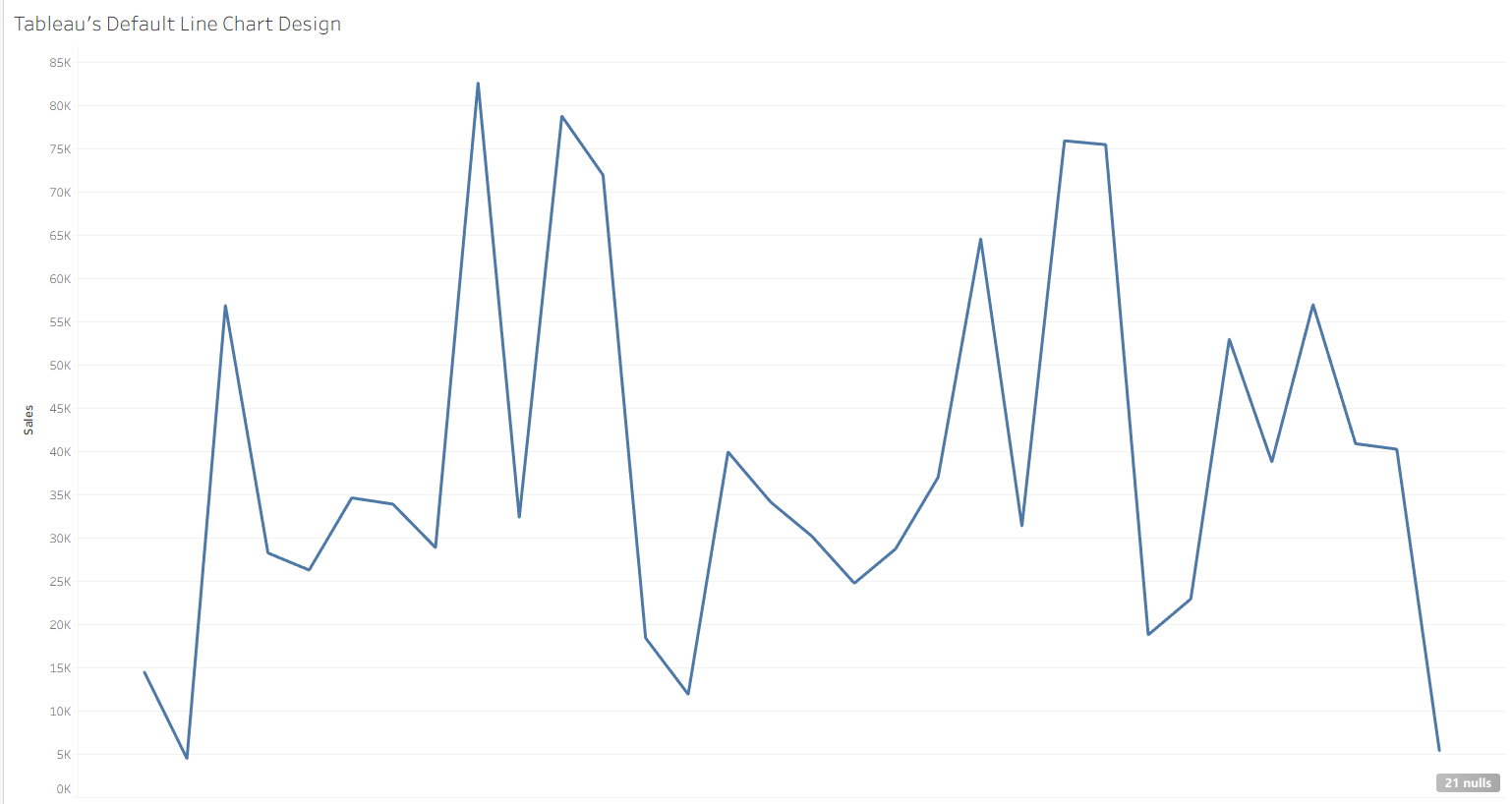
Sometimes, smoothing in Tableau is done using moving averages, which smooths out the line but also loses the information about where the line actually was at any given point in time. To have a smoothed curve while still preserving the exact values, we have to use interpolation, which takes estimates of where the line could be in between known values. In fact, Tableau's native line chart uses its own interpolation – linear interpolation – which I will compare to my method later in this blog.
Filling in Missing Values
The first hurdle of this project is adding new rows in between the already existing ones, which is a feature that is not built into Tableau Desktop. This processing and/or preaggregation is often done outside of Tableau Desktop itself, such as the method outlined in this tutorial by Neil Li. My goal is to make this as accessible and dynamic as possible, so I have constrained myself to doing data processing within Tableau Desktop.
My solution for this hurdle was to take advantage of an already built in "new rows" hierarchy: dates! Tableau Desktop is natively really good at breaking down years into months into weeks into days, and so on. We can simulate the generation of points between monthby using the already existing sub-periods (days) that lie between the different months.
For this example, I chose to use the Sample - Superstore dataset, which was relatively dense but missing some individual days. To fully scaffold, I mocked up a single column dataset with a whole bunch of days (every day from 2015 to 2035, but still only 90 kb!) and right joined it to the orders table such that every day would be included, regardless of if there was an order that day, which can be done using Excel/Google Sheets or an LLM (how I did it). I also had to replace my Sales field with ZN(Sales) so that days without orders would register 0 sales rather than NULL.
First Calculations
The main idea behind any interpolation, even linear, is that you begin at a starting value A, and travel to an ending value B. To know what the interpolated y-value is, we will need to know:
- The y-value we are coming from
- The y-value we are going to
- How close we are to the endpoints
To translate those into the language of this use case, we need to know
- The total sales from the last complete month
- The total sales from the next complete month
- Where a given day falls within its month
First, to get This Month's Sales, I used the calculation
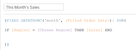
which takes the total sales for a given month with an extra check to see if the region is a chosen parameter value to allow for the chart to be dynamic. If this is not a desired functionality, that middle line can be as simple as [Sales].
Next, to get Next Month's Sales, I used a lookup table calculation.
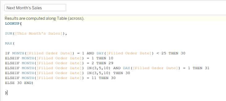
The idea behind this calculation is to ensure that the look ahead ends up in the next month after the original date. This can be tricky in a month like January, where 31 days after January 1st is in February, but 31 days after January 30th is March. The above is a brute force method I used to solve this problem, but I am sure there is a better way.
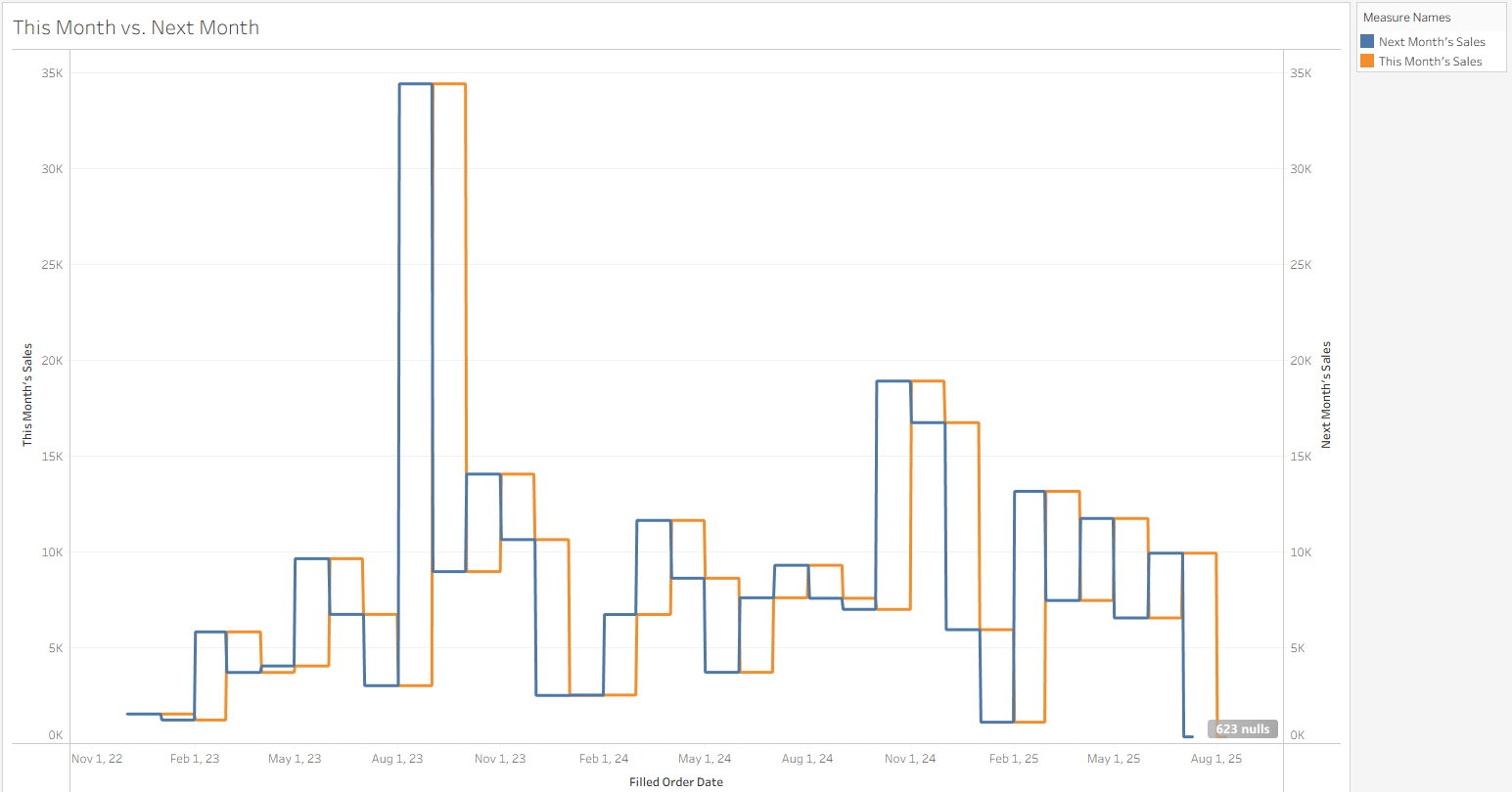
To check my work I plotted both calculations on the same date axis and confirmed that I have successfully shifted the sales by one month!
Interpolation Math
I could have chosen among a number of different functions to smooth out the gaps between the months. The typical choice I have seen is the Sigmoid Function, which creates an "S" shaped curve from the beginning to the end. The trouble with this function is that the steepness of the "S" varies a lot from segment to segment, so I ended up with some curved connections, and others that looked like a linear drop-off. To make things connect smoother, I looked for a smoothing function that has a slope of 0 at every transition point, which guarantees smoothness and also alerts the viewer to changing values (when they might be less apparent).
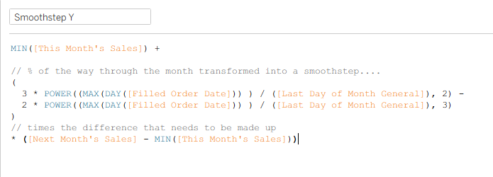
In the end, I went with Smoothstep, a smoothing function often used in graphics, with a pretty simple form (3x2 - 2x3) that ensures a slope of zero at its start and endpoints to ensure seamless connections between segments.
Here is my final smoothing calculation, where the middle section contains the Smoothstep algorithm with x being the proportion of the month represented by that day, using a nested calculation considering the number of days in that specific month. Once that proportion is calculated, it is converted to a smoothed value between 0 and 1 using smoothstep, then that proportion of the difference from the previous step to the next step is added to the previous step.
In the case of linear interpretation, the middle part of this function is just x, or the proportion of a month that is done at that given day, which I confirmed by building out as well!
Final Product
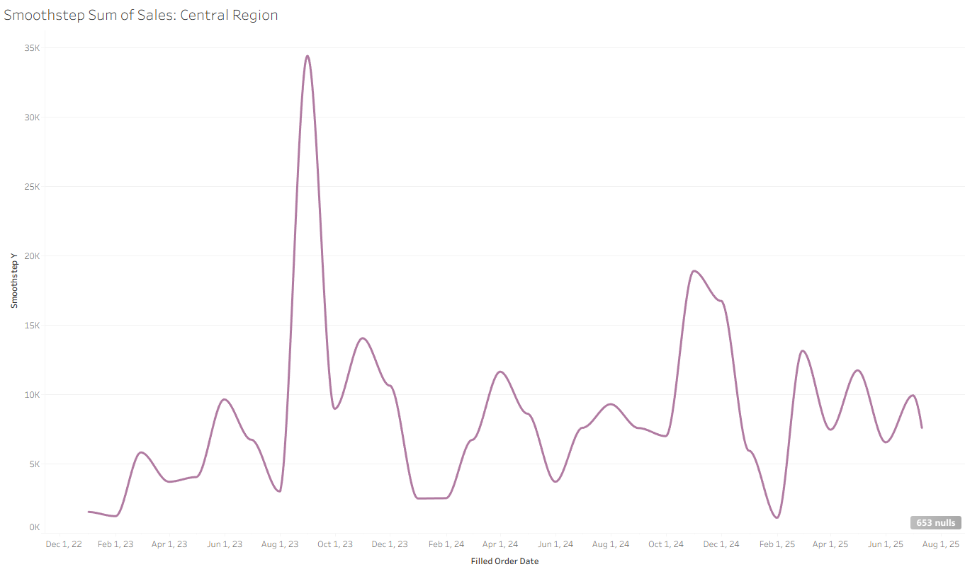
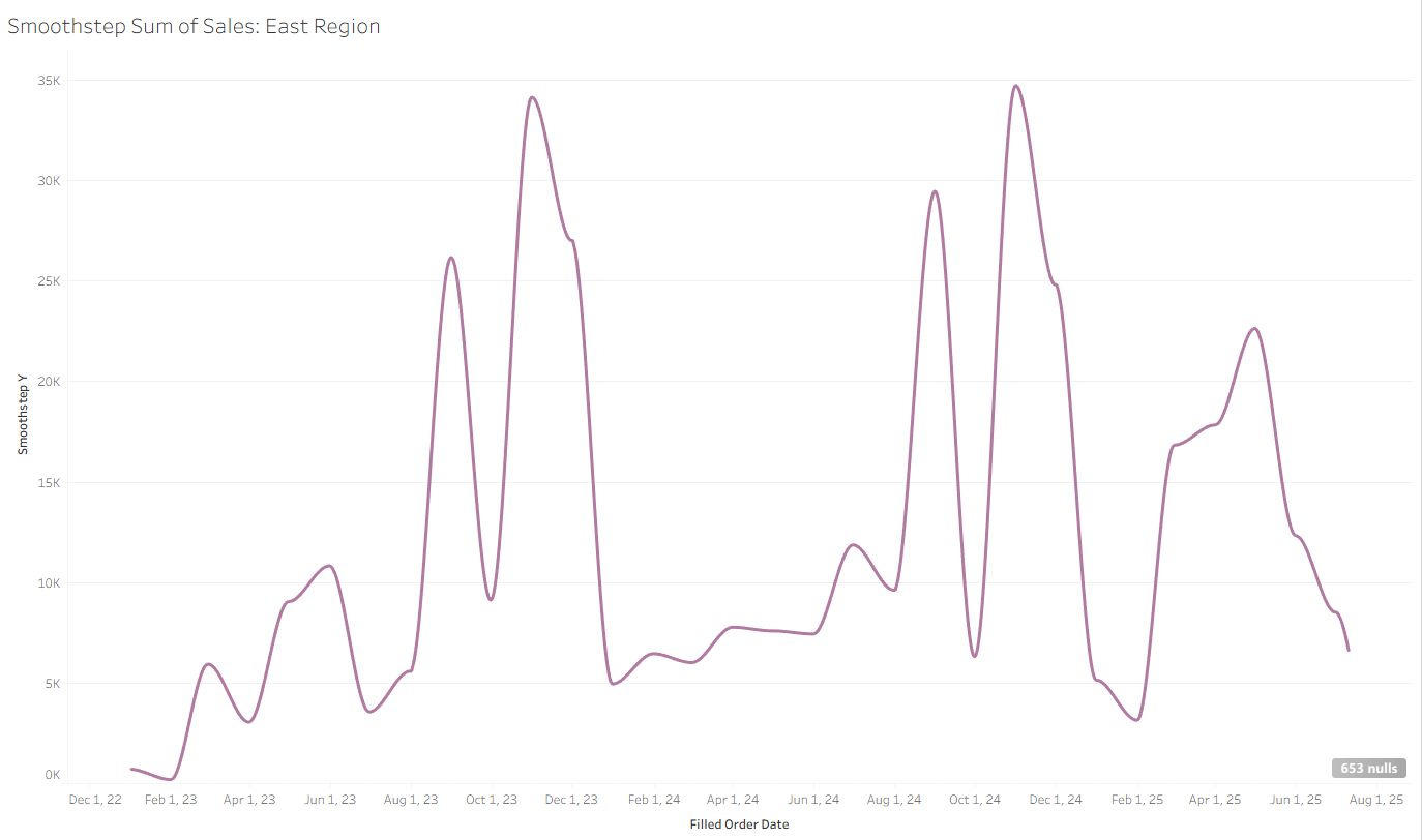
In the end we have this nice rounded graph of sales by month in the Central region, which can be dynamically switched to a different region!
In the past, the interpolation math has been done before Tableau Desktop, so this interactivity could not be taken advantage of. Now, you can have curved line charts that dynamically update based on user parameter selection!