


It begins! Dashboard week is something I have been hearing about since the early days of applying to the Data School, so it is exciting to be officially living it. The basic format is that we are given a dataset at the start of the day, and are responsible for cleaning it, prepping it for visualization, and building a dashboard to present at the end of the day!
Today's task involved some COVID19 data, a topic that has been the focus of many data visualizations in recent years. The most challenging part of today was the data format. Instead of a tidy format with each row representing a single record with additional information about that it in other columns, the data arrived in an unwieldly, nested structure of tables and formatting in excel. The data is easy to parse as a human – when I referred back to it myself I could navigate pretty quickly – but the aforementioned shape is required for visualization software like Tableau to parse the data. Here is a quick picture of the data, which can also be accessed through the Information is Beautiful Data Repository:
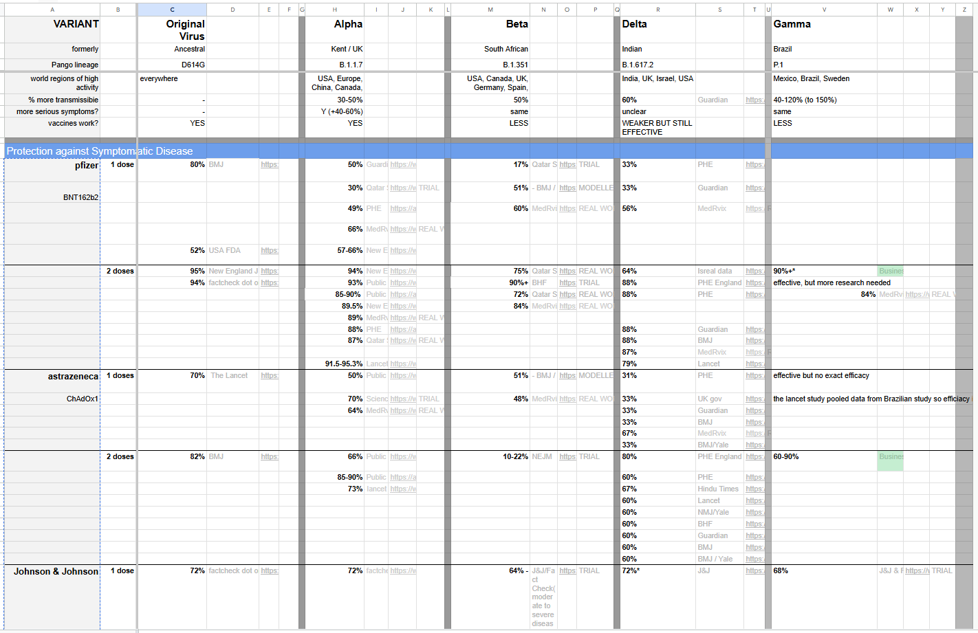
For the task of data processing, I chose to work in Alteryx since I feel comfortable doing things like pivoting and unioning in that software! The main concept behind my data preparation was splitting the tables into the way that they would be semantically understood by a reader. This meant separating out the variant information on top, the "Protection Against Symptomatic Disease" information in the middle, and "Protection Against Severe Symptoms" information (not pictured above) on the bottom.
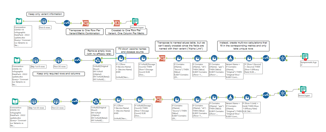
I used 3 identical input data tools in Alteryx, then used sample tools to only access the rows that I was interested in. Without going too far into the gory details of my flow, I will give a bit of insight about how I solved some of the visible problems with this data structure.
For the variants data, I first transposed (pivoted from wide to long) to get one row for each variant/metric combination, then cross-tabbed (pivoted from long to wide) to get one row for each variant, with metrics as the column headers.
To fill in the names of the vaccine manufacturers that are listed for the first row of each section, but not below that, I filled the data down using a Multi-Row Formula Tool that referenced the previous row to check if it should fill down or start anew.
My complete, annotated Alteryx flow is included below, ending with 3 output steps producing .hyper files that I later input into Tableau and related together in order to build a data model.
Building this data into a dashboard was another unique challenge! Since there is so much discontinuity and missingness throughout the data, my natural instinct to go for line charts over "time" (from variant to variant) proved uninsightful. Instead, I decided to build a dashboard with different panels going from left to right to represent the passage of time. My original sketch is included below, but if you are interested in seeing the final product it will be up on my Tableau Public by the time you are reading this blog!

I had a lot of fun with this challenge and I am looking forward to some more dashboarding throughout the rest of this week!