Bar charts offer quick and easy comparisons, but you can enhance them to let users decide what selected value is the focus of your bar chart, and shape bar charts around how other values relate to the selected value.
In this case, we'll use parameters in Tableau to shape a bar chart around one item in a field, in this case using the superstore dataset. There are a lot of topics in here which deserve more time (date formats, parameters/parameter actions, LODs), so feel free to read around for more information!
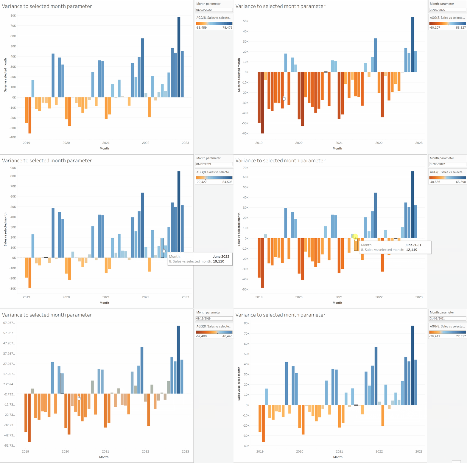
We're going to look at sales in each month of the dataset, based on the month a product is ordered. The first step is to create a custom date field, in order to create the right date partitions for our bar chart. Select the months field in detail and give it an appropriate name. Select date value, which gives us the months for each year (i.e. February 2019), rather than date part which gives us months as an aggregate (i.e. all Februarys in the dataset).
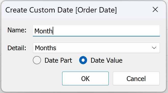
Next we need a month parameter. This should be a date type, with the other fields auto-filled. All values should be allowed.
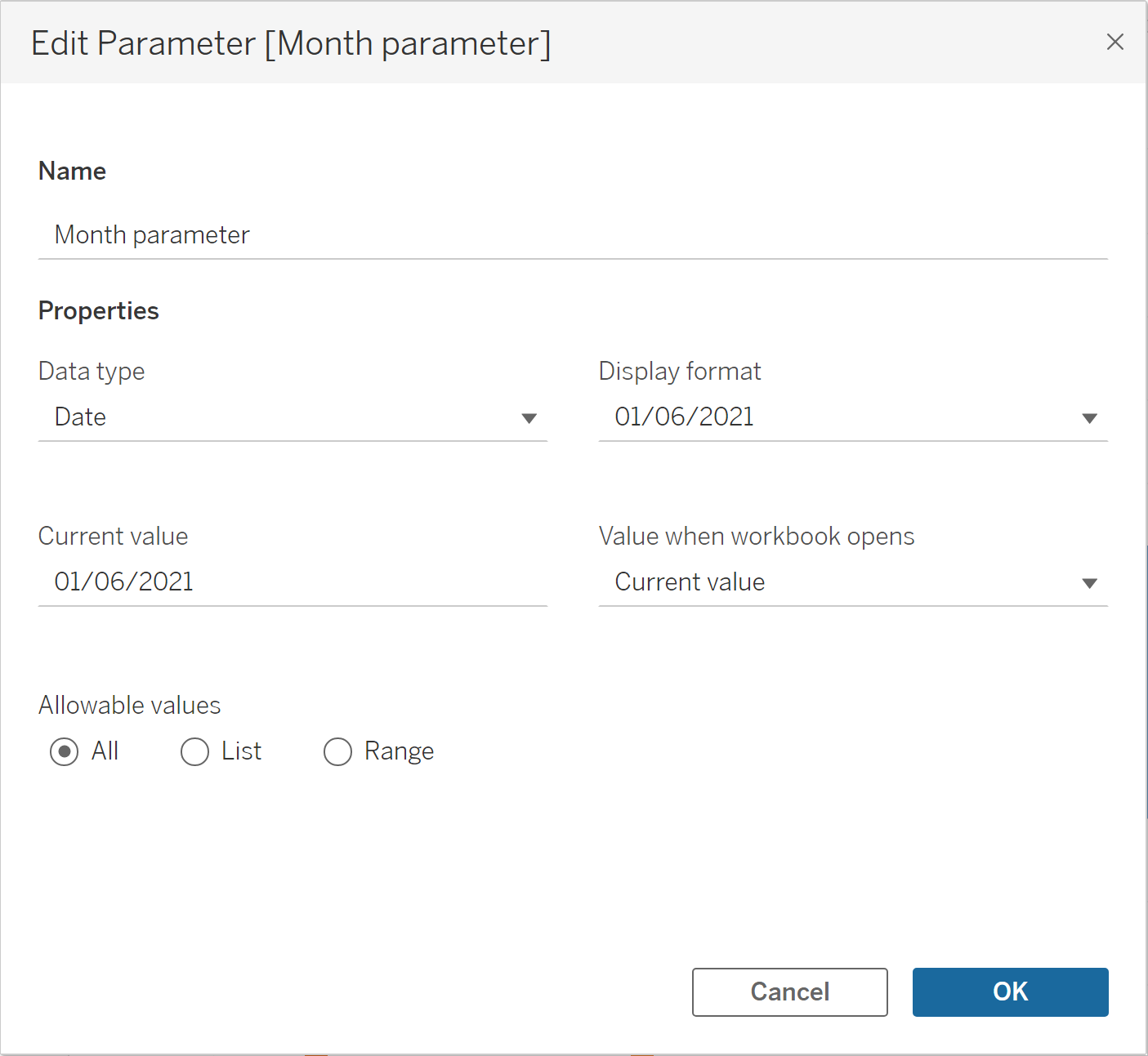
Next we need two calculated fields. The first is an 'if' statement inside a LOD (If you'd like to know more about LODs, try reading here). The 'if' statement is fairly simple, providing a sales value for the month which matches our parameter. However, in order to calculate difference we need the selected month's sales value available for every row.
This requires the use of a LOD. The 'if' statement is wrapping in a LOD, summed to meet the LOD's requirement for an aggregate value. It is a fixed LOD, to prevent changes in granularity based on our view, with no given category to ensure that every row is filled.
Using the "translation" of our LOD outlined in the blog linked above, our LOD is simply saying:
"For all rows, calculate the sales of the selected month"
The second calculated field simply takes any month's sales and subtracts the selected month's sales values. This is the difference between our selected value and each other values.
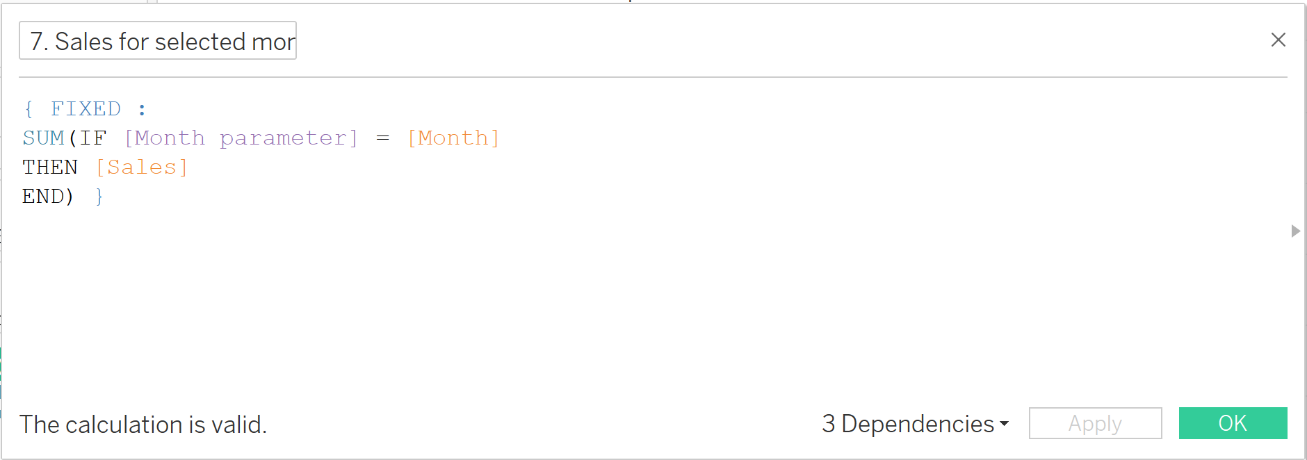
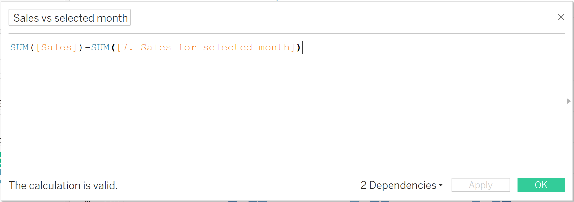
Let's bring it all together! Month is placed in the column bar, and our difference calculation in the rows. We'll also use our difference calculation to colour our chart, emphasising larger differences.
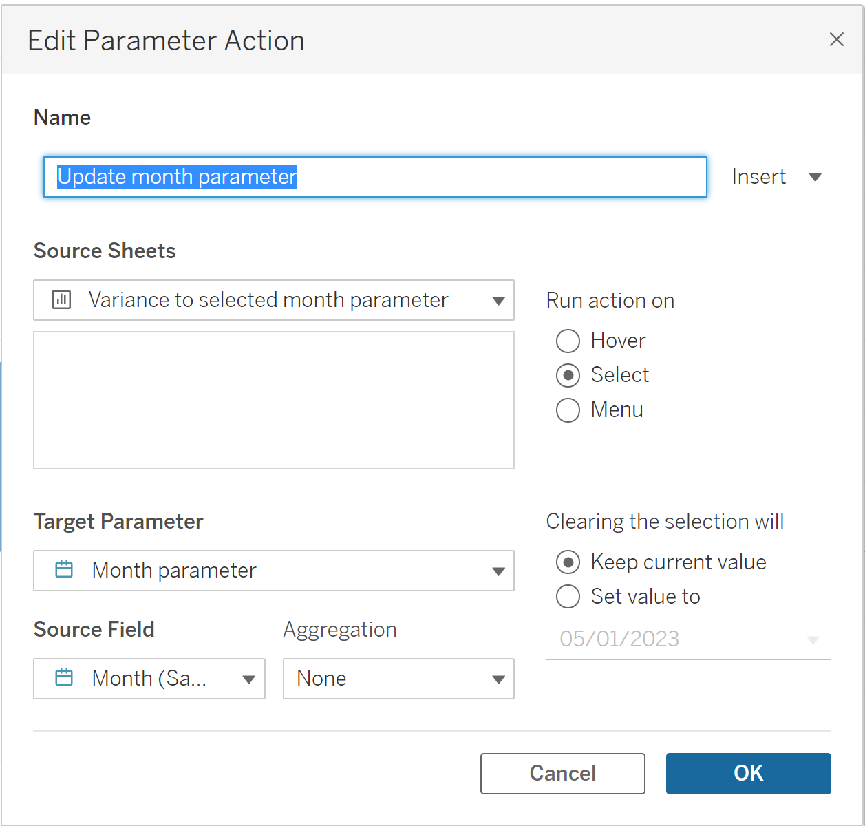
We now need a parameter action. Navigate to worksheets actions, add an action and give it an appropriate name. Make sure it refers to the current sheet, confirm that the "run action on" setting is select, and the "clearing the selection" setting is keep current value. The target parameter is our month parameter, and the source field is our custom month field. You should now be able to select any bar, and see the chart refocus to that particular month.
Finally, there's the slightly annoying highlighting that affects any bar you click. There's a solution for this! Create a new calculated field called dummy, and put any string in there. Move it to the detail section of the marks card, and use the highlight option in the toolbar to select dummy. This will remove the highlighting issue.
Not a simple task, but a chart that is well worth it!
