


Today I had an exceptionally humbling day. We were presented with the conspicuously simple challenge of visualizing data from an international study of cats (https://cattracker.org/).
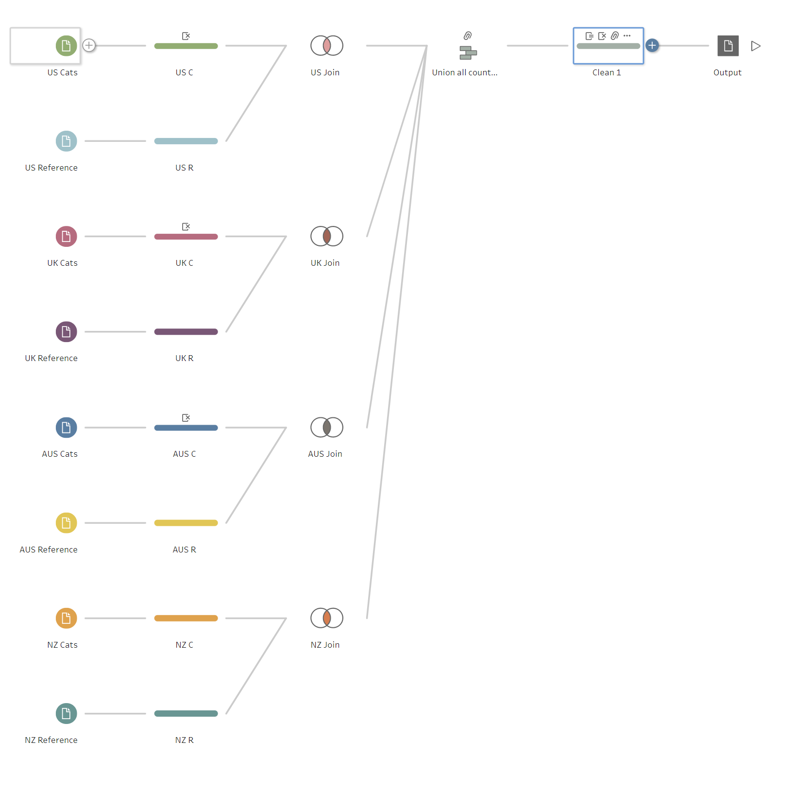
At first, the challenge seems simple. I quickly brought together data from all 4 countries, including both event data and specific cat information, before preparing the fields for analysis. This took approximately an hour, but I had assumed that by doing this, I would be able to answer questions across countries.
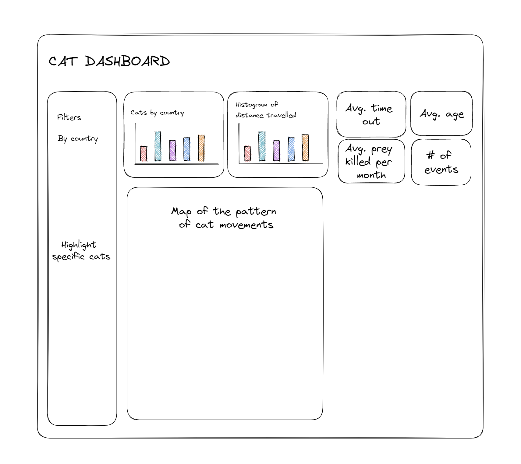
This also gave me a rough idea of the data's structure, which allowed me to plan my dashboard accordingly. I aimed to specifically focus on the distance between two points, which could be expanded to an analysis of cat's territories and relative speeds. This could be expanded to include age and gender breakdowns, which would answer questions about what determined the activity levels of a cat.
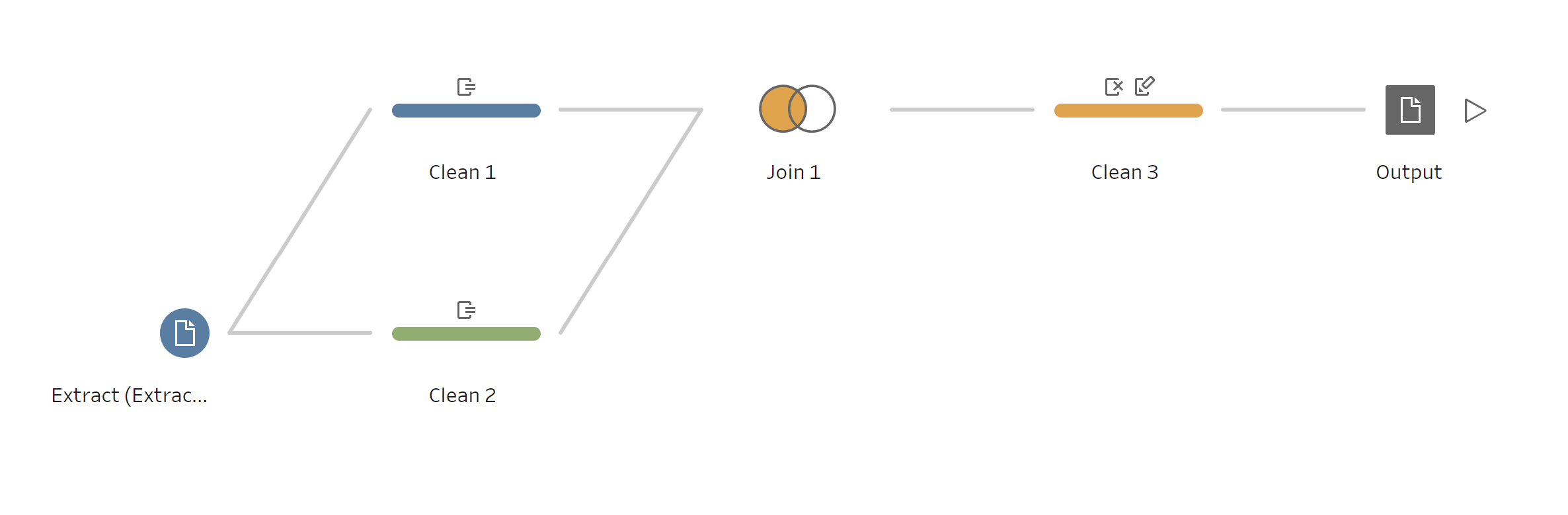
Having planned out my dashboard, I moved onto building a dashboard. However, I quickly realised that I needed to restructure my data to calculate distance and time. This would require joining the data onto itself, with a row being joined to the following row in the order of the original data set.
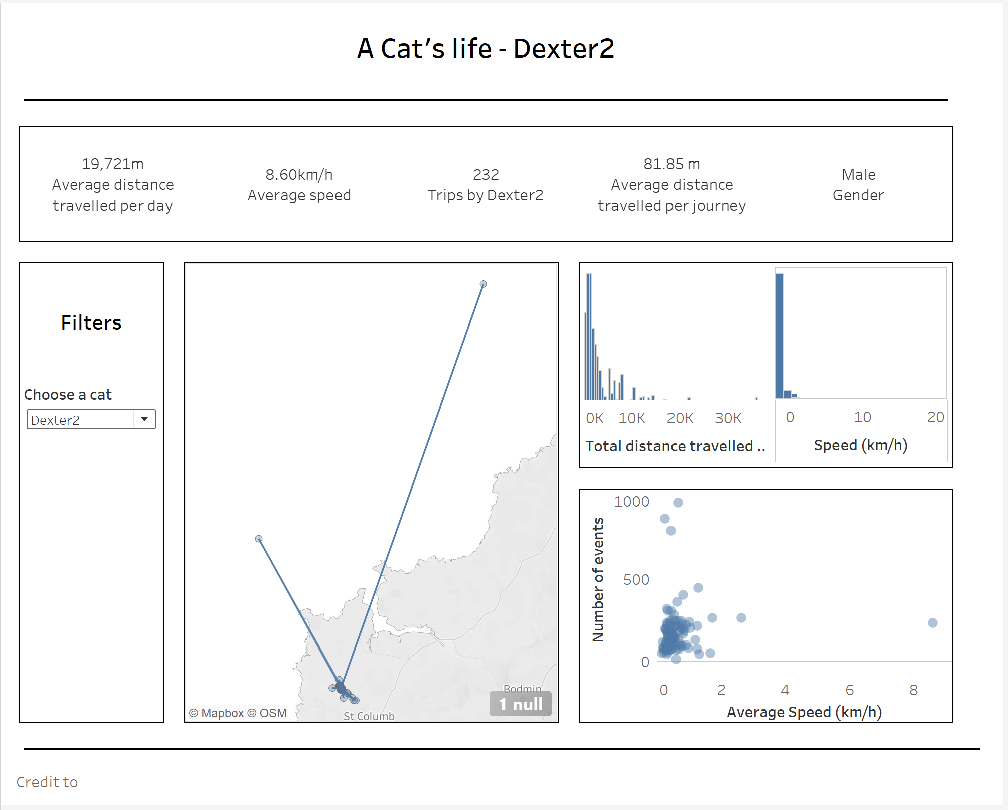
This further delayed the building of my dashboard, and led to complications. While my final dashboard featured many of the details I included in my sketch, I rushed the final implementation due to the compressed timespan, and several issues with buffering as the combined dataset was unwieldy.
The overwhelming lesson of the day is that good things take time. I would have loved to focus more on my dashboard design, but overall it was a good lesson for future reference.