Today DS32 spent the morning learning Power BI - one of Tableau's main competitors.
What is Power BI?
Power BI is a data visualisation tool provided by Microsoft that allows you to:
- Connect to data
- Model data
- Visualise data and create insights
The main difference between Power BI and Tableau is that you create everything in one place rather than in separate worksheets. In Power BI worksheets are called 'Tiles' and they represent individual charts.
The Pros of Power BI:
- The visualisations tab - which allows you to change chart types - is better than Tableau's 'show me' feature. It allows users with little experience to experiment with different chart types.
- The interface is quite intuitive and easy to navigate - after an hour or so playing around on the interface you will be familiar with how to create charts and format certain things.
- The Canvas is easy to use and it is easy to layout your dashboard - unlike Tableau, you don't need to use containers to align items in the dashboard.
- Data preparation in Power BI is user friendly and easy to navigate.
The Cons of Power BI:
- Calculations are harder to perform - unlike Tableau, Power BI does not colour code formulas, fields etc.
- The formatting section is quite clustered and not easy to use as a lot of the formatting options are hidden behind a lot of drop down menus.
- Having to do everything in one window rather than using worksheets can get confusing with complex datasets and analysis.
- Unlike Tableau, Power BI does not have a 'Fit to x' window which makes it harder to effectively size tables and charts.
- There are a lack of axis and label controls on Power BI which makes it harder to format charts to exactly the way you want them to look.
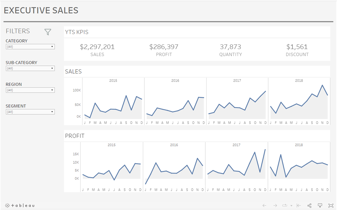
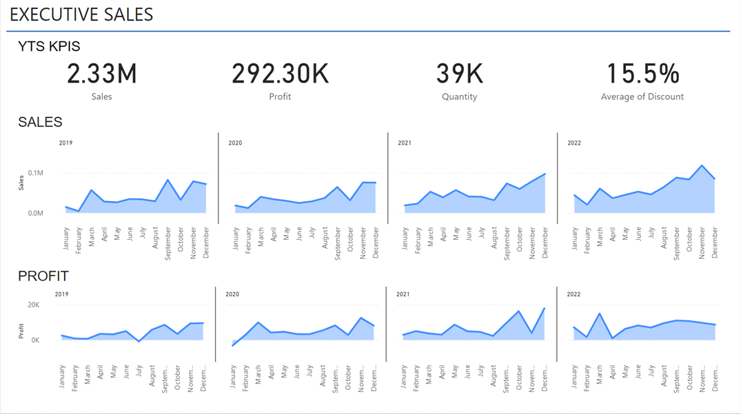
Overall, both Power BI and Tableau have their pros and cons, so it is worth trying out both to see which one you prefer. My final dashboards from this week's training on Power BI are below:
Tableau:

Power BI:

