


In the final week of Data School training we were asked to create an infographic. This gave me the idea to spend some time experimenting with Tableau techniques that might make a standard but useful chart more fun. The idea at the top of my list was to work out how to create bars that looked like objects, starting with pencils.
The pencil bars worked much more quickly than I expected. From there, one experiment became several: rulers, thermometers, lightsabers and ladders.
This post is not a full tutorial for every chart. I plan to write those separately. Instead, it covers the main principles I learned and the small collection of Tableau techniques that made all of these designs possible.
Custom bars are really layered marks
The biggest lesson was that these charts are not primarily about finding the perfect custom image. Most of the work happens inside Tableau by creating several marks, positioning them on the same scale and controlling how they overlap.
The same few building blocks appeared repeatedly:
- Multiple copies of the same measure
Measure ValuesandMeasure Names- Synchronized dual axes
- Custom shapes with carefully designed transparent canvases
- A small scaffold table for generating repeated marks
- Calculations that return a value, zero or null depending on which layer should appear
Once I understood those pieces, each new design became less about inventing a completely different technique and more about recombining the same tools.
1. Duplicate a measure to create visual layers
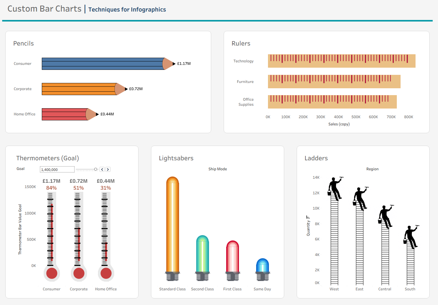
The pencil bars use Sales more than once. Two copies sit inside Measure Values as overlapping bars, with Measure Names controlling their size. The larger bar creates the coloured pencil body and the smaller bar creates its central detail. Black borders provide the outline.
The lightsabers extend the same principle further. Several copies of Profit sit directly on top of one another, moving from a wide coloured outer glow to a narrow, pale central core. Because every layer is driven by the same measure, they always reach exactly the same value.
The manual order of the measures also matters as it controls both the size assignment and which layers are drawn over others.
2. Use a dual axis to combine bars and shapes
A single Tableau Marks card can only use one mark type. A dual axis makes it possible to draw the main value as a bar while using a shape at a meaningful position on the same scale.
This is how I added:
- Pencil ends to the pencil bars
- Bulbs to the thermometers
- Hilts and rounded caps to the lightsabers
- People standing at the top of the ladders
The two axes need to be synchronized so the shape remains tied to the correct data position. Once synchronized, the extra headers can be hidden.
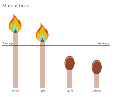
In an additional experiment, shown below, the matchstick bars demonstrate that the shape can encode information as well as complete the illustration. A calculation compares each region's Profit with the average in the view. Values above average receive a flame, while values below average receive an unlit match head.
3. Design shapes around Tableau's centre point
Tableau centres a custom shape on its data coordinate. That sounds simple, but it affects how every endpoint image needs to be designed.
For the pencil, the back edge of the wooden tip needed to sit halfway across the image canvas. Tableau then placed that midpoint at the end of the bar, allowing one half of the image to overlap the pencil body and the other half to extend beyond it.
The same principle applied vertically. The top of the lightsaber hilt needed to meet the blade at zero, so the connection point had to be aligned with the centre of the image while the visible hilt extended below it.
Transparent space is therefore useful, but only when it is intentional. Tableau sizes the entire image canvas, including transparent pixels. One of my early hilt images was 500 pixels wide but 5,686 pixels tall. Tableau faithfully fitted that enormous canvas inside the mark-size box, turning the visible hilt into a tiny grey line. It is best to keep your custom images square to have the best guess at how they will render in Tableau.
4. Use a scaffold when one value needs many marks
Pencils and lightsabers only need a few layers. Rulers, thermometers and ladders need many regularly spaced marks.
For these charts, I created a tiny scaffold table containing values from 0 to 100 in steps of 2. I related it to the main data using a constant 1 = 1 relationship. This gives every category access to the complete sequence of scaffold values.
Putting the scaffold field on Detail generates a separate mark at every interval. A calculation then translates each percentage into a position on the chart. For the rulers, those positions become major and minor tick shapes. A filter removes any ticks that would extend beyond an individual bar. For the thermometers, the ticks are positioned relative to a Goal parameter. The grey tube reaches 100% of the goal while the narrower red liquid stops at the current Sales value.
The ladder uses the scaffold in a different way. Every interval creates a transparent bar with a black border, extending from zero to its rung position. When all those outlined bars overlap, with stack marks turned off in the Analysis pane, their shared sides form the ladder rails and each new top border forms another rung.
5. Zero and null are useful positioning tools
Not every measure in Measure Values needs to produce a visible bar.
The lightsaber hilt uses a measure whose value is simply zero. On the Bar Marks card, it creates a zero-length bar and is effectively invisible. On the Shape Marks card, the same measure gives Tableau the exact coordinate required to place the hilt.
Returning null is equally useful. The ruler and ladder calculations return a position only when that mark belongs within the length of the current value. Any unwanted marks return null and are not drawn.
This makes zero and null useful design instructions:
- Return zero when a shape needs to sit at the origin.
- Return the measure when a shape needs to sit at the endpoint.
- Return a calculated position for intervals or targets.
- Return null when a particular layer should not exist.
Keeping custom charts honest
These experiments are intentionally decorative, but the decoration should not make the values harder to understand.
The pencil tip, for example, extends beyond the true scaled endpoint. A viewer naturally reads the graphite point as the end of the bar, even though the quantitative position is actually where the pencil body meets the custom shape. Direct labels at the end of the pencils communicate the exact values more clearly than relying on an axis alone.
The thermometer is more successful analytically because the metaphor matches the measure: the outer tube represents the goal and the liquid represents progress. The matchsticks also use their decorative shapes to explain a threshold condition.
Always keep in mind if the decoration added is distorting the meaning behind the chart and adjust the design accordingly.
What I Learned
The central lesson was that custom bars in Tableau are about controlling four things: how many marks exist, where they are positioned, which mark type draws them and how the layers overlap.
Once those decisions are separated, a small toolkit can turn an ordinary bar into almost anything.