


This tutorial is based on Kasia Gąsiewska-Holc’s Custom Bar Chart. I loved the clean coloured endpoints and labels sitting on top of the bars, so I downloaded the workbook to explore how it worked. This tutorial documents my recreation and what I learned from taking it apart.
Step 1: Create the starting table
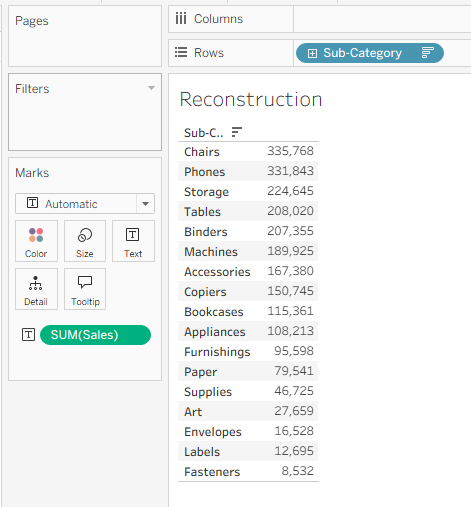
Drag Sub-Category to Rows and SUM(Sales) to Text.
This creates a simple text table that we can use to check the Sales values as the chart develops.
Step 2: Calculate a shared position for the value labels
Create the following calculated field:
WINDOW_MAX(SUM([Sales])) * 1.3I named this field Window Max Sum Sales.
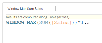
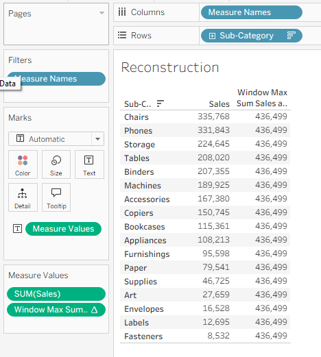
WINDOW_MAX() finds the largest Sales value in the view. Multiplying it by 1.3 adds some space beyond the longest bar. Because the calculation returns the same value for every row, it gives us a consistent position for all the value labels.
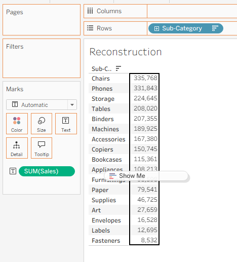
Drag the new calculation to Text beside SUM(Sales). Tableau will generate Measure Names and Measure Values, allowing us to see both the real Sales value and the shared label position.
Step 3: Move Measure Values to Columns
Drag Measure Values to Columns.
At this stage, Tableau creates horizontal bars for both measures. The bars are initially stacked, which is not what we need.
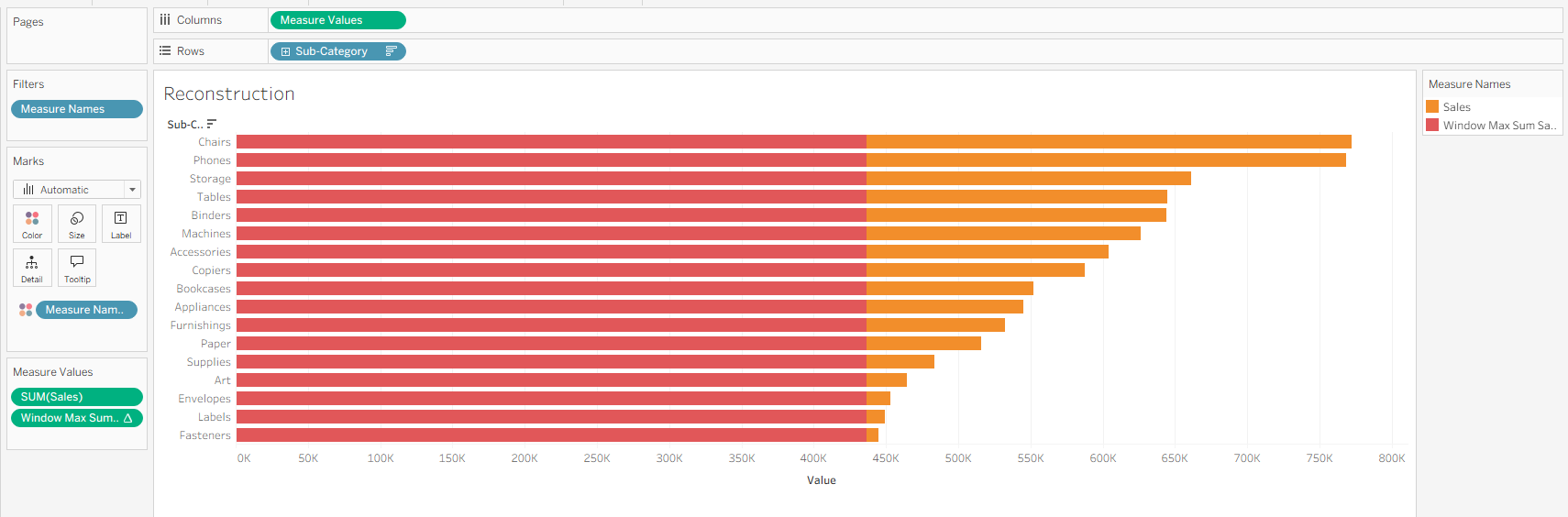
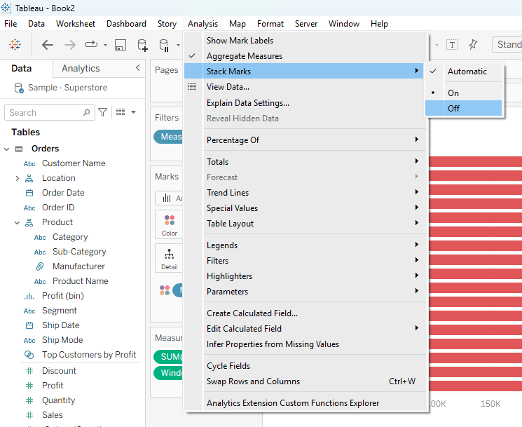
Go to:
Analysis → Stack Marks → Off
The marks will now occupy their actual positions on the axis instead of being added together.
Step 4: Create a vertical bar-height axis
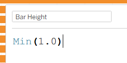
Create another calculated field:
MIN(1.0)I called this Bar Height.
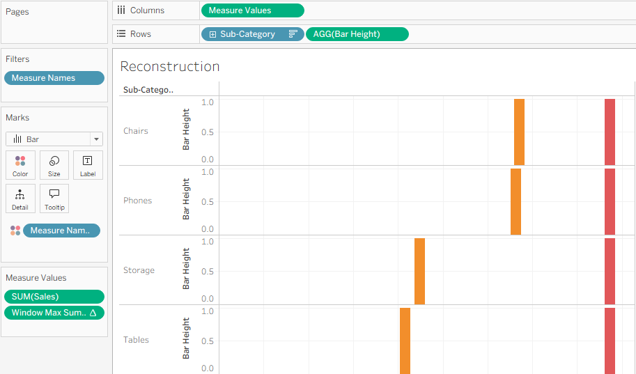
Drag Bar Height to Rows beside Sub-Category. Make sure it is continuous, then change the Measure Values mark type back to Bar if Tableau has changed it automatically.
This gives every sub-category its own small continuous vertical axis. The Sales marks now appear as vertical bars at their respective positions.
Step 5: Create a position for the sub-category labels
Create one more calculated field:
MIN(0.0)I called this SubCat Label Position.
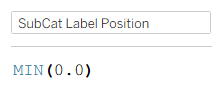
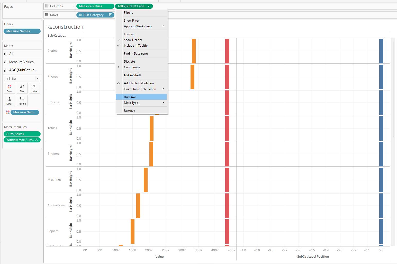
Drag SubCat Label Position to Columns beside Measure Values. Right-click the new axis, select Dual Axis, and synchronise the axes.
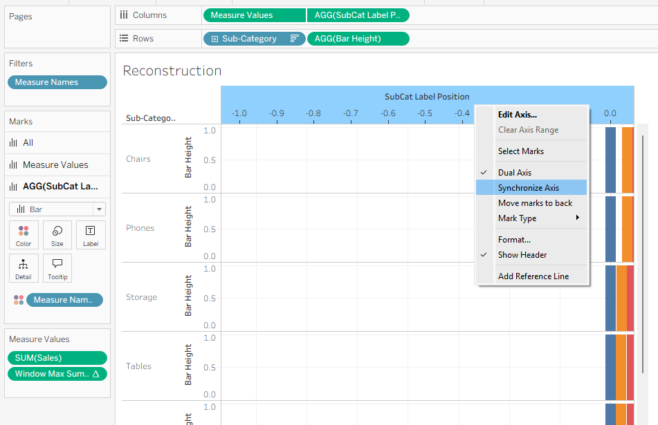
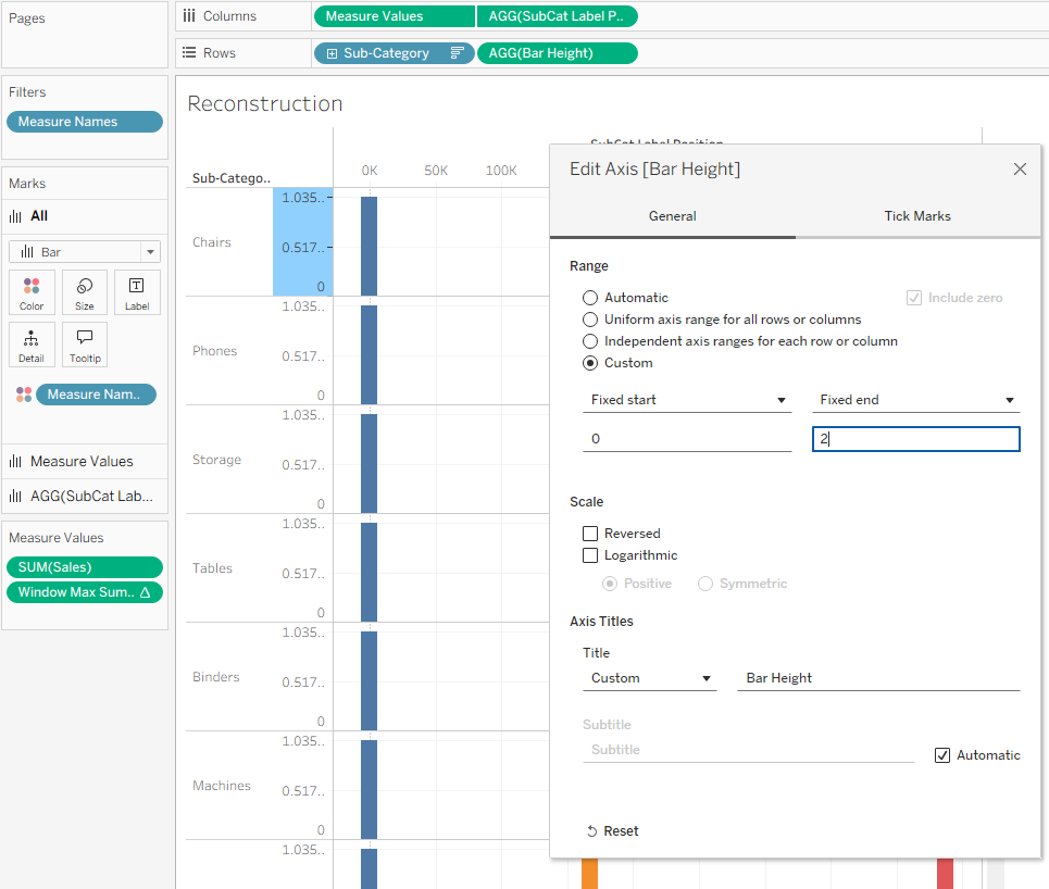
Next, edit the Bar Height axis and fix its range from 0 to 2.
The Sales bars now extend from zero to one, occupying the lower half of each row. The upper half will provide room for the sub-category label.
Step 6: Colour the Sales endpoints
On the Measure Values Marks card, drag Category to Detail. Click the icon beside the pill and change it from Detail to Colour.
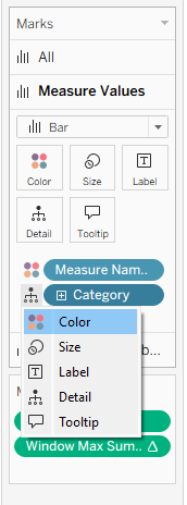
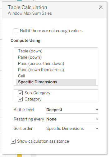
Adding Category changes the level of detail in the view, so we also need to check the Window Max table calculation.
Edit the table calculation, choose Specific Dimensions, and tick both Category and Sub-Category.
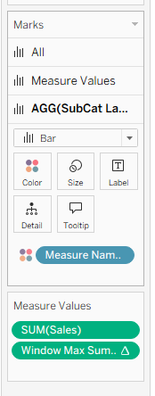
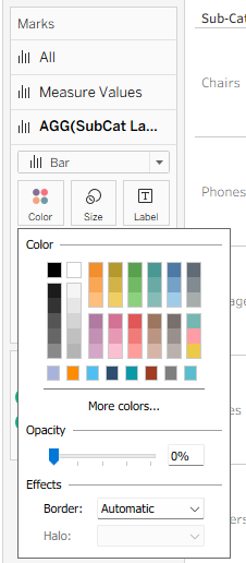
Open the SubCat Label Position Marks card and remove Measure Names from Colour. We only want the category colours to affect the marks on the Measure Values axis.
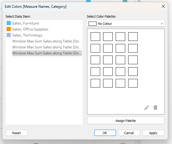
Edit the remaining combined colour legend:
- Give each
Sales, Categorycombination its chosen category colour. - Give every
Window Max Sum Salescombination a transparent colour.
On the SubCat Label Position Marks card, set the mark opacity to 0% and turn off the border.
Step 7: Create the grey bar bodies
The grey horizontal bars are not bar marks. They are created with reference bands.
Open the Analytics pane and drag a Reference Band onto the Measure Values axis at the Cell level.
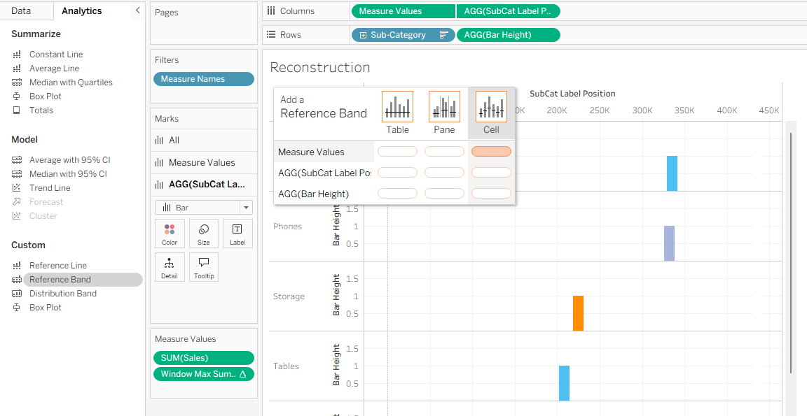
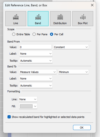
Configure the band as follows:
- Band From: constant value
0 - Band To: minimum of
Measure Values - Line: None
- Fill: light grey
- Scope: Per Cell
This fills the space between zero and each Sales value.
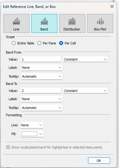
Next, add another cell-level reference band to the Bar Height axis:
- Band From: constant value
1 - Band To: constant value
2 - Line: None
- Fill: white, or the same colour as your worksheet background
This second band covers the upper half of the grey fill, leaving a horizontal bar between zero and one and clear space for the label above it.
Step 8: Add the sub-category labels
On the SubCat Label Position Marks card, drag Sub-Category to Label.
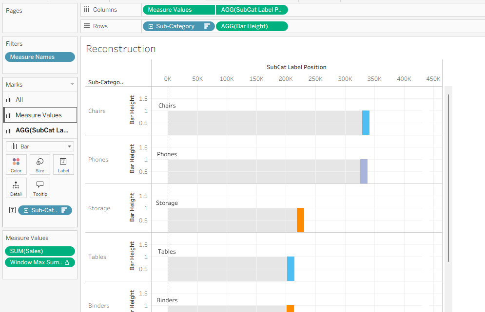
Edit the SubCat Label Position axis so that it begins at zero. Then set the label alignment to top-left.
You may also need to increase the mark size slightly. If the mark is too small, Tableau may not display its label.
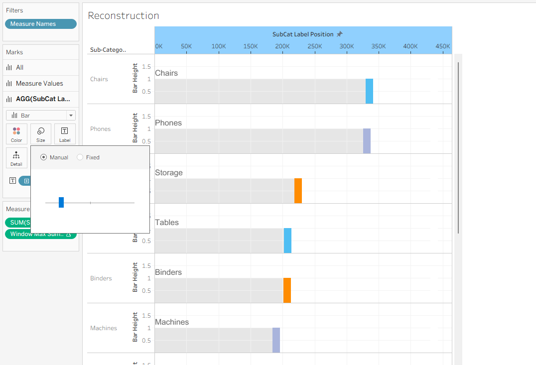
Step 9: Add the aligned Sales labels
Drag SUM(Sales) to Label on the Measure Values Marks card.
Initially, the value may appear both at the end of the Sales bar and at the shared Window Max position.
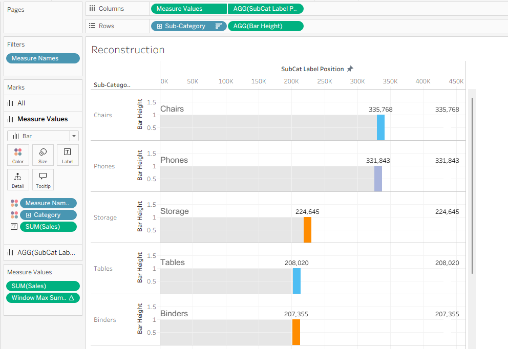
Open the Label settings and select Min/Max under Marks to Label. Then use:
- Scope: Table
- Field: Measure Values
- Label minimum value: Off
- Label maximum value: On
- Alignment: Bottom-right
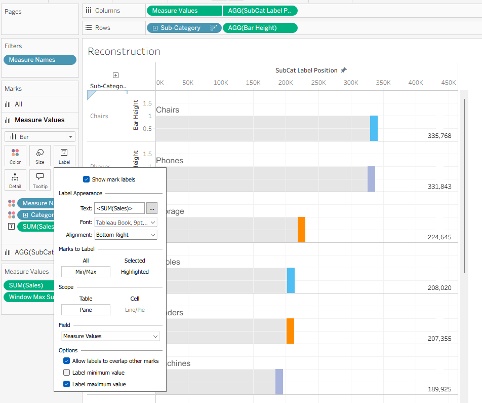
The Window Max mark has the larger Measure Value, so it receives the label. Because that mark is transparent and occupies the same position in every row, the Sales values appear in one neatly aligned column.
Step 10: Adjust the endpoint widths
Drag Measure Names to Size on the Measure Values Marks card.
Make the invisible window max marks small so they don't show up large when hovered over.
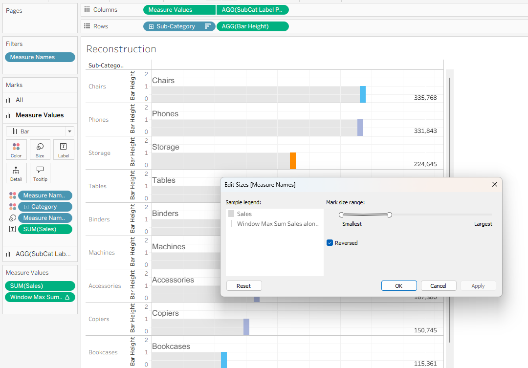
Finally:
- Hide the remaining axes and headers.
- Remove grid lines and zero lines.
- Retain subtle row dividers if desired.
- Format the Sales labels.
- Adjust the row height.
- Sort the sub-categories by Sales.
- Add a title and colour key.
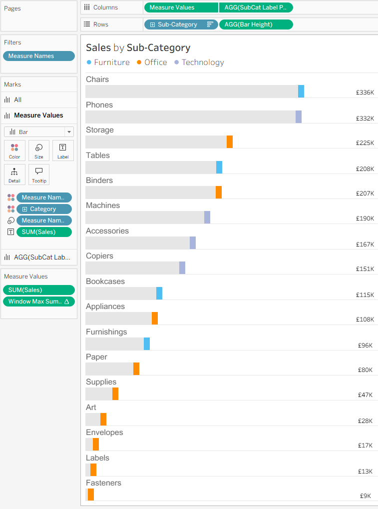
How the finished chart works
Although the result looks like a customised horizontal bar chart, each visible component is doing something different:
- The grey bar body is a reference band.
- The coloured endpoint is a narrow vertical Sales bar.
- The value is attached to a transparent Window Max mark.
- The sub-category name is attached to a separate invisible mark positioned at zero.
- A second reference band masks the upper part of each row.
- Measure Names controls which marks are visible, labelled and resized.
The biggest lesson for me was that a Tableau mark does not need to be visible to be useful. Transparent marks can act as anchors for labels and other elements, allowing their position to be controlled independently of the marks that display the data.