


Happy Dashboard Week Day 5!
For the final day of Dashboard Week, DSNY12 was given a set of World Cup data that DSNY14 used for their application dashboards as a way of comparing how far we’ve grown ourselves since first starting training.
My first instinct when taking a look at the dataset was to create a dashboard with interaction elements and actions.
I thought it could be interesting to have a dashboard that uses soccer player marks to move around a field in a scatter plot, and that I could create metrics and use some from the dataset to compare teams on and see who comes out “on top.”
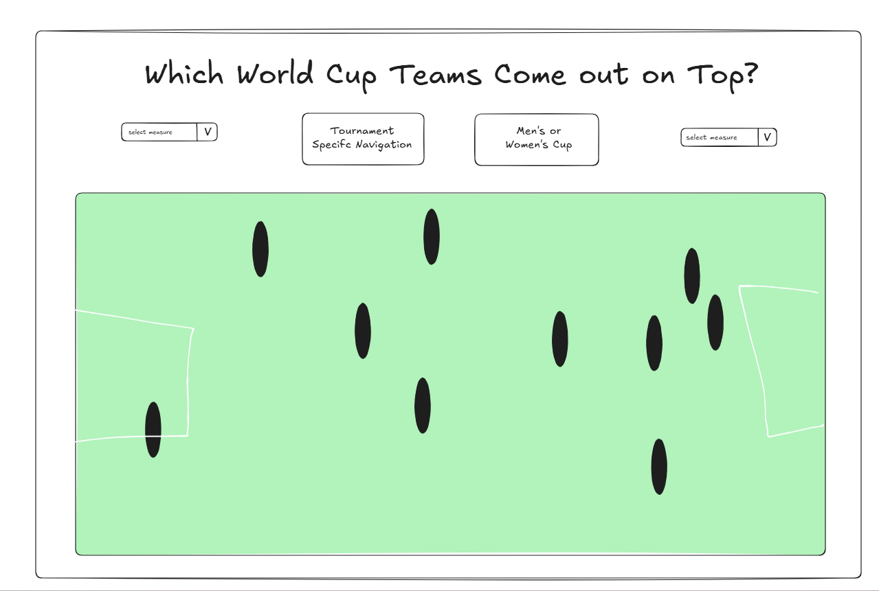
The sketch that you see pictured here is actually not my original one! I ended up accidentally closing my Excalidraw tab and it didn’t save, so I had to redo it. Thankfully, it was too complex of a sketch.
For my actual dashboard, I ended up adding an additional metric that calculates an overall winner based on the two metrics chosen. I also got rid of the navigation to dashboards that focused on splitting men's and women's cups and to specific tournaments because tournaments and the men's and women's cups are combined in one measure in the dataset, and I didn't have time to split them, as we had from 9 AM to 1:30 PM to complete these.
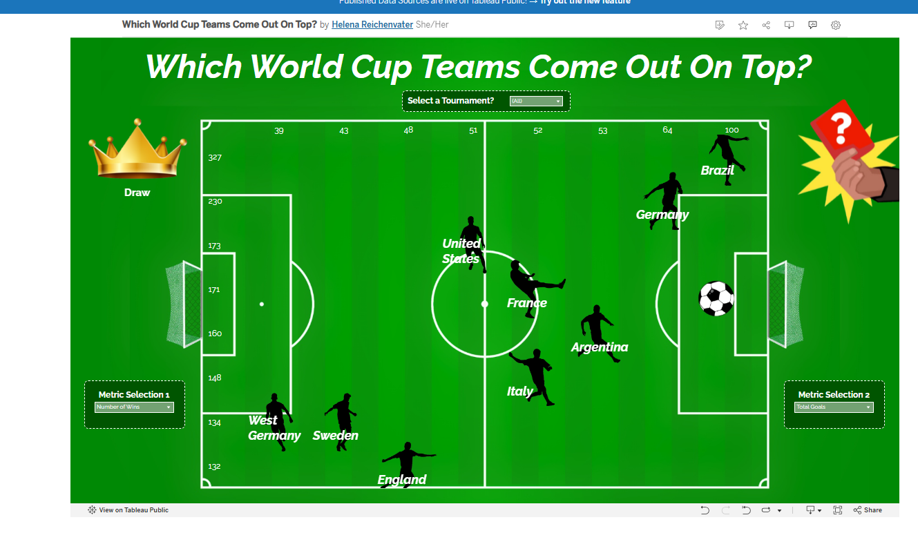
I also added a red card instruction button that fills you in a little on how the dashboard works, and added a tournament filter selection button.
You can play around with the dashboard yourself here at https://public.tableau.com/app/profile/helena.r/viz/WhichWorldCupTeamsComeOutOnTop/WorldCupDashboard !
I’m nervous but excited to wrap up training! Good luck to the incoming DSNY14!