


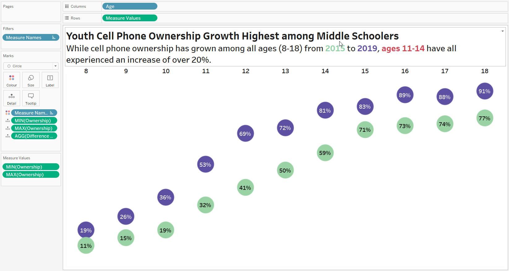
Scrolling through the latest Workout Wednesday Challenges, I found the dumbbell chart quite attractive at first glance, even though I was a bit confused by the strange name, which can definitely be used as an insult.
The data set was really small and the creation of the diagram according to the specifications on the WoW site turned out to be very fluid at the beginning and I was relatively fast at this result.
The only thing missing was the thick line connecting the two circles, and I just couldn't create that. In the end, I was so desperate that I downloaded the Tableau Public workbook to see how it was done.
I realized that I was setting things up in a very different way than the "solution" I had before. On one hand, that's pretty cool, because my own solution still felt kind of precious when I saw the WoW solution. For example, I brought the numbers on the x-axis up in a different way. Instead of using a double axis here, I followed Andy Kriebel's approach, which I found in a video. To do this, just open Analysis > Table Layout > Advanced and uncheck the 'Show innermost layer at bottom of view if there is a vertical axis' box here and you're good to go.
On the other hand, I was concerned that my approach might not be able to create the missing lines between the two circles. I even thought of creating a stacked bar chart with a white (and therefore invisible) bar extending from the zero line to the green circle. But apart from the fact that this solution looked very improvised, I also failed to create the stacked bars at the right height.
I finally found the missing step in the downloaded workbook. I just had to put the 'Year' field in a double axis (left red rectangle) on the path and all was well.
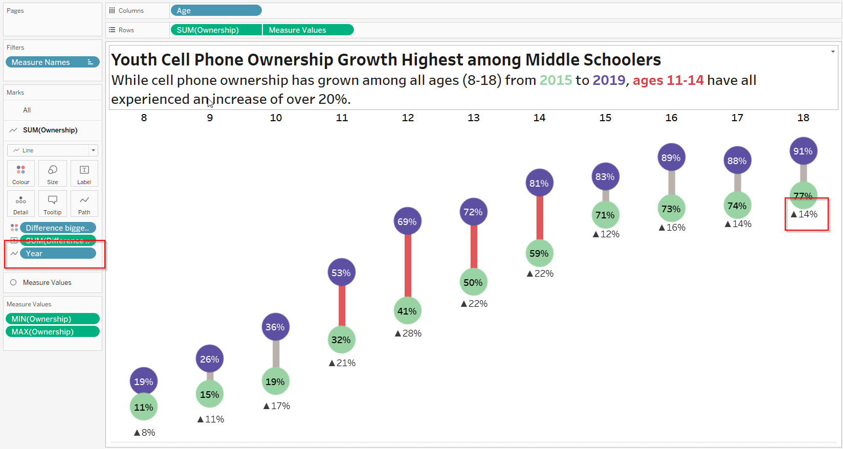
The only other thing I struggled with was the line chart label, which had a much smaller distance to the green circles on the right side of the chart than on the left side of the chart (right red rectangle), but I found no difference in the label of the downloaded workbook, so I decided to keep it that way and uploaded the dashboard to Tableau Public.