


Our fourth day of dashboard week was very different to the previous three days. The task was to create a CV profile in a different software to the previous days project - that meant building in Tableau.
The data had to be generated but accurate to myself. I opted to use a combination of Chat GPT and Gemini to create some headers and tables which could be used to build a dashboard. After some back and fourth I settled on having three tables each with a different level of granularity. The data model is shown in figure 1.
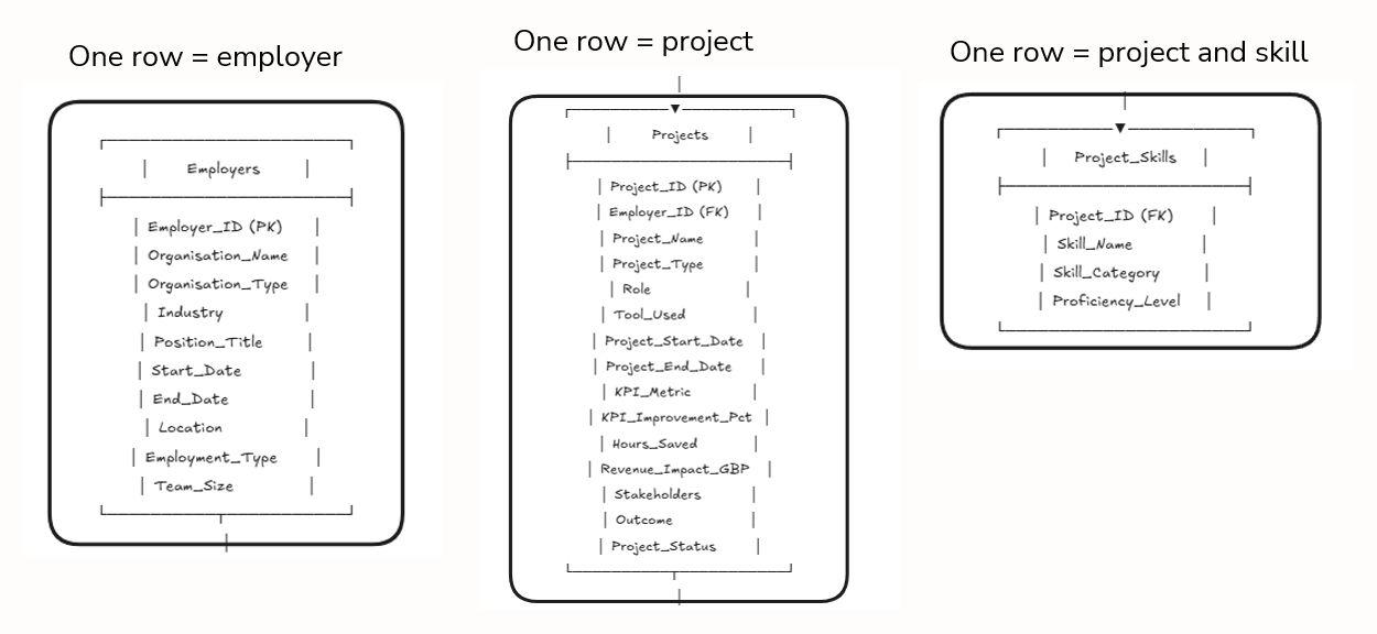
As the data being generated had to be personal to me I uploaded my CV to Gemini and manually prompted any additional information which was left out. AI was able to populate the tables. I did have to manually correct certain parts which were inaccurate. For example, start and end dates in the employer table were only given to the year level but I wanted them to be at least to a month level. Once the data was created I then set about sketching a dashboard design with the following considerations in place...
Simplicity: Only show essential information that is relevant to an employer
High Level: Provide an immediate high-level without the need for excessive interactions
Drill Down: Have the ability to focus down to specific experiences and have a logical flow to the dashboard which compliments this
Realistic: Use information from my personal CV to help generate synthetic data
With that in mind see figure 2 for the concept sketch which was created.
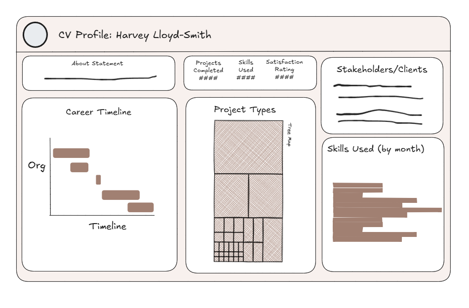
I wanted the dashboard to be simple to read, have a logical flow and have all the key information immediately visible. This meant minimal interactions (the only one being selecting an employer on the career timeline to filter the rest of the dashboard). The final dashboard was very similar to the sketch and is shown below

The user can interact with the dashboard in several ways. Firstly they can click on an experience and filter the rest of the dashboard, secondly they can hover over different charts to view tooltips which contain additional information. Overall a fun project - a few things to tweak and improve are the following:
1) Make the title dynamic so it always shows my current role
2) Change the satisfaction score to something else, this could be viewed as quite 'cheesy'
3) Add pictograms to the dashboard