


Day 1 of Dashboard Week brought a challenge that was more about the user experience than anything else. We were tasked with building a report for Access London, but with a twist: our user is a consultant who relies solely on keyboard navigation and screen magnification.
Accessibility in data viz isn't just a 'nice to have.' When we build dashboards, we often assume everyone can use a mouse and has 20/20 vision. But of course that isn't always the case (I'm at about 10/10 vision myself). If people can’t navigate it, they can’t do their job. Design for accessibility is just generally good design as it makes the report clearer, more logical, and more efficient for everyone.
Access London have hired an expert to audit the city’s top attractions and TfL stations, but they can't use a mouse and rely solely on keyboard navigations. Here were the objectives of the brief:
- Keyboard-Only: No mouse dependency whatsoever.
- Fast Analysis: The user needs high-level summaries without digging through tables.
- Magnification Friendly: High contrast and large focus areas for users zooming in at 400%.
To make the report actually usable for someone solely on a keyboard, I focused on a few key changes. I used a high-contrast theme to keep things sharp under magnification, and I manually reordered the tab sequence so the consultant could move logically through the page. I also swapped out dropdowns for large tile slicers to provide bigger, more obvious targets and reworded my titles as questions to make the data more intuitive. These changes were all about reducing friction and ensuring the dashboard functioned as I wanted it to.
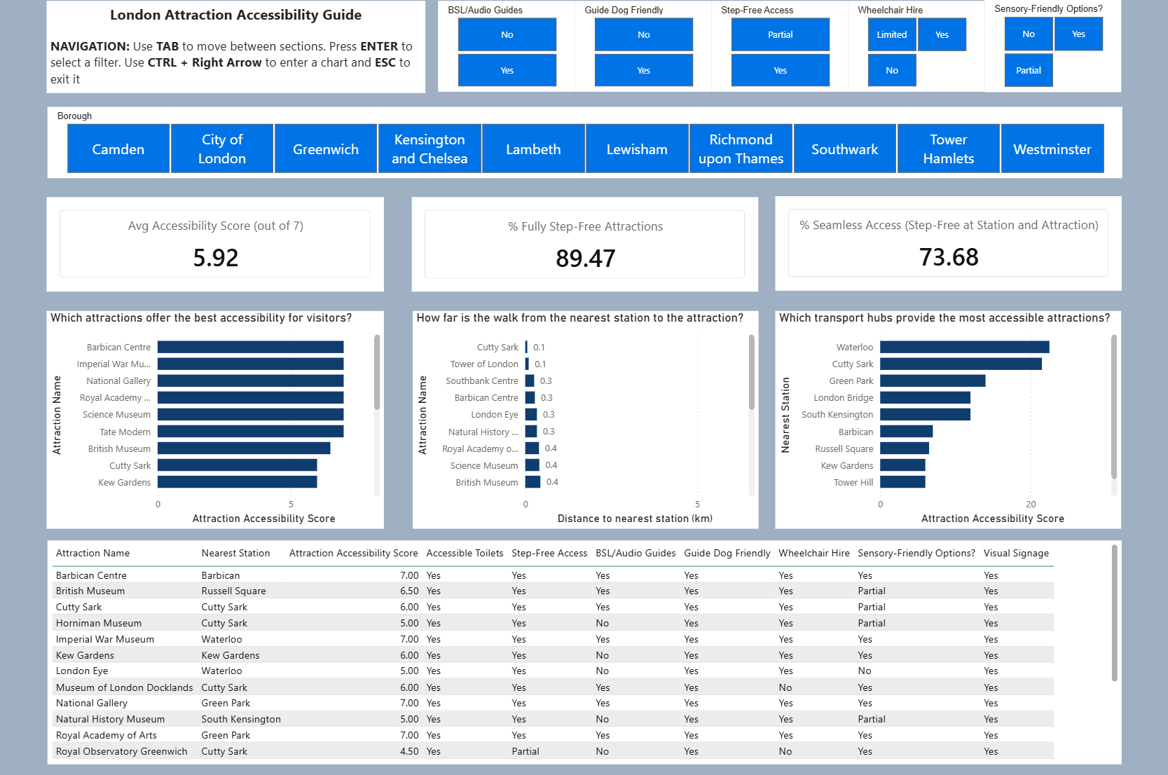
Beyond the visuals, the data had to work hard too. I created a custom Accessibility Score using DAX, which assigned points for features like Step-Free Access, BSL guides, and accessible toilets. I then paired this with transport data to create a "Seamless Access Rate" KPI identifying if the journey from the station to the attraction is as inclusive as the venue itself.
Building this was a learning curve as it forced me to actually "walk" through my own report using only the Tab and Enter keys. It’s a great reminder that as data analysts, our job isn't just to find the insight, but also to make sure that insight is available to every single user, regardless of how they interact with the screen.