


Brief:
The world has realised the COP meetings are not delivering on either preventing the worst effects of anthropogenic climate change, or sufficiently raising people’s awareness of how it will affect countries in the OECD (as in, it is not considered a political priority in these nations). The UN, World Bank and other agencies collect a lot of data and model potential outcomes, but these are often stuck behind difficult interfaces or require users to sign in and navigate complex databases which are not friendly to users of assistive technologies.
Create a product which enables users who are not well served by current interfaces to access insight about anthropogenic climate change and how it may affect the UK.
Be prepared to explain every design choice on your dashboard.
Plan:
After reading the brief, I decided to draw up a plan in Excalidraw (see below).
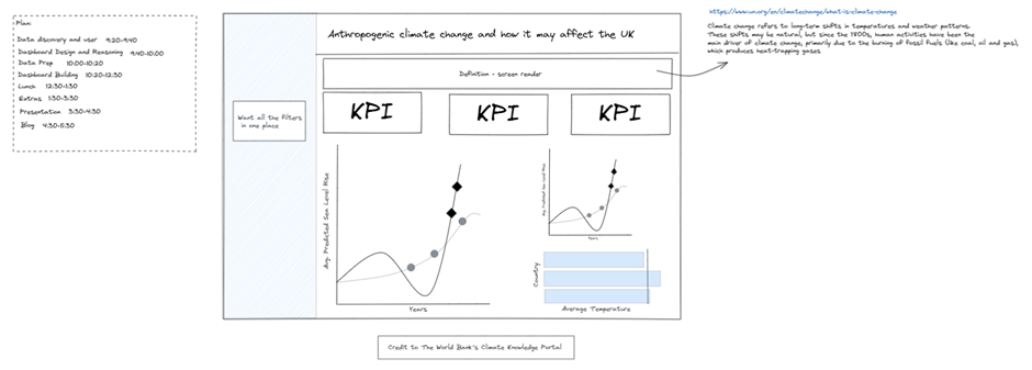
This plan was broken up as follows:
Data discovery and user:
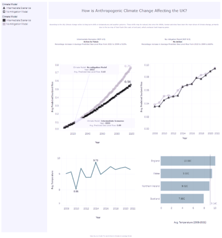
During this time, I did research on climate change to better understand the data. For example, RCP 4.5 and RCP 8.5 are two different climate models based on actions taken to prevent climate change. RCP 4.5 is linked to action being taken (Intermediate Scenarios), whereas RCP 8.5 is no action at all (No Mitigation Model). I also wanted to get a formal definition of climate change, which I obtained from https://www.un.org/en/climatechange/what-is-climate-change. This emphasised temperature correlations and prompted me to look at additional data.
Climate change refers to long-term shifts in temperatures and weather patterns. These shifts may be natural, but since the 1800s, human activities have been the main driver of climate change, primarily due to the burning of fossil fuels (like coal, oil and gas), which produces heat-trapping gases.
Since the data provided was projected values for each model, I joined the temperature data and kept only the overlapping years to investigate the known impact of temperature in the United Kingdom.
I designed the dashboard for the following:
· Keyboard only users (only able to tab through the dashboard).
· Visually impaired (tab through dashboard and require a screen reader).
· People who are not able to see colour (various types of colourblind).
Dashboard and Design and Reasoning:
In terms of design, I thought that blue, white, black and grey would be easily distinguishable. Although, at this stage, this was just an assumption that required confirmation after uploading images of the final dashboard to a colourblind simulator. All simulators provided positive outcomes, with the exception of Monochromatic. See below example for Blue-Blind/Tritanopia. Verdana was used for the font as it is easily legible (differentiating between a capital i and a small L). Double encoding was also used so that when colours look similar, there is a way to tell the difference by looking a the shapes.
Dashboard Presentation:
See my final dashboard below.

Things that need improvement are:
· Text size is WAY too small.
· KPI % is confusing.
· Shapes used on top left graph aren’t ideal.
· Try to combine legend into one when double encoding.
· Use titles for graphs as it is unclear when the screen reader is not being used.