The pea in a pod chart is a chart used to visualize the change between multiple data points. It is typically used to illustrate the change or compare the difference between two data points, but can also be used for more.
This blog will go through how to create a Pea in a Pod chart using Tableau with an example.
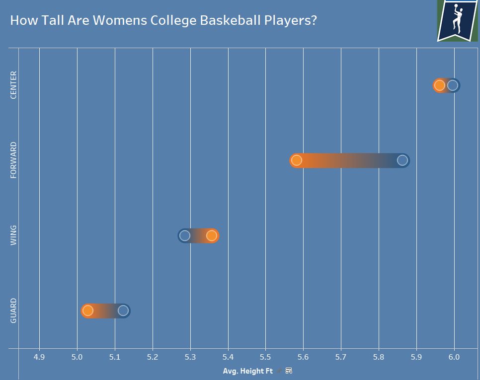
For this example, I want to compare the height difference of athletes in different divisions and split the data by basketball position, using a pea in the pod chart.
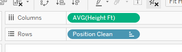
1) Place your discrete variable that you would like to separate each pod by in the rows column. For this example, where we want to separate by position; we drag my position field into the rows tab.
2) Now drag the dimension you want to measure and compare into the columns row.
3) This should return a bar chart. which we now need to split to compare the height differences between different divisions. Drag division into the color tab.
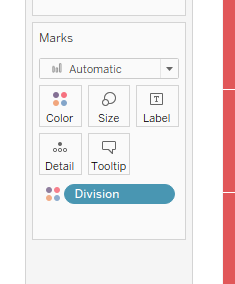
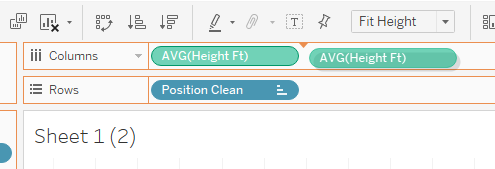
4) In the marks tab, change the drop down value from Automatic to circle. Once this is done, we need to duplicate the graph by dragging the dimension field to columns again so that we have two green pills in the tab. This should leave two identical graphs side by side.
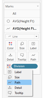
5) In the marks tab of the second chart, change the chart type to a line graph. Then change the way that the division tab is separated, by moving it from color to path.
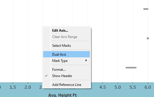
6) Join the two graphs into one by using a dual axis and synchronizing the axis.
7) What we have now, is a dumbell chart. To evolve it into a pea in the pod chart, increase the size of the line chart to increase the thickness of the lines. Then adjust the circle chart size so that the circles fit within the lines.
8) Finish off any additional formatting and you should end up with something similar to this: