


For day 3 of dashboard week, I worked on creating a Tableau dashboard designed specifically for users who rely on screen readers. The project used data on London Tube stations and tourist attractions, with the goal of making journey planning more accessible for visually impaired users.
To guide the design process, I created the following user story:
"As a visually impaired commuter who uses a screen reader, I want to filter London attractions and Tube stations by key accessibility features and hear text-based summaries, so that I can easily absorb the key information needed to safely plan my journey."
Creating an accessible dashboard involved much more than simply building visuals. I needed to ensure that all charts and dashboard elements included meaningful alt text and detailed descriptions so that screen readers could communicate the information to users.
One of the biggest challenges was organising the dashboard in a logical reading order. Screen readers process content sequentially, so careful thought had to be given to how text, filters and visuals were arranged. I also needed to configure keyboard navigation to ensure users could interact with the dashboard without relying on a mouse. Another important consideration was avoiding the temptation to continuously add accessibility features without clear purpose because different user groups often have different and conflicting accessibility requirements.
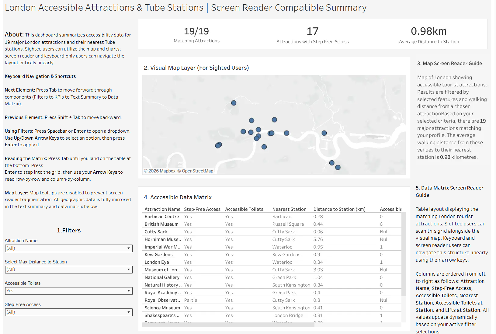
The final dashboard included both a map and a data matrix as seen below. The map provided a visual way for users with partial sight to explore the data, while the matrix offered a screen reader-friendly alternative that could be navigated and interpreted more effectively through assistive technology. I also included a detailed "About" section containing comprehensive instructions and guidance on how to use the dashboard.
This project highlighted the importance of considering accessibility from the beginning of the design process rather than treating it as an afterthought. It demonstrated that accessibility is not a one-size-fits-all solution and that different groups of users can have very different needs. Ultimately, creating accessible dashboards is about ensuring that everyone can access and use data effectively regardless of how they interact with technology.