


For the final day of dashboard week, we were given a list of heritage site names and cities in upstate New York and given the prompt of finding the next heritage site location The Information Lab should go together for a hike. Since it was officially the final day of my training before beginning a placement at another company, I wanted to use this final day to make something creative that I wouldn't get the chance to in a professional dashboard. I also wanted my dashboard to be a tribute to my great cohort and coaches that spent the past 4 months of training with me. My gears began spinning, and I started to sketch out a line chart that looked like this:
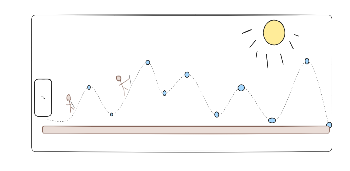
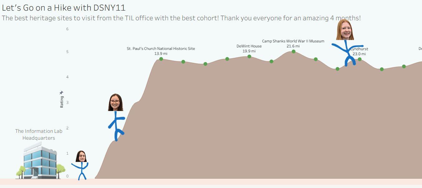
Because the dashboard was going to be about hiking, I decided to have my visualization look like rolling hills that my cohort and myself could hike over. I decided I would map the heritage sites by distance on the x axis, and google rating on the y axis. That way the dashboard would not only look interesting, but also be useful to find a great hiking location that is both close to the office and highly rated.
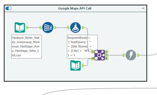
Since we were only given a data set with names and cities of each heritage site, I needed to find a way to get the exact location and google rating of each site. After some research into different location tools, I ended up choosing Google's "Places API (New)". This API allowed me to run a search on google maps for each location, and gather its latitude, longitude, rating, and website URL. I set up my account, got my API Key, and read the documentation to understand exactly how I needed to query the API.
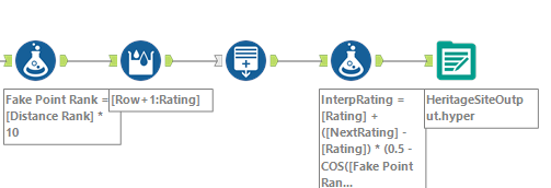
After getting all the API information, I hopped into Alteryx to do the call. I first input all the information I needed to call the API and retrieve the location and rating information.
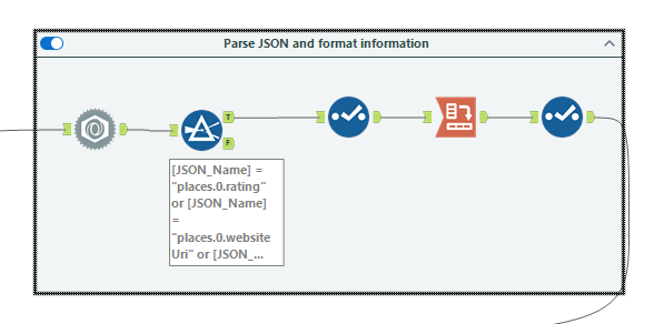
I then parsed the JSON and pivoted the data to get it in the right format.
I then brought in the longitude and latitude of The Information Lab office and calculated the distance to each heritage site.
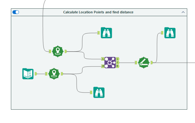
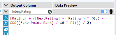
Finally, since I wanted the visualization to look like rolling hills and not a normal straight line chart, I sorted each site by distance to the TIL office. I then calculated 9 fake points in between each point. These fake points use a mathematical formula called interpolation to create a curve between the rating of the first site and the site after it.
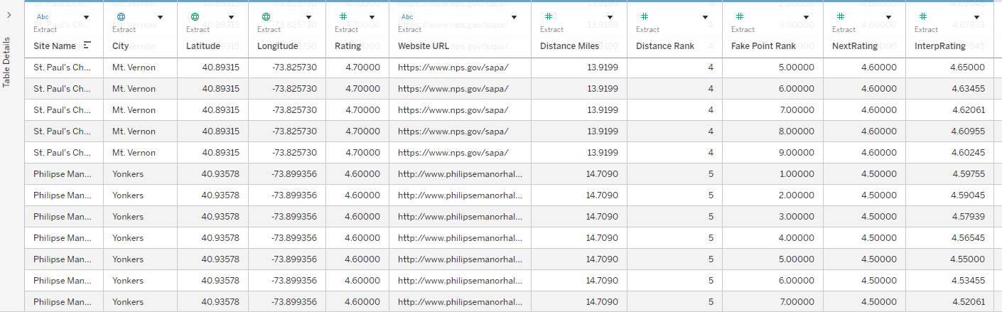
The final data ended up looking like:
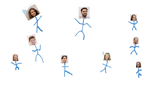
With this new "InterpRating" field, I was able to use it in my line chart to get the smooth rolling hills effect. The only thing left to do was to add my cohort! I sketched them out very expertly:
Adding them in, I got my final visualization:
Feel free to check it out at my Tableau Public: https://public.tableau.com/app/profile/george.chachkes/viz/HikingwithTheInformationLab/Dashboard1
This wraps up my dashboarding week experience, and I'm happy to have finished with a fun dashboard that pays tribute to my fantastic cohort and coaches here at The Information Lab!