


This week is Dashboard Week here at the Data School, meaning every day this week we will be getting a new dashboarding challenge to create and blog about. Today, we were given a very messy data source and given the challenge to clean it and create a dashboard.
The data set provided at the start of the day looked at covid vaccines and their efficacy rates. It was structured in a way that was easy to read in Excel, but definitely not easy to read by a computer. When brought into Alteryx to be cleaned, the data looked like this:
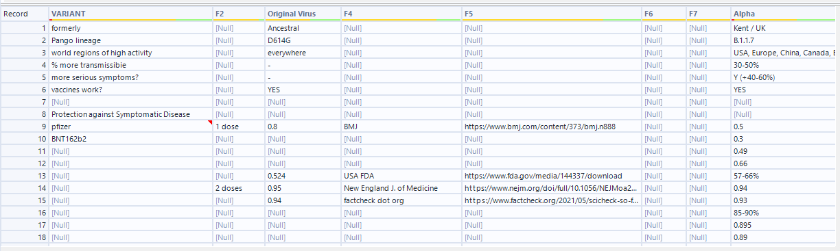
As you can see, there are lots of nulls and mismatched values. I wanted the data to end up looking a lot cleaner, so I wrote out my ideal way the data would be structured in excel:

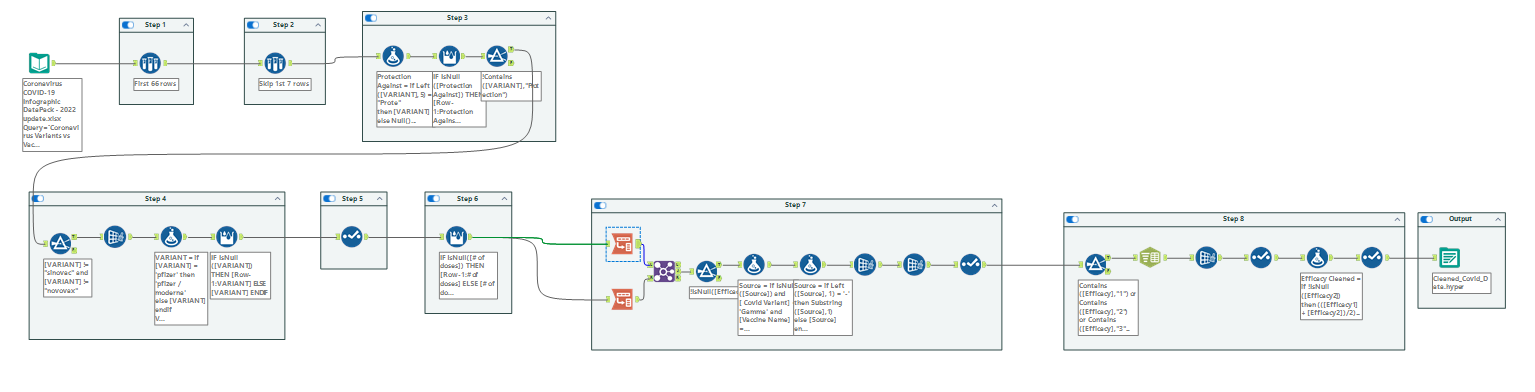
To go from the messy data to this nicely cleaned format, I came up with 8 steps.
- Remove the extra bottom rows
They provide extra sources and info that I don't need. - Remove the first 7 rows of data
The first 7 rows provide extra info about the variants, which could be its own dataset but should not be put with this one. - Create a new column for "protection against"
-The information about what the viruses protect against was lost in another column, so I needed to extract it and make it its own column. - In the Variant column, remove the 'sinovac' and 'novovax' rows, rename 'pfizer' to 'pfizer / moderna' then fill down with only 'pfizer / moderna', 'astrazeneca', and 'j and j'.
This would clean up the Vaccine Name column. - Remove all null columns and columns with links
- Fill down the # of doses column so there are no nulls
- Transform the data using the Columns to Rows tool, combining the 4 variant names. The values in those columns should go into an Efficacy column.
- Standardize Efficacy Numbers
-The efficacy numbers were in different formats, some decimals, some whole numbers, and some ranges. I needed to make them all the same.
To complete these steps, I created an Alteryx flow. Each tool used to complete one of these steps is in a container that is named the step number.
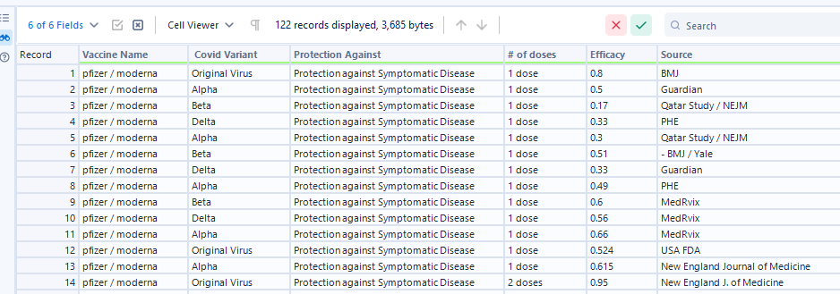
After running this flow, I was left with the clean data set looking like:
With the data fully cleaned and ready to bring into Tableau, I then was able to start sketching what the dashboard I wanted to build would look like. I decided to compare the 3 vaccines to see which was the most effective. I did this by creating a bump chart that ranks the 3 vaccines by how well they handled each covid strain, and compared the 3 again using KPIs. I also wanted to add a chart to show the sources of the efficacy tests. My final dashboard ended up looking like:
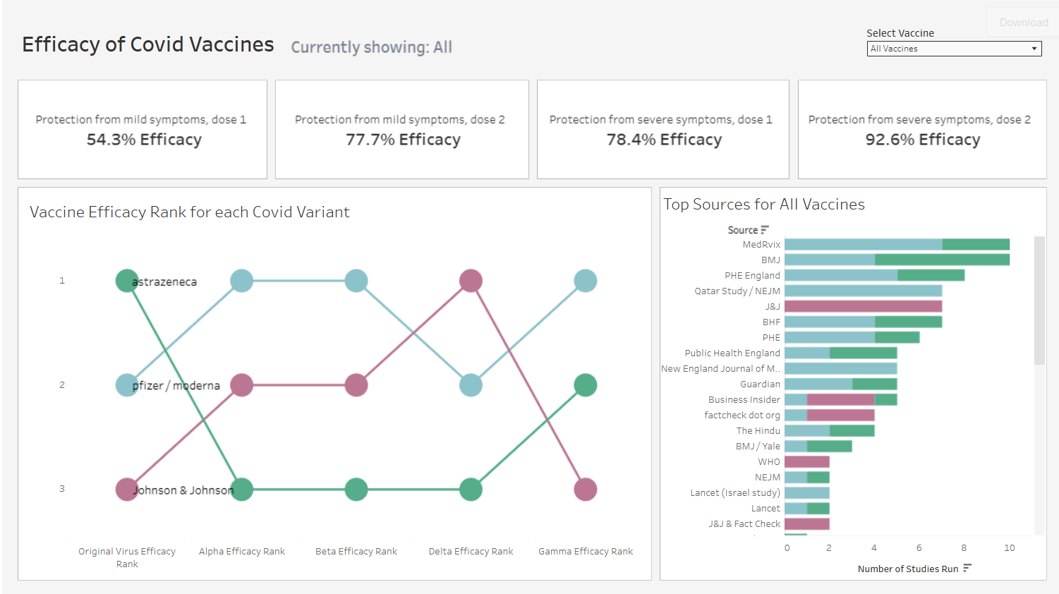
To see the dashboard, visit my Tableau Public here: https://public.tableau.com/app/profile/george.chachkes/viz/EfficacyofCovidVaccines/Dashboard1?publish=yes
This was a great day 1 of dashboard week, and I'm looking forward to the rest!