


ChatGPT is not only excellent for coding but also for generating color codes! If you ever find yourself stuck on color combinations or need assistance exploring various shades of a single color, ChatGPT has got your back.
Themed Dashboards
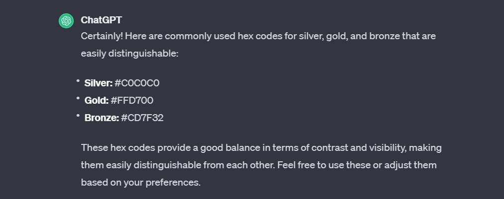
It's really helpful if your dashboard has a specific theme, that can be categorized into colors. When I built my Olympics dashboard I asked ChatGPT for medal colors that are easily distinguishable in a chart.
"can you give me hex codes for the colors silver, gold & bronze to use in my visualization. They need to be easily distinguishable from another"

Different Shades of an Existing Color Palette
When building a dashboard, you often need additional shades of your existing color palette. While you could play around with the color wheel and pick each color individually, it's time-consuming. It can also be hard to find perfect shades of your original colors, often times you can accidentally change their hue too much and they might not perfectly fit with the rest of the colors anymore.
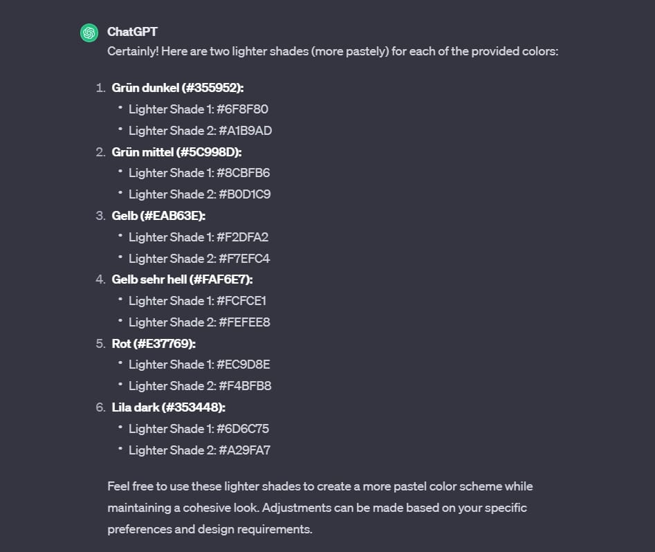
"can you give me 2 lighter shades of all of these colors .... so more pastely. But keep the color similar to fit the scheme
Grün dunkel #355952
Grün mittel #5C998D
Gelb #EAB63E
Gelb sehr hell #FAF6E7
Rot #E37769
Lila dark #353448"


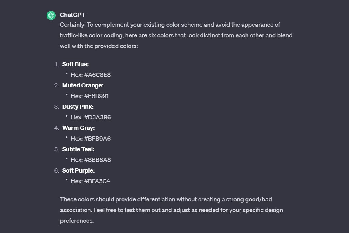
I also needed a bunch of different colors for some tags I added to a table in my dashboard. The problem that I had while using the lighter colors was, that the tags looked like I color coded them like a traffic light. There were too many red, yellow, green shades. It looked more like a ranking than individual tags. I asked ChatGPT for an alternative version:
"can you give me 6 colors I can use as tag colors, that look different from each other, fit my color scheme, but also don't look like a traffic light like color coding"

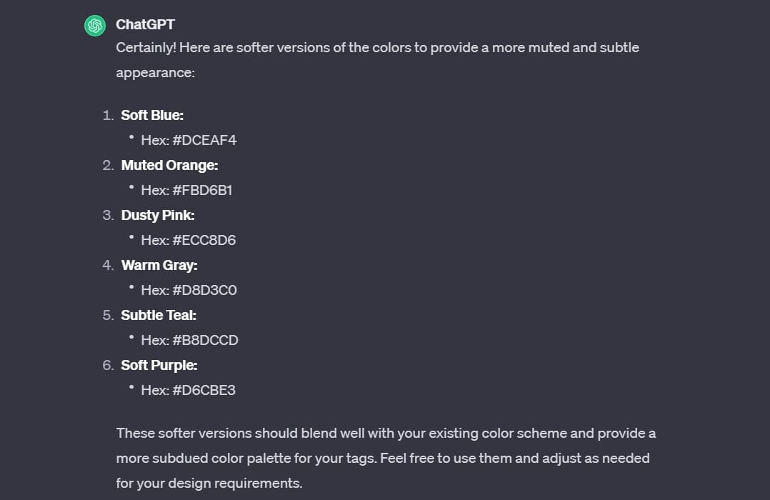
Although the alternatives were great, they didn't work as well on my white background. They looked too intense, so I asked once more for a more muted version:
"they are a bit too vibrant, can you give me a softer version of these?"

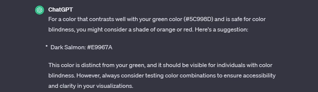
Beware of Color Blindness Accessibility
A word of caution with ChatGPT - be mindful of color blindness accessibility. It's a bit hit or miss. I saw it go both ways:
When I asked for a red to specifically accompany a green that needed to be distinguishable for persons with color blindness, it gave me one that seemed to work well. But I also let ChatGPT give me full color schemes that were supposed to be accessible for color blind viewers and it just gave me a very vibrant red and green that I'm sure would not be safe. Always double check the output!
"Give me a hex code that works well with my green (for positive values) #5C998D It needs to be safe for color blindness and show the negative values."

Conclusion
ChatGPT can be a fantastic tool for selecting colors for your dashboards. However, it's crucial to prompt it the right way and know exactly what you are looking for.
It is not ideal for generating complete color palettes from scratch, and its understanding of color blindness accessibility is not perfect.
So, while ChatGPT can guide you well, don't blindly follow everything it suggests ;-)