


Another day, another dashboard. Today we had to use an API to get weather and air quality data.
We struggled a lot with the API, because the API calls were really restricted and we'd get 'too many request' errors all the time, even while looking for tiny amounts of data.
My first idea was to build a dashboard showing an evolution of air quality data over many years. I wanted to be able to have a big heat map and maybe also do some projections on how the quality might change in the future.
After having a closer look at the API, we noticed that actually we can only extract today's weather data. My plan had to be adjusted, I wanted to switch to a dashboard that shows today's air quality index for a lot of global cities.
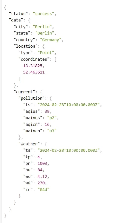
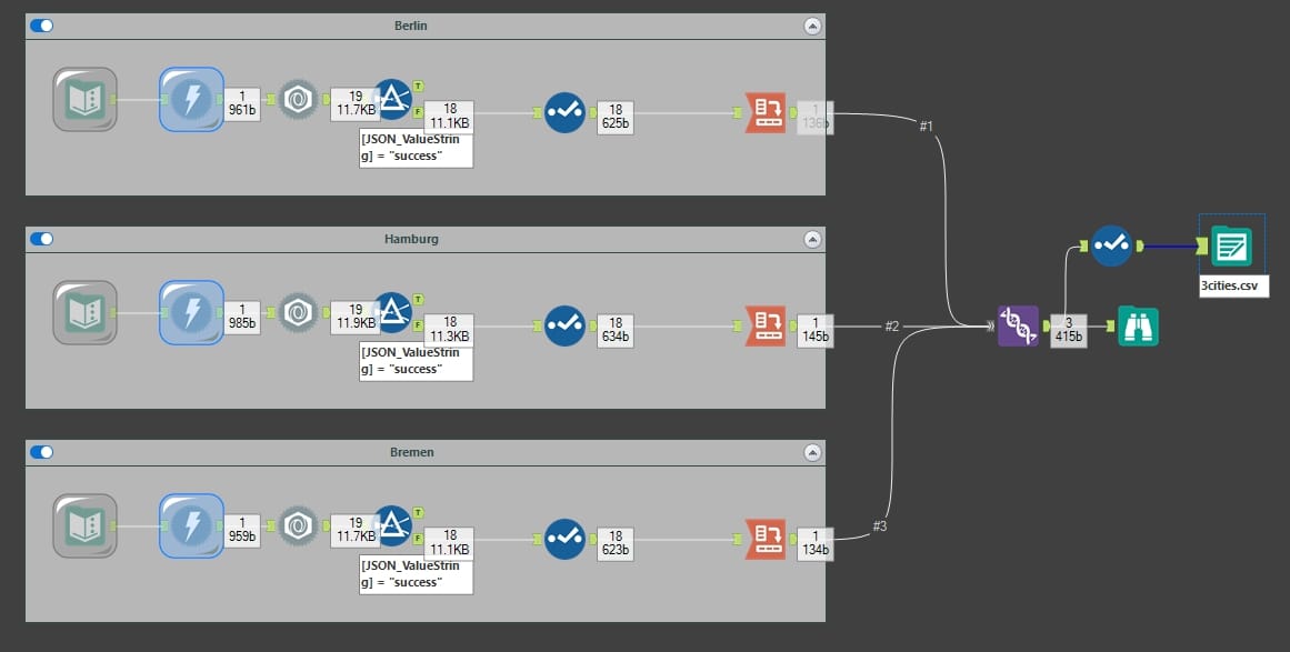
In the mean time, my Alteryx started acting up too and we couldn't find the resolution for why some API calls weren't going through. After battling with that challenge for more than half the day, I still only had data for 3 cities.
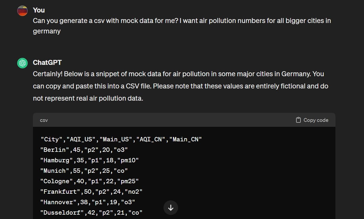
I was really frustrated, because we only had 2 hours left to finish the dashboard and the presentation. So before I couldn't work on a visualization at all, I generated some mock data with ChatGPT. Once I can finish the API calls I will easily be able to switch out the mock data with the real values.
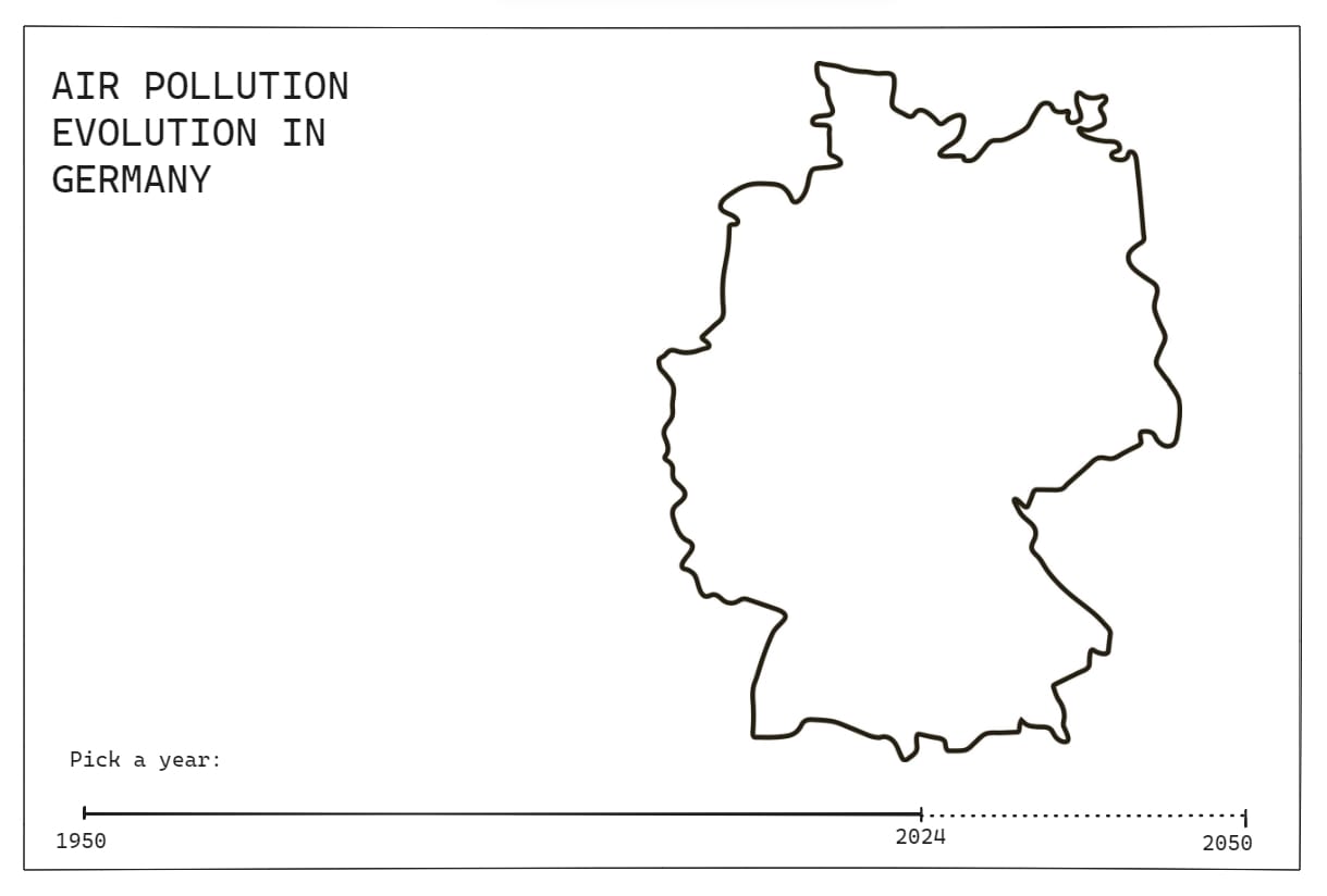
So, here is my small dashboard on the Air Quality Index Germany. Beware that the numbers are fake, but enjoy looking at it nonetheless 😉
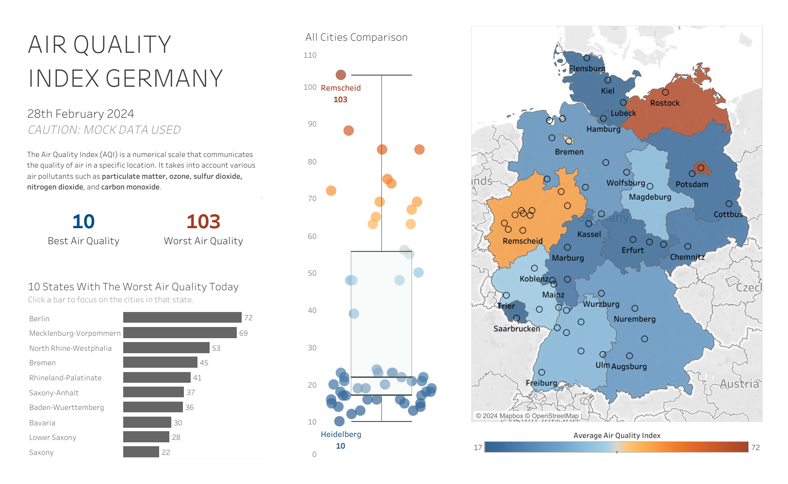
You can find it on my Tableau Public!