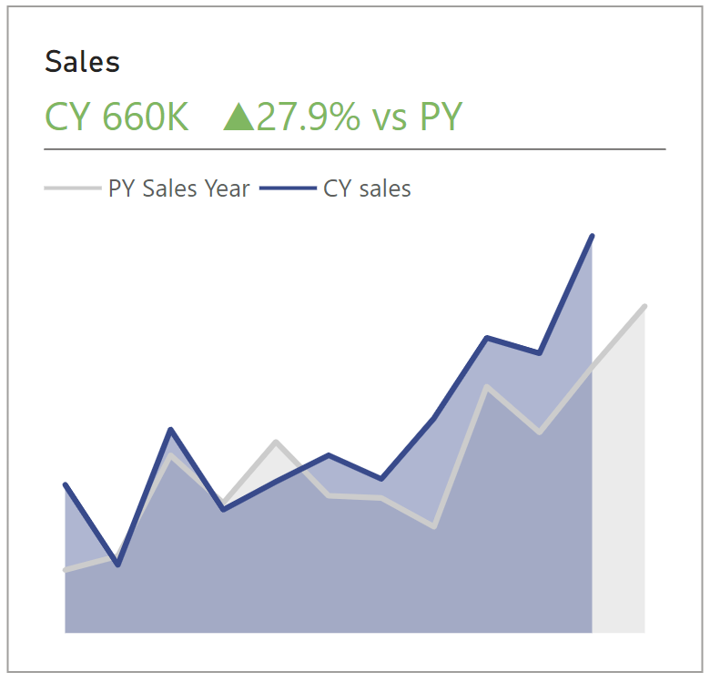
One of the things that I realized when trying to create KPIs in PBI, was that titles are not as flexible to place multiple calculations in it. So, I usually just create a card or multiple cards, a chart, and then group them. Even like that, it wouldn't look as nice as it could.
So, here is a way to format the titles of a chart and turn it into a KPI without extra visuals. (p.s. - color formatting and text size is still not as flexible, at least based on the knowledge I have at the time of this post)

1- Create a chart. I am analysing CY sales and PY sales ( PY sales line have the whole year). (Format as you wish)
X-Axis - date ; Y-Axis - the two measures created


2 - Create 2 calculations (this could also be variables in the next step).
First calculation for the previous year sales that only gives you the value of months to date. This will be pretty much the same calculation as the one above for the previous year. However, this time we also specify the month.
Second calculation for the % change between CY and PY Sales


3 - Now we create a measure for the chart subtitle. You can format it the way that you want.
The basics of what I have done:
I. add CY text.
II. & is basically saying - add more in front of this - and the quotation marks with space in between them is adding space between the text
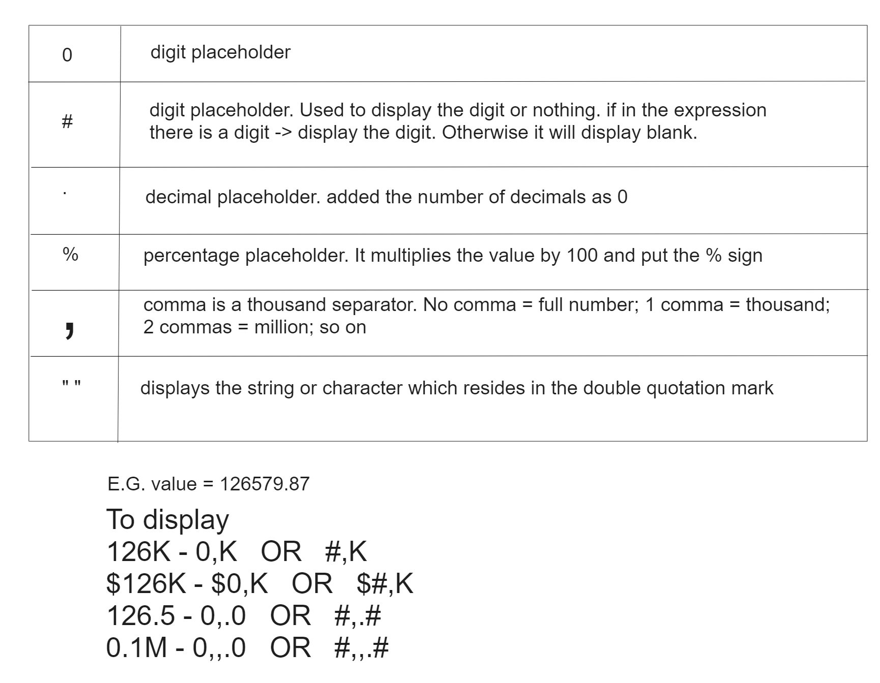
III. Format the CY Sales value. In this case I want to format CY sales in thousands. There are multiple ways of how you can format the value. (See second image below)
IV. Format % Change Sales vs PY. If the value is positive, it shows a triangle upwards. If negative, it shows a triangle downwards. (to get the arrows, simply hold windows key + dot key → a menu will pop up with symbols)


4 - Change Title and Subtitle. I wrote the title manually and the subtitle will be the measure we just created (Change size as you wish and make sure "text wrap" is off)
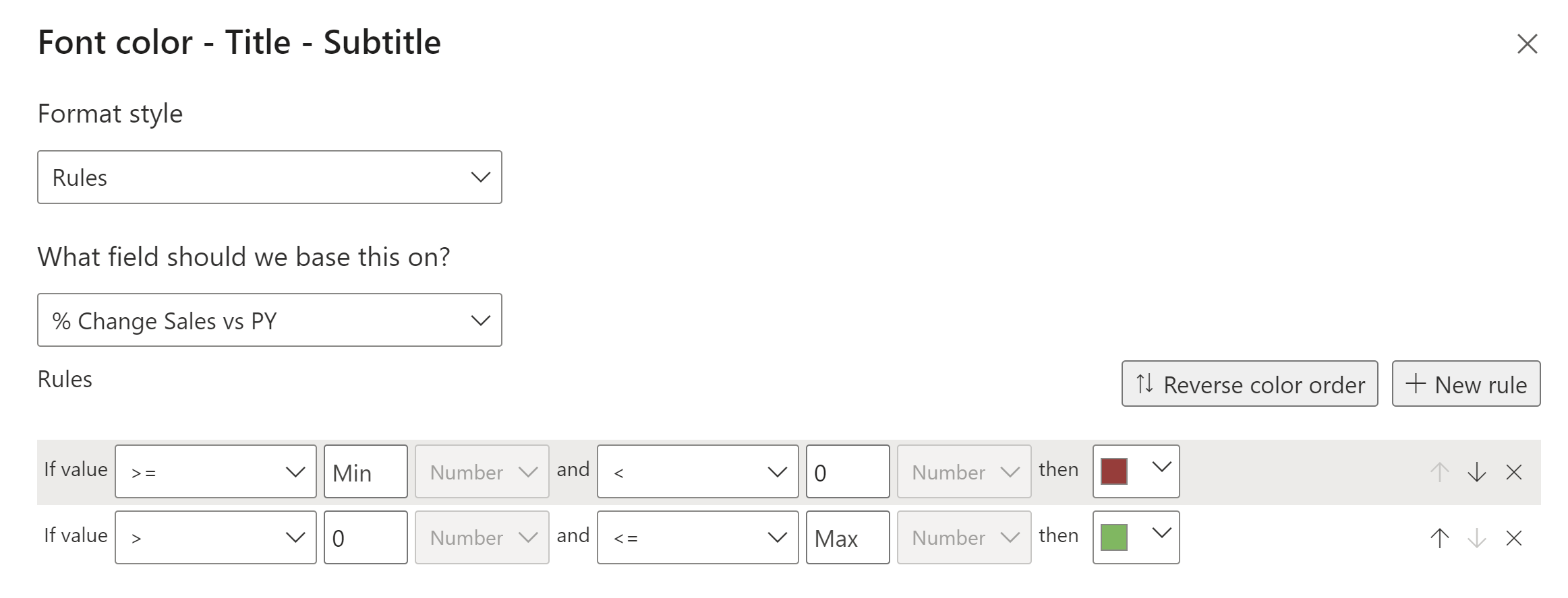
5 - Color formatting - The measure will have a different color if positive or negative.
Subtitle → text color → fx (check image below)

