


A dashboard is set apart from the rest by the information that can be gleaned from it. An even better dashboard makes this information readily accessible to the user by telling a story. In this blog post, I'll explain how to find that story within the data and how to use that knowledge to translate it into a tale on a dashboard.
Step 1: Familiarise yourself with the data. With your chosen dataset (I picked the Forbes' Top 50 paid athletes in 2023 from an old Makeover Monday), load the file into Tableau Desktop or Prep to get to know the data that you have. See if there are any outliers in the data which you could highlight and explore if there are any trends. If there are trends in the data, think about why this might be. For example (and this is a very simple one, I know), you may notice that ice cream sales peak in the Summer. Why might this be? Because temperatures are higher in the Summer and people like a cool treat when it's warm. You can do these explorations by looking at the table of data or make it easier for yourself by creating a few rough charts.
Step 2: Think about what question your user might want to answer with your dashboard. At the Data School, we think of this as the user story. In a user story, you put yourself in the user's shoes and try to understand what they want to find out from your dashboard. Start by looking at the situation they might be using your dashboard in, why they need to be making these decisions from your dashboard and what they would need to make these decisions or come to such conclusions.
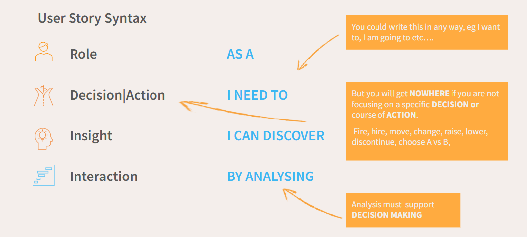
A user story is a little less appropriate for general intrigue about a dataset but you can still follow a similar layout by thinking about what sort of user might be looking at your dashboard and what they might want to glean from the data as a result. There are a few important things to note though when considering this step, as I will now go on to explain.
Firstly, it's important that you ask a related question and not one that you wanted to ask but might not be able to explore in the data (like at school when you answered the essay question you were revising for, rather than the one actually asked). If you're not sure whether you have enough related data for your question, have a play around with the data in Tableau Desktop to see the different charts you might make and think about whether these would guide you to your answer or not.
Also remember that you don't need to just use a single dataset so if you think adding a related dataset might help you demonstrate a point more clearly (e.g. adding population data to look at a measure per capita), add that. If you want to determine if a company is profitable but you only have revenue and costs in your raw dataset, create that calculated field. Essentially, you don't need to limit your question by what you have in your original dataset alone.
That being said, you also don't need to ask the broadest question possible. A broad question can often be a little directionless because there are so many avenues to go down. This means you're unlikely to be able to explore the question completely, and if you do end up with an in-depth complete exploration then it will probably be quite a large dashboard which, contrary to the belief of many Data School applicants (myself included), doesn't mean it's a better, more effective dashboard.
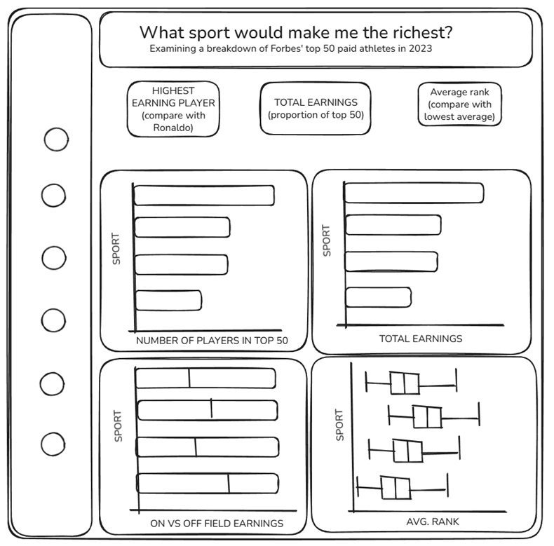
Lastly, I would recommend asking one question of your data (with sub-questions that can be asked by each chart relating to the main question). For example, in my dashboard I wanted to explore the sport I could play that would make me the richest. Forgetting about my lack of any athletic ability (my running has been described as looking like I'm going in slow motion, sadly not a joke), I could see several ways to explore this question from the data. I could look at number of players from each sport in the top 50, I could look at overall earnings, I could break this down to earnings on/off field and I could look at ranking within the top 50. Overall, asking one question with sub-questions will provide you with directionality so that your dashboard doesn't lose track of the main storyline. If you have multiple questions, you can always make multiple dashboards!
Step 3: Choose the best charts to guide your question of the data. There is an excellent dashboard on Tableau Public which you can use as a guide to help you highlight what you want to show. Again, think about the story that you're telling and how you can show these aspects in your charts. You want to make your findings as clear to the user as possible so think about pre-attentive attributes when you're choosing your charts. You might love a bubble chart (guilty as charged) but it isn't a very effective choice so just stick with the bar chart (if you read the blog linked, you'll find length is the strongest pre-attentive attribute). You can do interesting things with your bar charts, I promise. You don't need to try to reinvent the wheel with a fancy chart (I'm looking at you, radar charts) if it's not supporting/guiding your question. That's what this all comes down to: if it doesn't provide insight into your question, it may sound brutal but axe it.
Step 4: Sketch it out. Then dashboard it. I recommend using excalidraw to sketch out your dashboard vision. It takes a bit of time to get used to (at least in my experience) but doing things online allows for a lot more editing. You can see my sketch below. When arranging your charts, you will typically follow a sequential pattern in your charts, just as with a story. For example, you may start with a chart examining the broadest level of information before drilling down to more specialised areas of the data (in my dashboard, I look at total earnings before I look at the breakdown on vs off field) or it might make sense to start by looking at one area of the dataset before looking at another, either due to chronology or logic (off the top of my head, you would probably want data on sewing the seeds to be before data on crop management in a farming dataset). You should think carefully about what your charts are showing and whether it makes logical sense to move from one chart to the next. Once happy with your sketch, make it a reality by inserting your charts into your dashboard following that formatting.
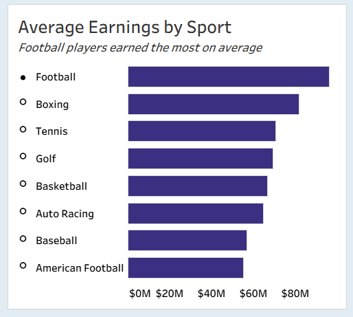
Step 5: Add the extra details to make the story in your data as clear as possible. Depending on what you wish to show, you might want to use a highlight action, filter, annotations, parameters - the world is your oyster! In this step, think about the question you want your charts to be guiding and the insight that you want them to be indicating. Then make that finding as obvious as possible without completely compromising the contextual information that the rest of the chart provides (and without double encoding!). You can also use subtitles on your charts to literally write out the answer that you want the user to come to (see below), but make sure that your chart is making the answer incredibly clear first.
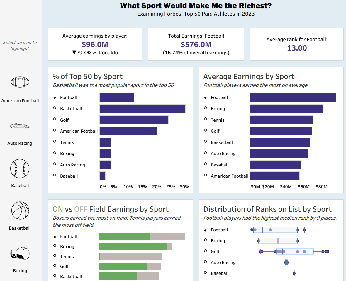
Step 6: Make it pretty! It's always important to make your product look as good as possible so that a user is drawn to it. An eye for these details will help to sell the product and spread your story to the masses! Here's a partial screenshot of the dashboard that I created for this blog.
So, next time you want to analyse a dataset, think about the story. Get to know your data and think about what your user might want to gain from your analysis. Consider charts that will best demonstrate the insight you are trying to show. Sketch it all out. Add to your charts to draw out those insights, making them as clear as possible. Then make it look as good as you can!
At every step, you should keep the story you're telling in mind, the why of it all. If you can't link back to how it adds to your story and the question that you're exploring, you're probably going in the wrong direction. Go back, remember the why aspect (the why I am showing this, why is this insightful to my question/story) and try again.
That's everything from me for today. Until next time, happy storytelling!