


I feel the need to start this blog post with a warning to buckle up. Inspired (read: overwhelmed, battered, obliterated - take your pick as the list could go on) by an old Workout Wednesday that we were tasked with attempting in training, I wanted to share what I had learnt. This is especially pertinent given the fact there is no solution online for completing this Workout Wednesday (that I could find), as there normally is. Since it's quite a long task, I'll be splitting this into two blog posts with a link to the second one here. This first blog post will focus on creating the bars and the second will focus on creating the Gantt lines with the colours/triangles/values. If you'd like to see the original task, you can find it here (Workout Wednesday 2021 - Week 46).
Step 1: Calculate the sum of sales for the 'current' year. To do this, I created two calculations. First of all, I worked out what the max year was because I didn't want to hard code it.
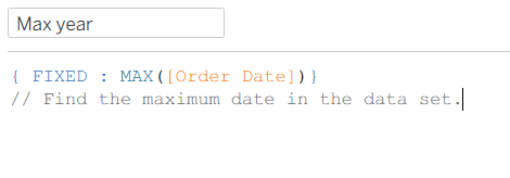
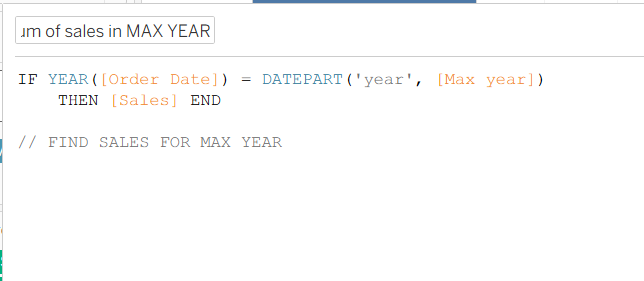
I then calculated the sales for all order dates whose year matched the year of my max year calculation.
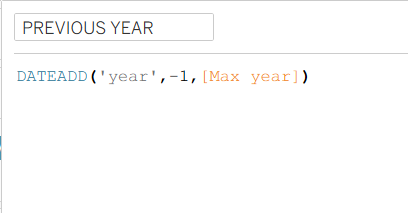
Step 2: Calculate the sum of sales for the previous year. Another two calculations are needed here, or at least I created two calculations to make it clearer to myself what was going on. Similar to the max year calculations, I first created a previous year calculation on its own. In the calculation below, you can see that I'm using a DATEADD function (because there is no date subtract) and taking a year off the max year calculation I created earlier.
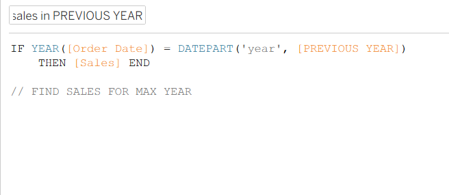
I then used the same second calculation as before but swapped out max year with previous year to get those sales. Please ignore the comment saying find sales for max year - I clearly should use the commenting function more effectively and not just duplicate calculations!
To be perfectly honest, that was the tricky part of this blog post and now I look back on it (I'm a few weeks on in training from when I first started this blog because I was given a project that took priority), it wasn't quite as bad as I originally made it out to be! Although, everything is easier when you have the answers I suppose. You now have those answers too though so you can feel more confident in creating calculations like these!
Step 3: Creating a small multiples chart. I had never created a small multiples chart before this Workout Wednesday but it's fairly simple to get your head around. You'll need to drag category onto columns and segment onto rows first of all. Then drag 'Measure values' onto columns as well, removing all of the values except the two sum of sales calculations that we just created for the current and previous year. To get the measure values in individual rows rather than in one segmented bar, you'll need to add 'Measure names' onto rows.
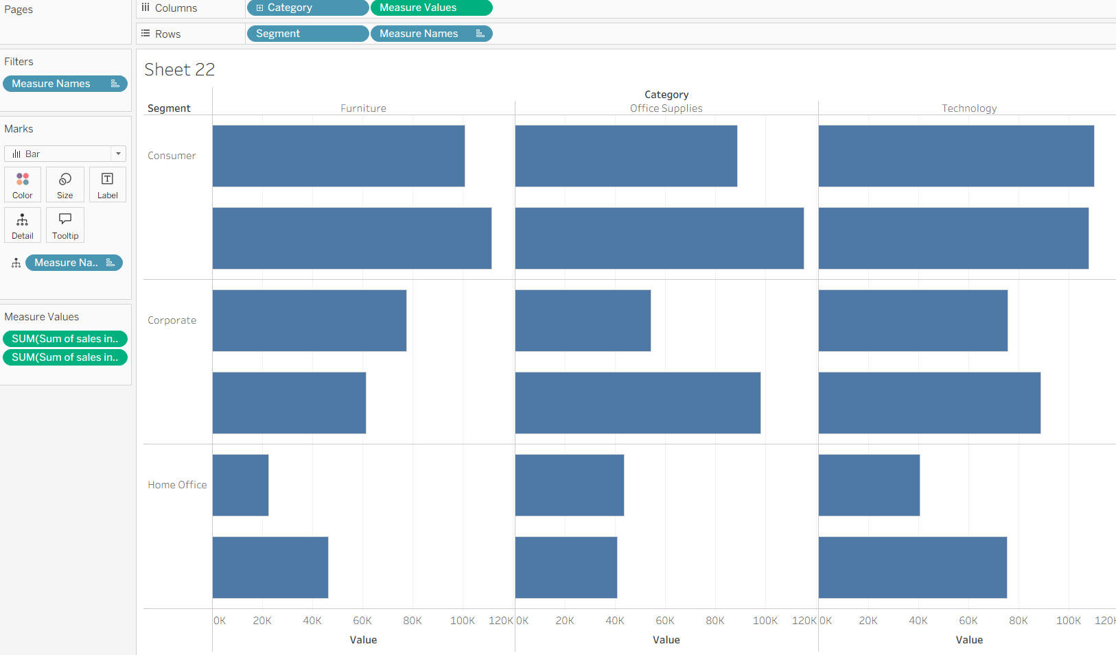
Step 4: Formatting the chart. There are lots of little formatting tricks (maybe not tricks per se as it's nothing unique, but techniques) that you'll need to do to get this chart looking like it does in the feature image. First up, add your measure names onto colour to differentiate between current and previous year sales. Edit your colours however you wish but in the Workout Wednesday they used two shades of grey. Hide field labels and axes, remove the rows/column dividers and resize the font on your headers. Check show labels in your marks card and align that to the left of the bars as well. To get the formatting as close to mine as you can, you might need to drag your y axis down and increase the size of your bars too.
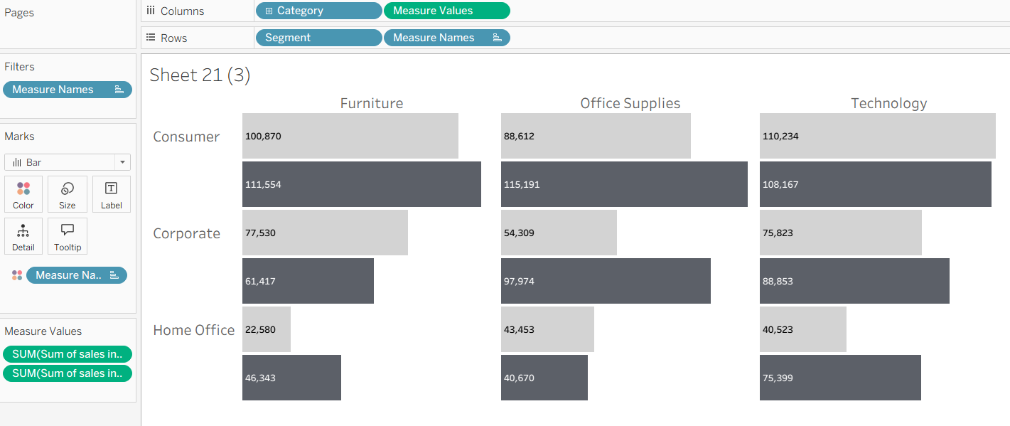
And there you have it, a nice comparison chart for current vs previous year across multiple categories and segments. If you'd like to do the second part of the Workout Wednesday which adds that extra something to the chart with a difference calculation, gantt line and colouring, head over to the second part of this blog post. Until next time, happy charting!