


I recently took on the challenge of creating a fake dataset that is as realistic as possible. Along the way I learnt a lot about fake datasets - and created a framework for making them that I hope will be helpful for others looking to do the same. I exclusively used Alteryx for this project, but I think that the principles I used can be applied in different software to achieve a similar result. In the first part of this blog I will talk about fake datasets and what makes them realistic, and then will run through the framework I used to generate my dataset.
What makes a dataset?
It is useful to think of datasets in terms of dimensions and measures:
Dimension: A category that splits your data into distinct groups. They are mostly discrete and often qualitative. In sales data, some examples would be the product being sold, the shop it was sold from, or the day it was sold on. All of these fields split up the data in some way: we can use the "product" field to split products in the data to compare them, or we can use the "shop" field to compare different shops.
Measure: A field that can be aggregated across your dimensions. They are mostly quantitative and often continuous. In our sales data, examples would be the revenue or profit from a certain sale. These can be aggregated across dimensions: we can calculate the total revenue per shop, or the average profit per product.
Most datasets can be thought of as combinations of dimensions and associated measures. Let's think about our sales dataset. Each row contains:
A combination of dimensions - a sale of a certain product in a certain shop on a certain day.
Some associated measures - the revenue and profit for that particular combination of dimensions.
My fake dataset is an Emergency Medical Services Call Centre dataset (think 999 / 911 ambulance calls). This is the schema:
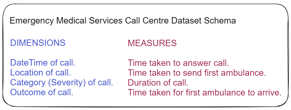
Each row in my data is a combination of the dimensions, each with four associated measures. These combinations of dimensions and measures cannot be random however, that would not be realistic in the slightest. There must be relationships and trends within the data.
What makes a dataset realistic?
Datasets without relationships and trends are useless - you can't gain any insight from them (unless of course the lack of trends is a useful insight). For this reason, almost all real world datasets contain relationships and trends that reflect the real world. For me, there are three main factors that make a fake dataset realistic:
Combinations of dimensions occur with different frequencies
The easiest way to explain this is with examples. In our imaginary sales dataset, some products will be sold more than others. Some products will be sold more in certain shops than in others. Some shops will sell more products on certain days than other shops. Notice how this is nothing to do with our measures, only in how frequently our dimensions combine with each other.
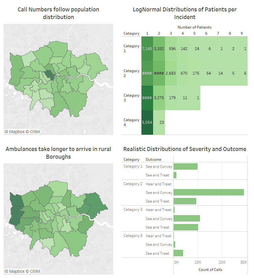
Let's have a look at an example from my dataset:
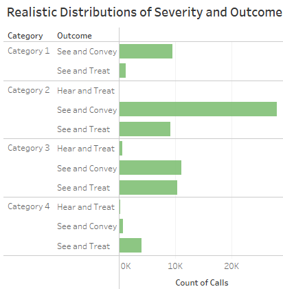
Here we can see that the dimensions of Category and Outcome combine with different frequencies. The majority of Category 1 and Category 2 calls end with the patient being "conveyed" to hospital, whereas Category 4 calls are more likely to be "treated" at the scene. Again this is nothing to do with our measures, just frequencies of dimension combinations.
In a large realistic dataset, every possible combination of dimensions will occur with a different frequency.
Measures follow mathematical distributions, and each combination of dimensions changes the Mean and Standard Deviation of these distributions
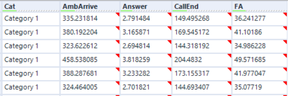
Let's have a look at a measure from my dataset: Time Taken for First Ambulance to Arrive.
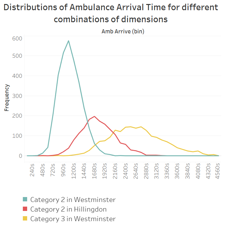
We can see that this measure follows a normal distribution, but with different means and standard deviations depending on the dimensions. The frequency is determined by what we discussed above - the frequency with which the certain combination of dimensions occurs.
In a large realistic dataset - all combinations of dimensions will have a different mean and standard deviation for all their associated measures. Some differences may be negligible, some may be large.
Realistic trends and deep trends
Even if every combination of dimensions has a different frequency and different distributions of measures, it doesn't mean they will feel realistic. A real dataset reflects the real world in all its causal complexity. We can find patterns and form hypotheses that make sense to us. We can investigate these hypotheses and find meaningful insights.
For example, imagine in our sales dataset that there are high sales in December. You wouldn't just expect the number of sales to blindly increase across the board. You would expect it to change differently across certain products, Christmas gift selections maybe; and on certain days, like the weekends before Christmas.
These deep, realistic trends are the biggest challenge in creating a realistic fake dataset, and there really is no limit to the amount of thought and time you can put into this.
How to make a Fake Dataset (with a little help from Alteryx)
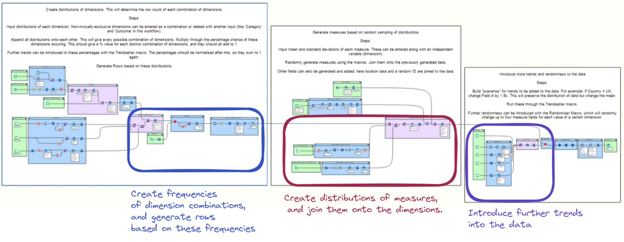
There are three main stages in my workflow framework, which roughly correspond to the three points in the section above:
Section 1: Creating the frequencies of dimension combinations. The output of this stage is every possible combination of dimensions, with a frequency (between 0-1) attached to each. Rows are then generated in line with these frequencies.
Section 2: Creating distributions of measures. These are generated based on mathematical distributions and then joined to the rows generated previously.
Section 3: Introducing trends into the measures of the dataset.
Creating Frequencies of Dimension Combinations
In the first section, we generate all combinations of dimensions at their desired frequencies. This gives us the rows of our dataset that we can then add additional fields onto. To do this, we first need a frequency table with every possible combination of dimensions and its frequency.
We can then introduce some more trends into this table, before generating all of the rows. Here is what this part of the workflow looks like:
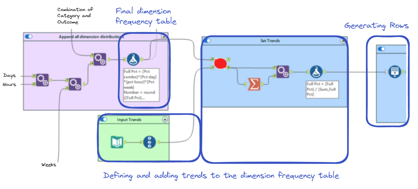
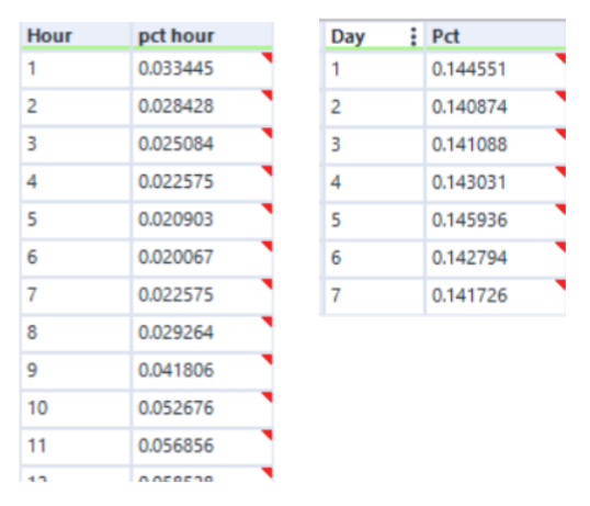
The "Append Fields" tools on the left are what create every possible combination of dimensions. The first two tools take real-life distributions of EMS time series data like this:
The third "Append Fields" adds this table:
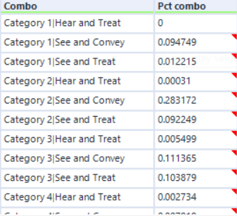
As the "Category" and "Outcome" dimensions have a strong relationship, I decided to add them as a single field and to split them apart later. In theory, the relationship between them can be added in the next step - however I found it was sometimes easier to add relationships between strongly grouped variables sooner rather than later.
These "Append Fields" tools build the final frequency table:
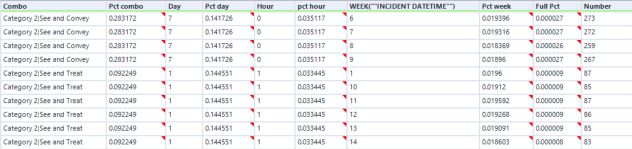
By multiplying all of the "Pct" columns, we can derive the frequency of each combination of dimensions. The next step adjusts these frequencies to add desired trends. I will talk more about the macro it uses later and will just show you the input now:
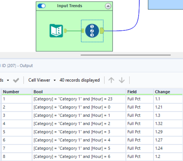
Here I am adding a trend: More severe calls are relatively more common at night, and less severe calls are relatively less common. The macro conditionally changes the "Full Pct" field based on the "Bool" field.
We then multiply this "Full Pct" field by the desired total number of rows to determine the amount of rows to generate for each combination of dimensions.
Generating distributions of measures
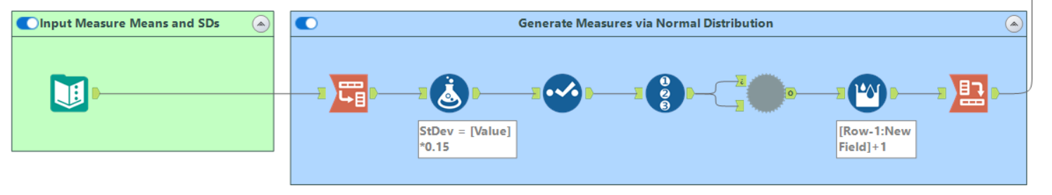
The next step is to make our four measures - this is the part of the workflow responsible:
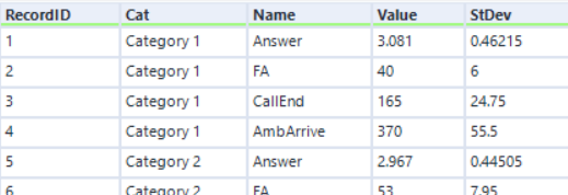
After some data prep, the input to the macro looks like this:
As "Category" has a strong relationship with our metrics, I again chose to separately define Mean and Standard Deviation values for each category. Also like before, this could be added in the next step but would probably be more work.
The batch macro then generates many rows for each Category-Metric combination according to the mean and standard deviation chosen. It does this using the simulation sampling tool:
The output, after a bit of transformation, is a dataset of normally distributed measures:
These can then be joined onto their respective categories.
Generating realistic trends in our measures
At present there is only one trend in our measures - related to the "Category" field. A realistic dataset should have far more. This section of the workflow introduces conditional changes into the measures to form trends in the data. The section looks like this:
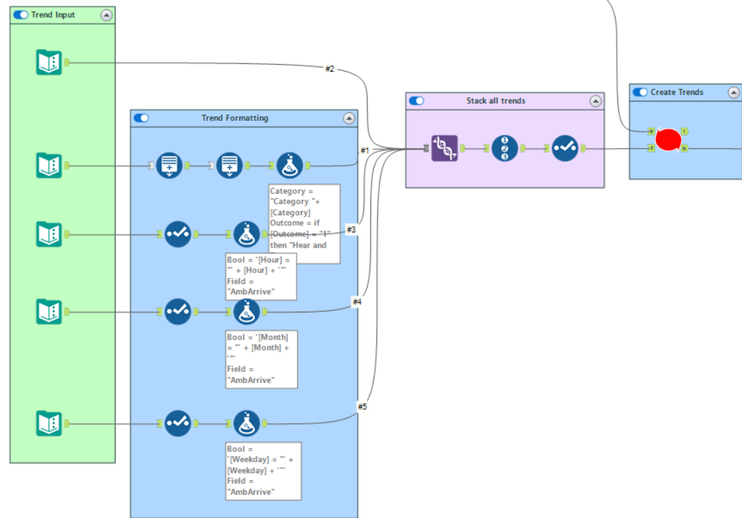
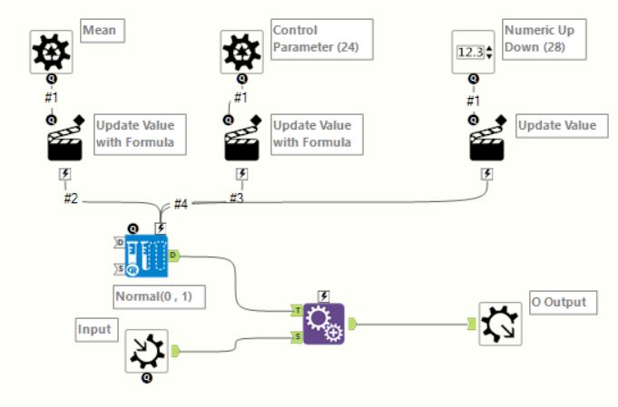
The input into the "Create Trends" macro looks like this:
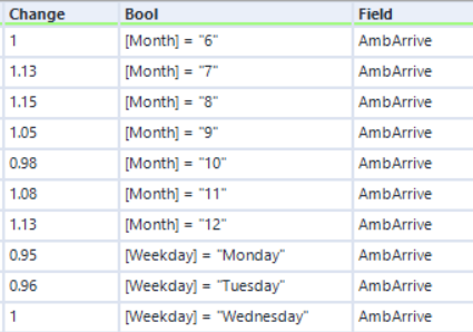
Conditional on the "Bool" field, the macro will multiply the "Field" by "Change". Applying this across many dimension values changes the mean and standard deviation of their associated measures, but retains the normal distributions. In total this workflow currently applies about 500 rows of trends, but this can be extended almost indefinitely. This is where complex trends, dependent on multiple dimensions, can be created and applied.
I won't discuss the macro in too much detail. Briefly, it is an iterative macro that uses the CReW Macro "Dynamic Formula" to iterate through the trends and apply them to the data.
Some additions to the dataset workflow
This completes the backbone of the workflow, but I will briefly discuss a couple more things that I added:
An existing location dataset: In order to make my locations realistic, I used existing location data from a real fire department call centre dataset.
A unique ID: For this I generated numbered rows, randomised the order using the rand() function and a "Sort" tool, and joined these to the dataset.
Further randomisation: In order to make the dataset feel a bit more random, I created a macro to slightly adjust the mean values of each measure for a chosen dimension. The macro "groups by" the chosen dimension and multiplies the measures in each group by a different random number between 0.83 and 1.17.
I should also mention that Alteryx is not always the best tool for additions to the dataset. It is very good at quickly creating measures and trends, but lacks some useful functionality when it comes to fake datasets. For things like fake names, emails and addresses, check out Mockaroo or the Python package Faker.
The Outcome
Here are some Tableau visualisations demonstrating the dataset:
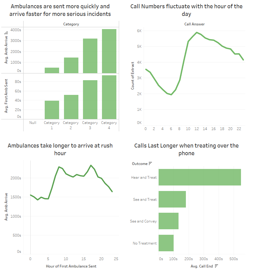
This dataset still lacks the many deep, realistic trends that would make it truly realistic. Adding these using my method is still quite manual - which is probably its biggest issue. There is likely a way to automate the addition of deeper trends, but it will come with the sacrifice of realism and will likely result in quite random datasets.
I hope this way of thinking about fake dataset generation has been helpful to someone. If you have any questions or want a closer look at the workflow, feel free to get in contact with me!