


That dimensions are blue and measures are green in Tableau is a common misconception. I thought it was as simple as that too when I first started using Tableau. Now, as I revisit fundamental concepts in preparation for the certification exam, I thought to write a blog post to clarify these crucial elements.
Blue vs. Green
The colours correspond to how Tableau represents data in the view depending on whether the field is discrete or continuous.
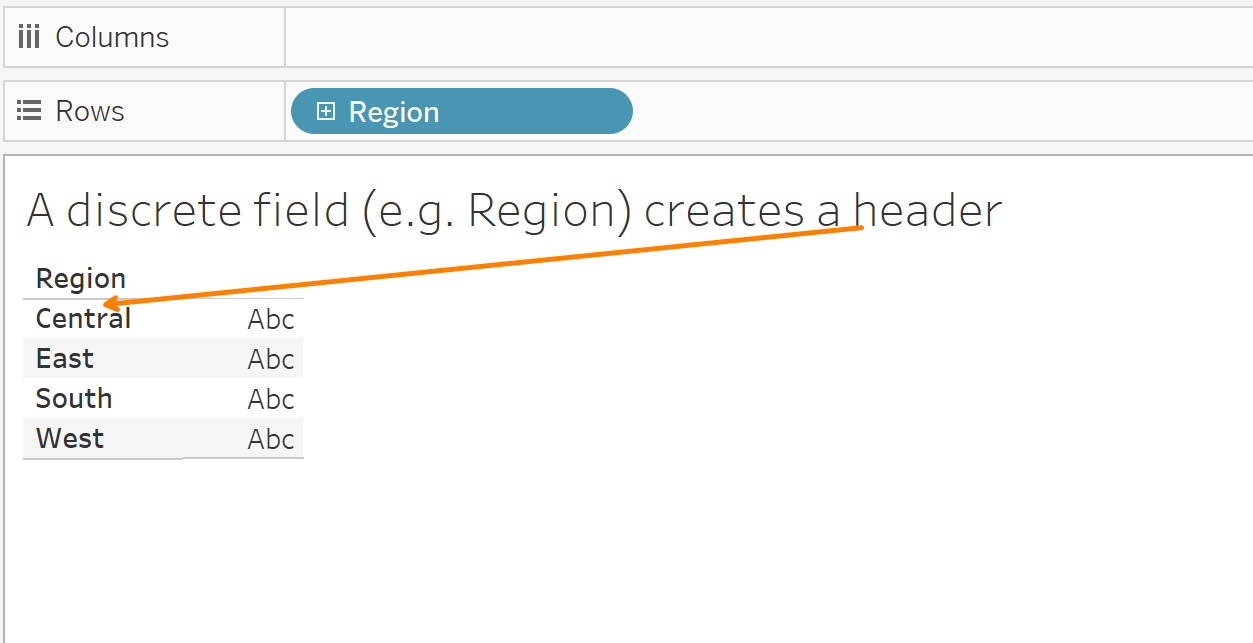
- Blue pills correspond to discrete data. Discrete means "individually separate and distinct." Discrete fields contain a finite number of values, for example the field REGION may contain the values North, South, East & West, but no others. When a discrete field is put on the Rows or Columns shelf, a header is created in the view, as shown below:
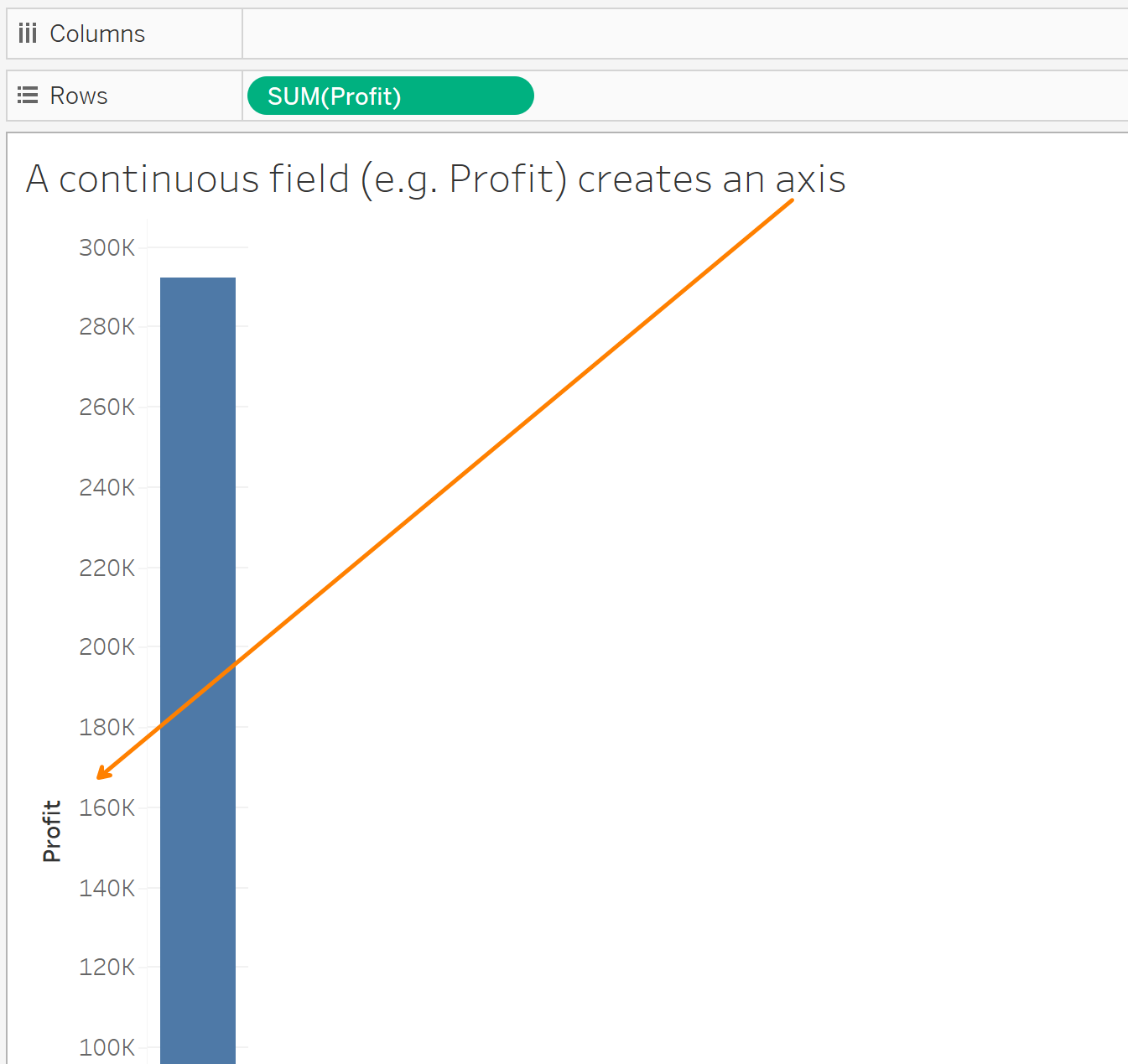
- Green pills correspond to continuous data. Continuous means "forming an unbroken whole, without interruption". Continuous fields could contain an infinite number of values, for example the PROFIT for a product could be any value along a number line. When a continuous field is put on the Rows or Columns shelf, an axis is created in the view.
Dimensions vs. Measures
Dimensions and Measures correspond to the type of data a field contains.
- Dimensions contain qualitative values, often members of a category. Examples include names, product segments, regions, etc. When you drag a dimension into the view, it splits up data points in the view.
- Measures contain numeric, quantitative values that you can measure. Examples include sales, profit, etc. In Tableau, measures are aggregated by default. When you drag a measure into the view, it aggregates (e.g. COUNT, SUM, etc.) values in the view.
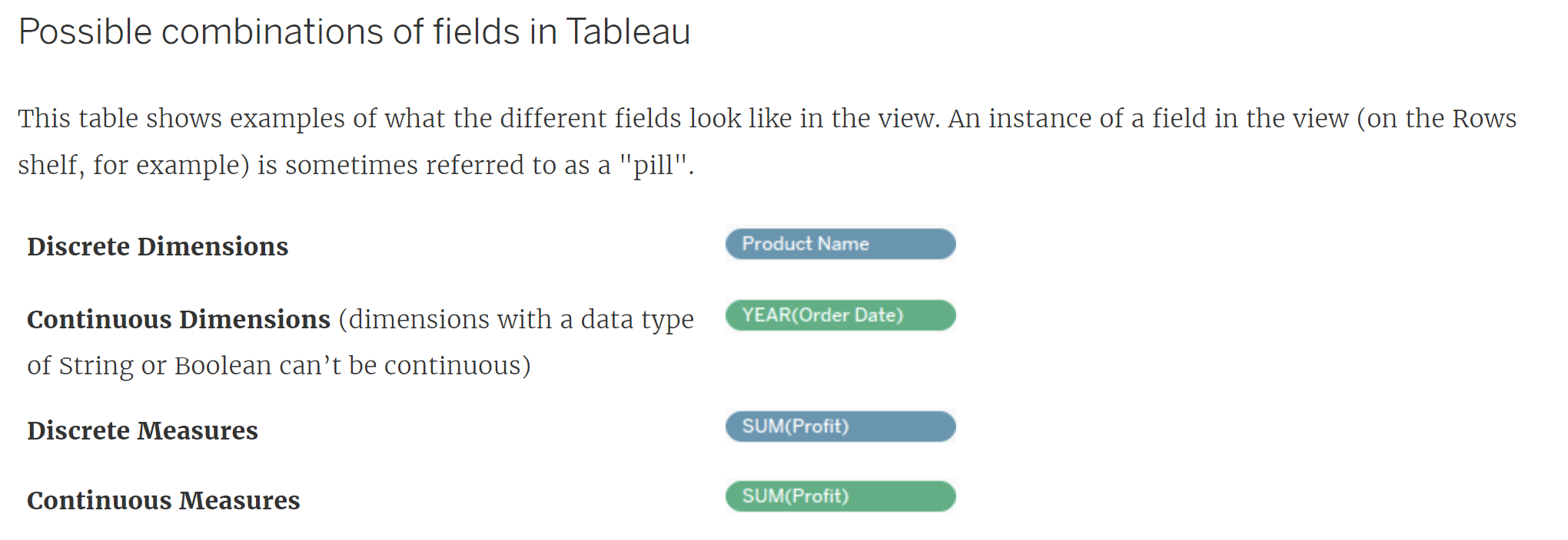
Now, most dimensions are blue (i.e. often discrete), and most measures are green (i.e. often continuous). But it's possible to have a continuous dimension (e.g. Year), or a discrete measure (e.g. quantity). Below is a handy illustration from Tableau showing the different possible combinations of fields:
What about Dates?
Dates are dimensions, and they can be either discrete (blue pill) or continuous (green pill).
The charts below compare sum of sales by month, when the date is discrete vs. when it's continuous.
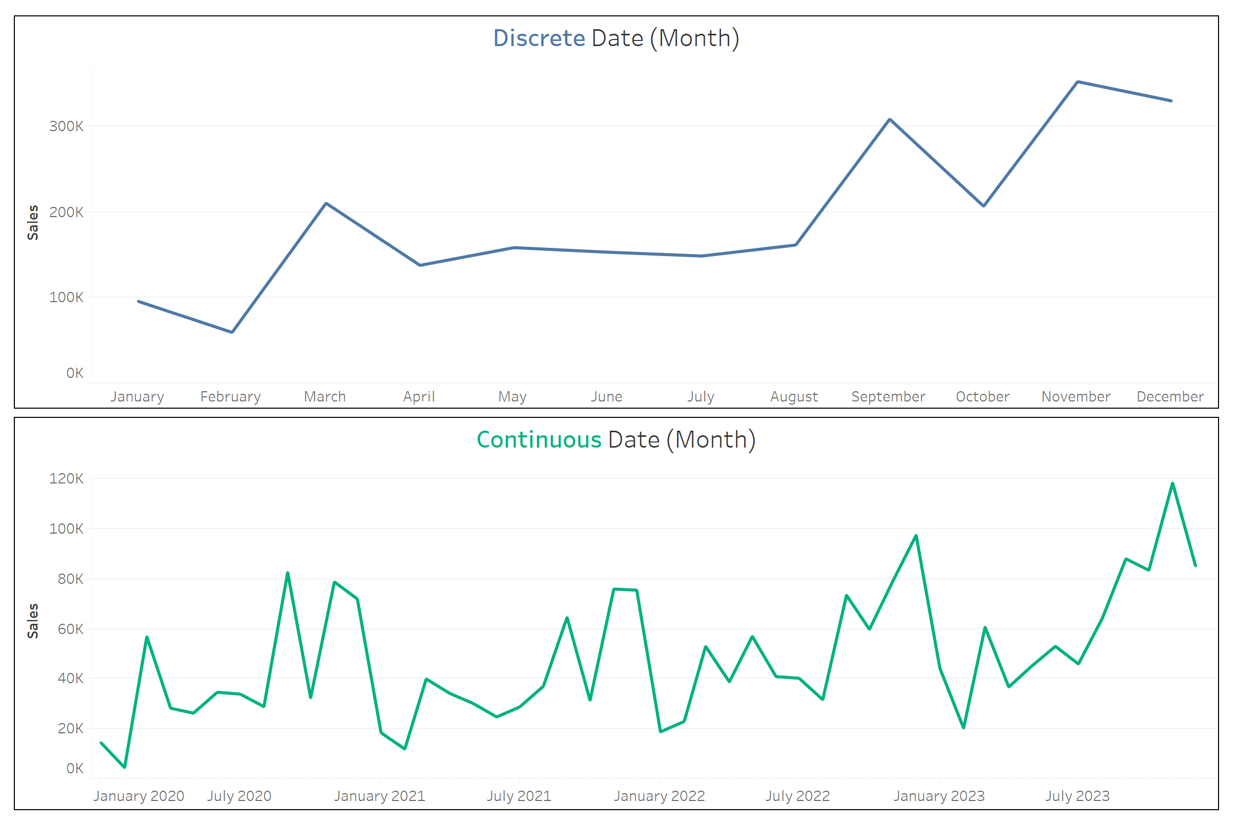
- When the date is discrete, the values for the sum of sales are grouped by the requested "buckets." In this case, all the sales are summed up to the month level so that the first data point on the line chart, for example, shows the sum of sales for all of the Januarys in the dataset.
- When the date is continuous, we see the sum of sales by month throughout the whole time time period, in this case from January 2020 to December 2023.
To summarize:
Blue (discrete) vs. Green (continuous) have more to do with aggregation, whilst Dimensions vs. Measures have more to do with the view. And to adapt Timothy Manning's summary:
- Blue things group your data
- Green things count (or aggregate) your data
- Dimensions split up the view
- Measures fill the view
More resources to learn more about the distinction and nuances: