


Today's dashboard week task was a fun one: creating dashboard templates for Tableau and Power BI.
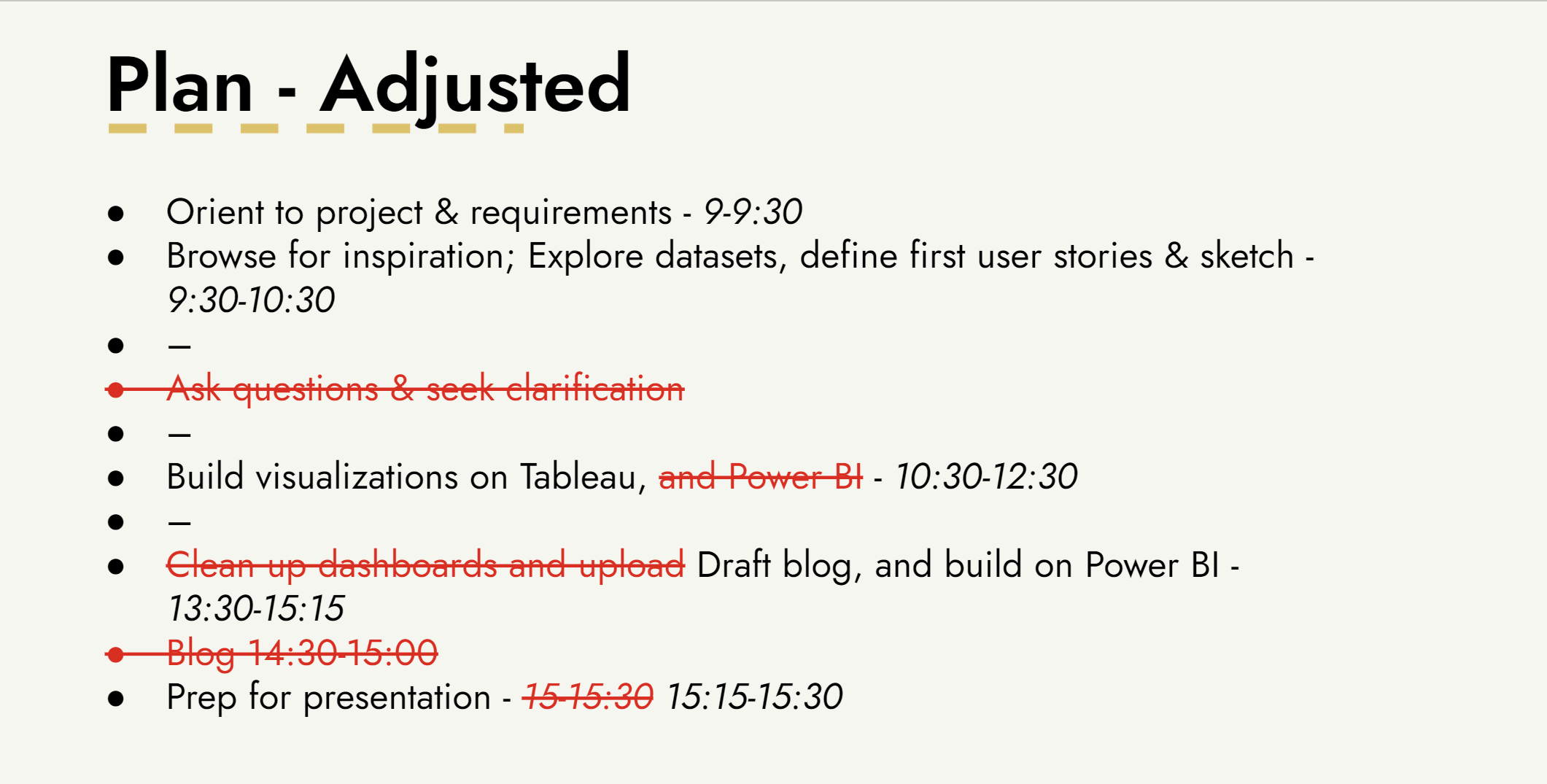
I kicked off the day with putting together a plan, which I updated throughout as the day went on:
Project and Requirements
I'd heard of dashboard templates before today, but I wasn't sure exactly what they are and what purpose they serve. After some light research, I found the following useful summary:
A dashboard template refers to a pre-designed layout or structure that serves as a starting point for creating a dashboard. It typically includes predefined components such as charts, graphs, tables, and other data visualization elements. These templates are designed to be customizable, allowing users to tailor the dashboard to their specific needs by adding, removing, or modifying elements.
Using a dashboard template can save time and effort in the dashboard creation process, especially for individuals who may not have extensive design skills. It provides a structured framework that can be adapted to various data sets and reporting requirements.
For this project, our templates were to meet the following minimum requirements:
- Title and Subtitle design outlining font type and sizes
- Spacing guidelines outlining inner/outer padding (to allow for appropriate white space)
- Colour scheme considerations
- Example charts & KPI's - provide as much scope for insight as possible, e.g., add context to KPIs with YTD/MTD's and trending indicators, etc.
- Interactivity examples (on hover, click and/or drill-throughs)
- An information button, image or separate dashboard page that outlines how to use the template
- A footer containing your designer's signature
Sketching
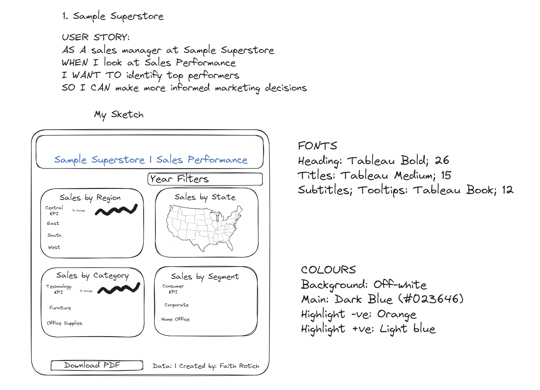
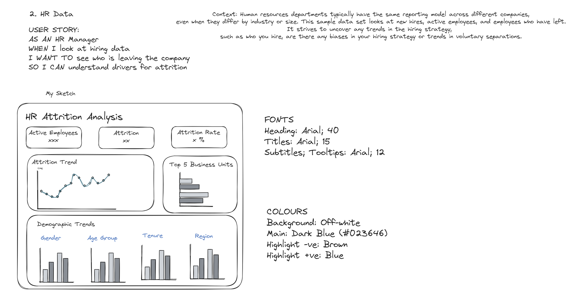
Before sketching, I started with defining some user stories for my dashboards. These were the sketches for Tableau and Power BI respectively:
Designing
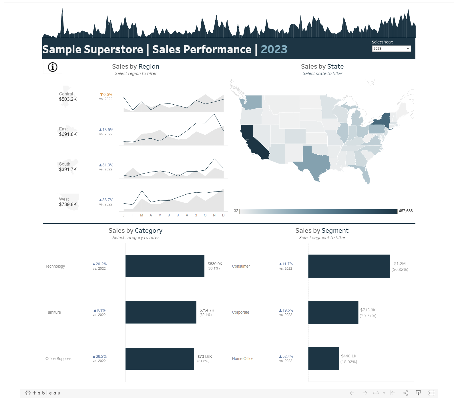
And when it came to building out the actual designs, I spent a lot more time than ideal on the Tableau template. Which meant that I was short on time to make the Power BI version properly interactive and a useful template. In any case, I'm pleased with the intermediate deliverables I arrived at!
- Tableau: Screenshot below, and link to viz on Tableau Public here.
- PowerBI:
Takeaways
- Things often take a lot longer than I anticipate, so I should create more buffer in my plan.
- Should have started with Power BI as I'm a bit rusty on it. It has been only a month since I created on Power BI, which means that if I don't practice using it more often, I'm at a risk of losing those skills. So, I'm planning to create more opportunities to practice building on Power BI as often as possible.