


To kick off dashboard week, we learned about designing Tableau for everyone, and were tasked with re-designing dashboards to be more accessible, inclusive and universal.
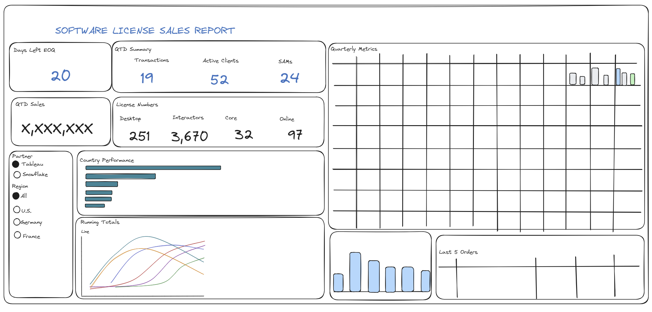
Harvey and I worked on redesigning a license sales dashboard (sketched below) to be used by both current and future staff, and be accessible to someone with dyscalculia.
Our plan for the day was as follows, accounting for what changed as we worked through the various components:
- Orient to task and make a plan for the day: 11-11:15
- Research on dyscalculia and design considerations: 11:15-11:30
- Review dashboard to re-design and identify the most important charts: 11:30-11:45
- Ask questions and seek clarification from Louisa: 11:45 to noon
- Sketch re-design of dashboard: noon - 12:30
- Build dashboard re-design: 13:30-
14:15until 14:55 Finish up blog posts: 14:15-14:30We didn't make it around to this until after the presentation : /- Presentation rehearsal:
14:30-15:0014:55-15:00
Introduction
Dyscalculia, akin to dyslexia for mathematics, is a persistent difficulty in understanding numbers. Individuals with dyscalculia struggle with mathematical concepts, interpreting symbols, and performing basic calculations. For adults with dyscalculia, managing numbers, interpreting data, and understanding graphs present significant challenges.
Symptoms of dyscalculia - that are related to understanding data and dashboards - include:
- Difficulty understanding graphs or charts
- Struggling with spoken math equations
- Skipping or transposing numbers in lists or spreadsheets
- Challenges using Excel formulas
- Reliance on fingers or tally marks to keep track of numbers
Re-designing
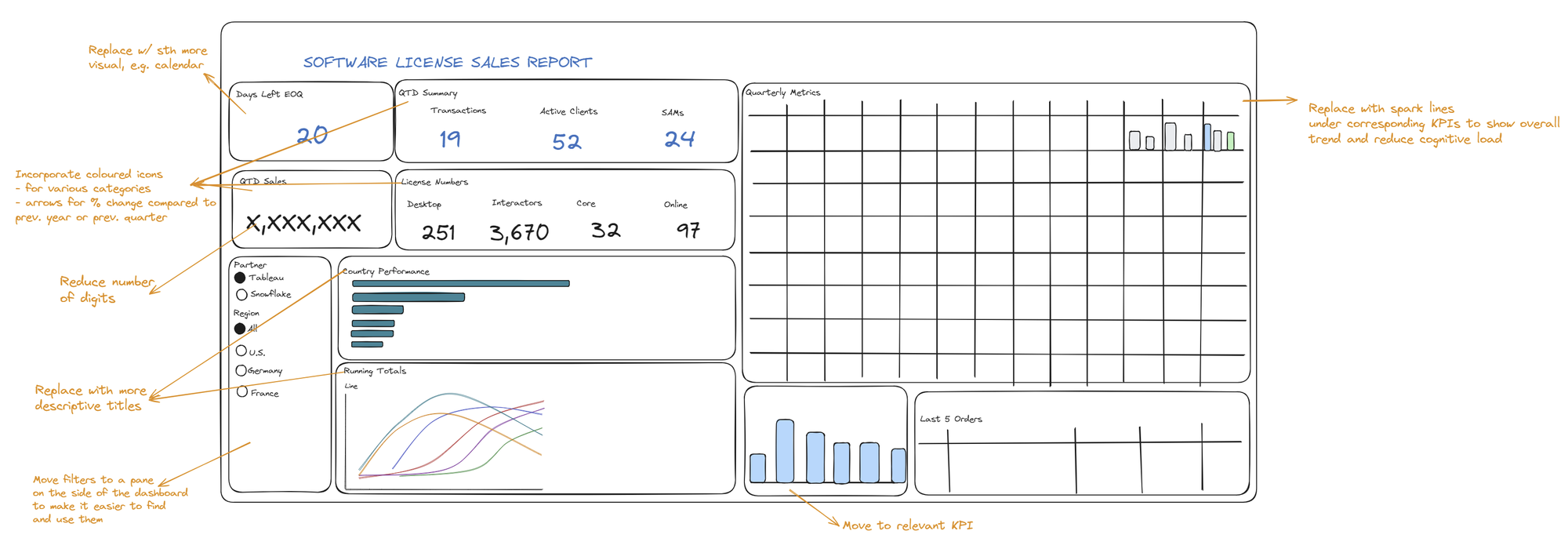
When sketching the dashboard re-design, we wanted to consider the following:
- Provide more descriptive titles for clarity and reduced cognitive load
- Express fractions or percentages in simpler terms (e.g., 'one out of three people' instead of 33%)
- Use visual elements like bars and progress charts to convey proportions
- Consider incorporating images alongside or instead of numbers
- Organize the layout into separate containers for related metrics, enhancing navigation
- Simplify KPIs by rounding numbers and offering exact figures in tooltips for precision
Given these considerations, these were the changes we wanted to make to the initial dashboard:
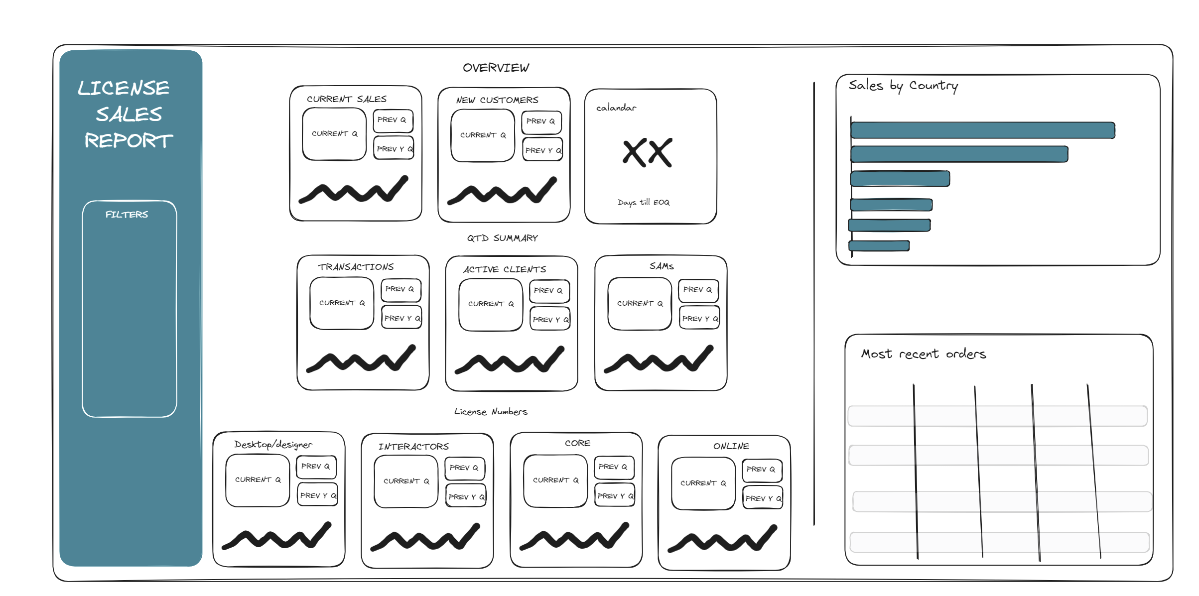
When it came to building the re-design on Tableau, we were short on time because we realized we needed to re-create most of the charts and relevant calculations from scratch. In any case, below is the eventual re-design we were aiming for (we were able to build about a third of it on Tableau):
Reflection
While re-designing the dashboard, I realized that we weren't just catering to a specific neurodivergent need; we were fundamentally improving the design for everyone. This shift in perspective underscores the broader significance of creating accessible and user-friendly dashboards that benefit diverse audiences.