Picking colours for a data visualisation project is a process I often enjoy, although one I sometimes find overwhelming. This week, we dived into what makes a great dashboard when it comes to colour. The golden rule is simple: Use colour sparingly.
If you need multiple colours to distinguish various elements within your dashboard, here's a handy guide to help you decide on a set to use:
- Main Colour: This is a neutral hue that serves as the main backdrop for your dashboard or charts.
- Positive Colour: Use it to show positive values like increased profits.
- Negative Colour: It's for negative values, like decreased sales.
- Highlight 1: This is a colour that stands out and complements the main hue, used to draw attention to the most important insight(s).
- Highlight 2: Similar to the first highlight, this is used when there's another layer of information you wish to call attention to. For instance, to show users what's selected when a filter or parameter is in use.
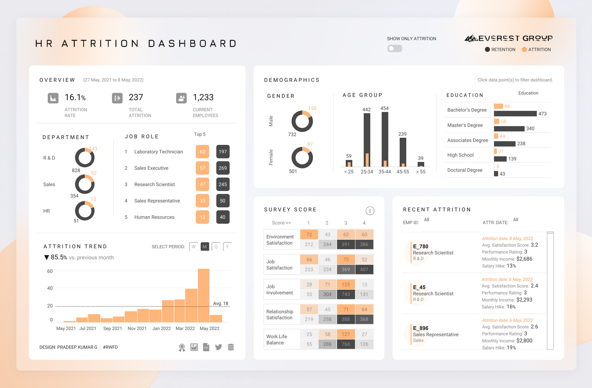
The number of colours you choose depends on your specific dashboard, and you might not need all five. Sometimes, just a main neutral colour and one highlight will do the job, or perhaps two. A great example of this approach can be seen in Pradeep Kumar's dashboard below, where he uses just three colours:
- Main: White
- Highlight 1: Dark Grey
- Highlight 2: Orange

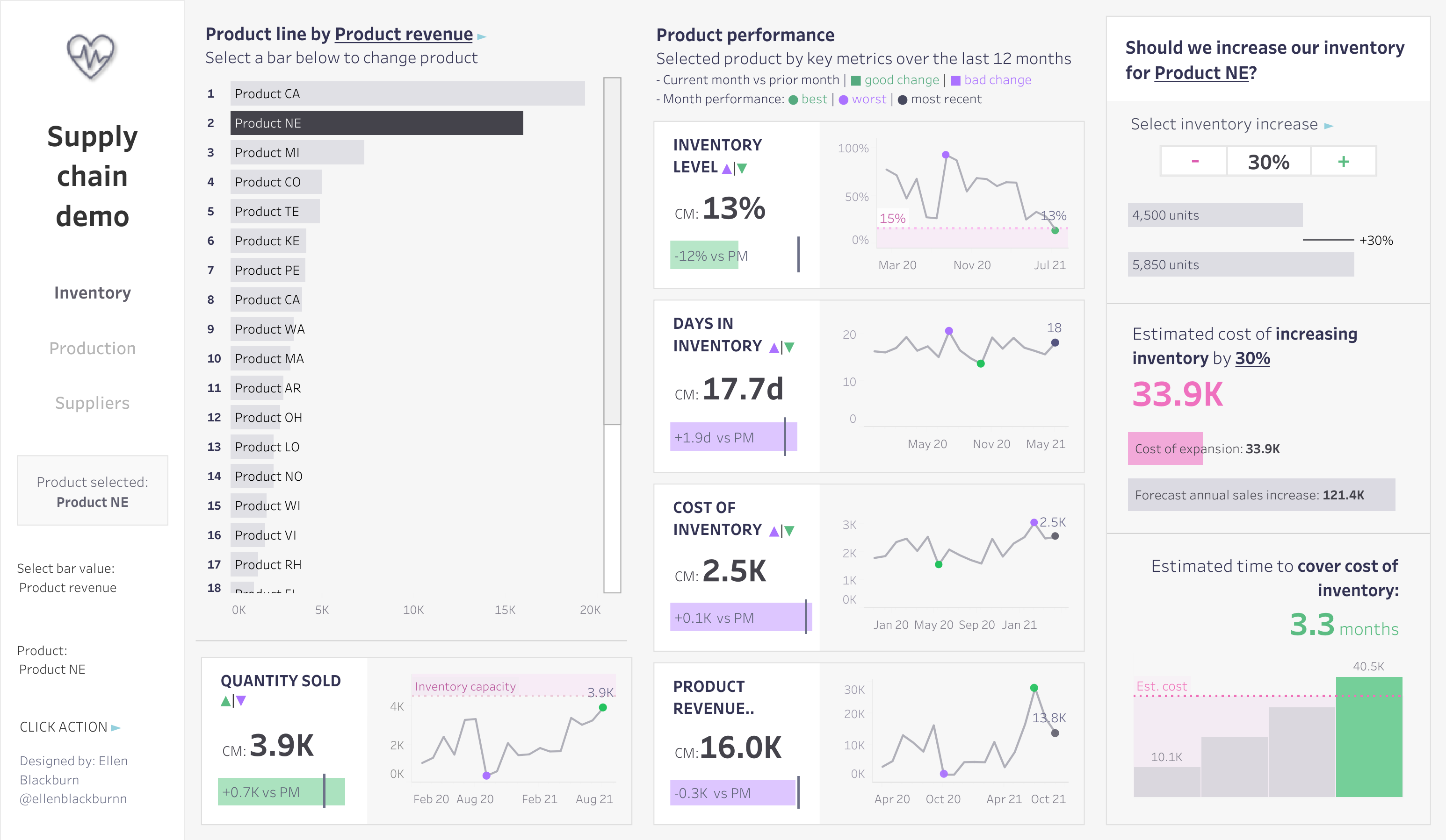
Below is a different example from Ellen Blackburn's dashboard where she uses five colours:
- Main: Grey
- Positive: Green
- Negative: Lilac
- Highlight 1: Pink
- Highlight 2: Dark Grey

Now, let me share some helpful resources that have guided me when picking colour palettes or at least served as a starting point:
- Eyedropper - A browser extension which allows you to pick colors from the web. It's a great tool to use when, for example, you want to adapt a colour from someone else's viz on Tableau Public!
- Microsoft PowerToys - A tool with a colour picker that works like eyedropper above, but works offline and comes with other handy utilities as well.
- Coolors - A colour palette generator, for when you want a set of colours that work well together.
- Adobe Colour Wheel - Another colour palette generator that makes it easy to start with one colour you like, and create others that are complementary, analogous, etc.
- Colour Brewer - A diagnostic tool for evaluating colours to use on maps.
Happy colouring!
