


Download workbook here: https://public.tableau.com/app/profile/eugenialgm/viz/Timelineofanimallifespanincaptivity/Dashboard
I came across this really interesting dataset on the life expectancy of captive animals and decided I wanted to make a dashboard out of it. I started by looking at the data and designing how I wanted the final product to look, and as I was sketching it out I thought the best way to represent this info was a timeline. Because I wanted it to be an aesthetic dashboard I chose to make a curved timeline and ideally make it look like a river the animals were walking along, but if you've ever made one of these charts you know its really not that simple to make, so adding the decorative elements was just going to make it even more complicated.
I started playing around on tableau and at first I tried using a template I had found on Tableau public which was really nice and I recommend you use if you just want a simple curved timeline, but it did not work with my data as it would not plot decimal numbers which my lifespans were in.
So next I went back into tableau and just tried plotting the animals along a normal axis to see how it would look and making sure the sample animals I was using didn't overlap, and this is when the idea kicked in, I could just connect these normal timelines with Figma!
ANSWER
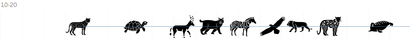
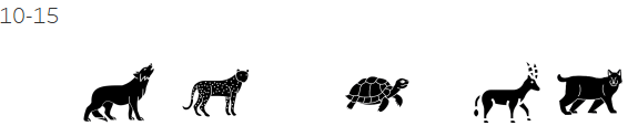
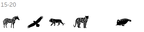
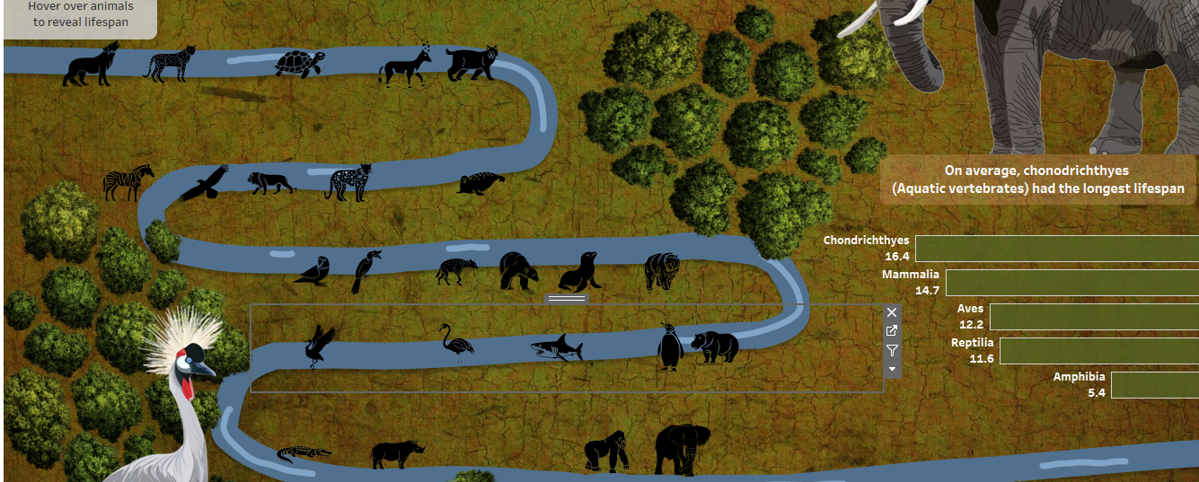
1) I started by plotting the animals over three separate ten year timelines and making sure everything was spaced out and nothing overlapped, as well as adding any extra animals where there was big spaces.
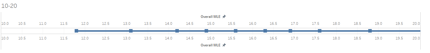
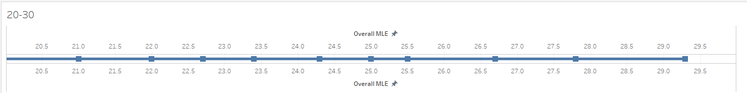
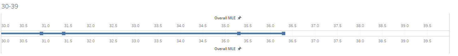
2) I removed all the axis from the view

3) I imported all the animals icons into my tableau shape repository. I got them all from my favorite free icon website called "The noun project". I also removed the back line and split them into 5 year lines to make it easier for myself when placing on the dashboard but these are both optional steps depending on what you want your dashboard layout to be like.
4) I created the river drawing in Figma and then just imported the image as a background to my dashboard
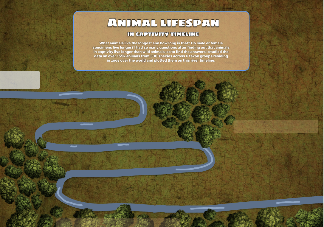
5) I floated the animal timeline worksheets on the river banks, making it look like this:
As you can see doing it this way made it super easy and allowed me to tailor it to exactly how i wanted it to look in the dashboard. My advice is that when you are trying to build something in tableau you don't just get stuck on the technical side of chart building, but also think outside the box and question what other ways I can achieve the desired outcome, as when you combine tableau with other tools you can build anything you can imagine really easily!