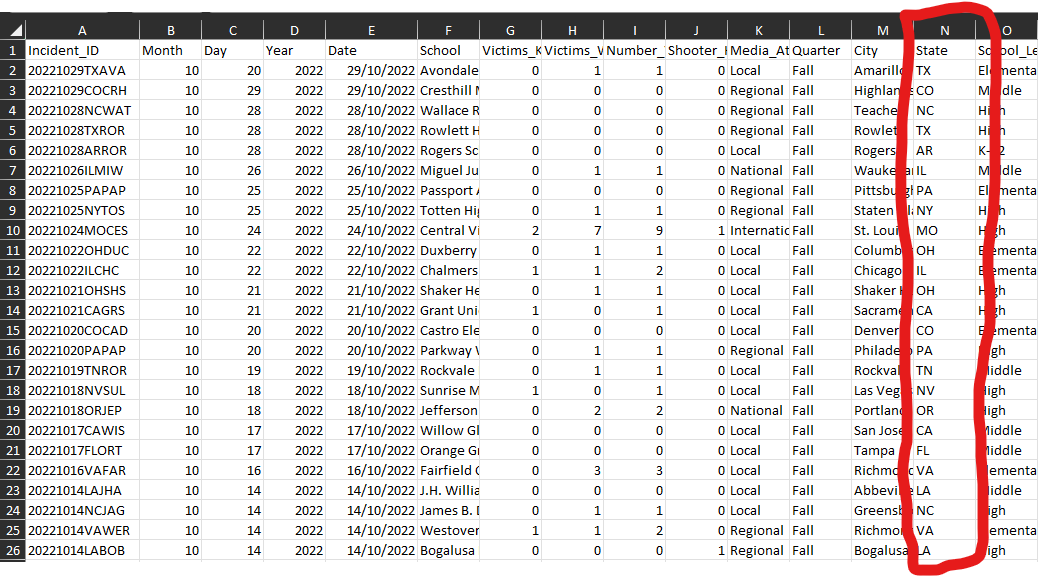
Today as I was completing the #makeovermonday challenge number 48, I really wanted to drill down into what states were the most dangerous in term of school shootings and have a colored intensity map. However, the initial data set looked like this:

My main problem was that the state column only had the state codes, which is an issue when loading into tableau desktop as it will not recognize the locations to create a map view.
For this reason, I had to manipulate the data. First thing I did was type in to google "list of US states and code equivalent", which took me to this page. From here I copied and directly pasted the full list into Alteryx. I also included the original database I was working with.
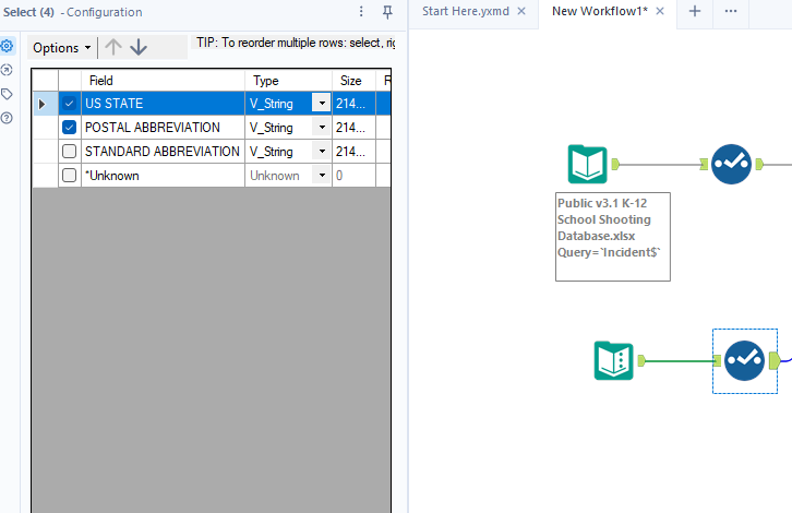
I also cleaned the pasted data by removing the standard abbreviation which was of no use to me in this occasion with the select tool like this:

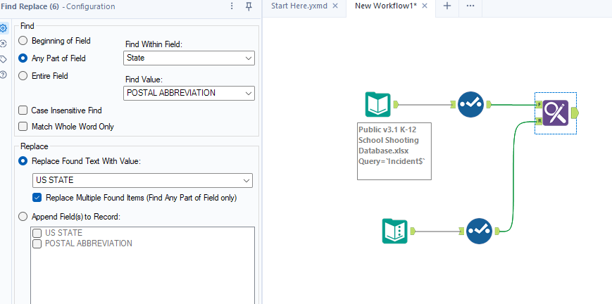
Finally, I hooked both data branches with a find and replace tool as so:

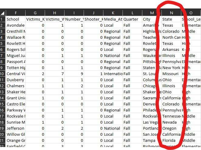
And voila! your final output shopuld now look like this:

