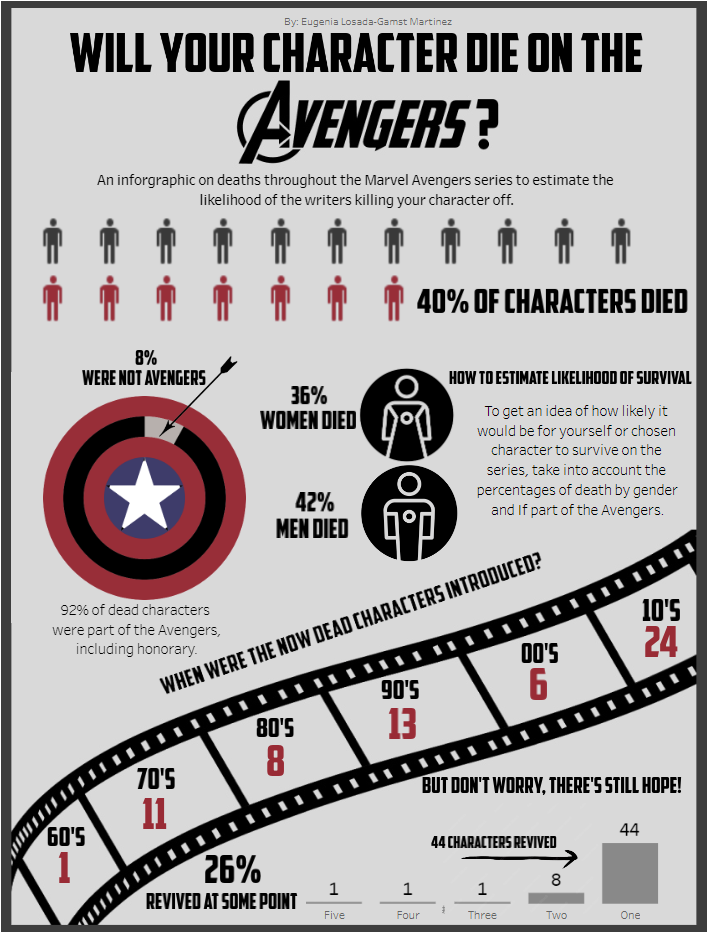
As part of dashboard week, for the third day we were set the challenge to create an infographic. For this we used the following dataset on Marvel comic Avengers deaths:
https://data.world/fivethirtyeight/avengers
As a great coach (Carl) once said, the best artists are good at getting inspiration from others, so I went onto Pinterest and tableau public in search of infographic inspiration.
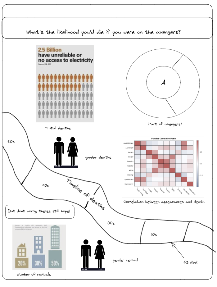
After looking at both the data and inspiration, I started planning what I was going to build as I had limited time. For this I made an excalidraw plan to go off of when building
The plan was to create an infographic with which you could estimate the chances of survival for either yourself or your favorite Avengers character by multiplying percentages.
FIGMA
I created this very simple figma background to put all my charts on:

BUMPS ALONG THE ROAD
-The year data in the data set only included when they were introduced and not when they died so I had to adapt that section.
-When I tried to make the deaths to appearances correlation I found that with the fields I had there was no way to get something like the more you appear the more likely you are to get written off.
-Ran out of time to make the gender revival chart
-When I created the % of dead characters chart there were too many so I had to hop on to Alteryx , scaffold the data and then regrouped on tableau desktop.
THE FINAL RESULT