In the world of data-driven decision-making, effective data visualization plays a pivotal role. To draw meaningful insights from raw data, we need to do more than just drag and drop data points onto a chart. Simultaneously, it's crucial to avoid overwhelming visualizations with excessive data and unnecessary information. Keep these two key points in mind to ensure your charts effectively communicate information and insights to your intended party.
1. Utilize Pre-Attentive Attributes
Pre-attentive attributes are visual characteristics that our brains can process visually almost immediately, before sending the information to the attention processing parts of our brain. These attributes are helpful in data visualization because they allow us to extract information and patterns from visual elements without requiring cognitive effort.
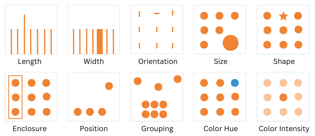
Below are examples of pre-attentive attributes that can be utilized in data visualization:

By utilizing length, width, orientation, size, shape, enclosure, position, grouping, color hue, or color intensity in data visualizations, you can guide the viewer's attention to key insights, facilitate comparisons, and help viewers grasp trends or patterns with minimal cognitive effort.
1. Apply The Data-Ink Ratio
The data-ink ratio is a principle that emphasizes maximizing the amount of ink (or pixels in digital visualization) that directly represents and communicates essential information, while minimizing any non-essential ink that adds no value to the visualization.
In other words, the data-ink ratio encourages removing unnecessary elements that don't contribute to understanding the data. This includes eliminating redundant labels, excessive gridlines, decorative additions, and other non-essential design elements.
Consider the following to apply the data-ink ratio:
- Simplify Labels and Text: Use concise labels and annotations that directly convey the information without unnecessary wording.
- Minimize Gridlines: Include only gridlines that help with precise interpretation of data
- Remove Non-Data Ink: Eliminate background patterns, decorative images, and any other elements that do not directly contribute to understanding the data.
- Utilize White Space: Provide adequate spacing between data points and elements to allow for easy interpretation without visual clutter.
