


Statistics help us understand our data in ways that headline figures cannot. An average on its own can be misleading; it may hide variation, extremes and patterns within different groups. By using statistical measures like quartiles, outliers and standard deviation, we can reveal how values are distributed and how consistent they are in the data. When these statistics are built into our visualisations, we gain deeper insight and greater accuracy.
In this blog post we'll focus on two powerful ways of showing distribution, boxplots and standard deviation, and specifically how we can build them in Tableau.
Boxplots
Boxplots mark the minimum and maximum, the first quartile, the second quartile (or median) and the third quartile. The box contains the whole interquartile range. Any outliers can be easily identified as they lie outside the "whisker". To build these in Tableau, we will use a dataset on London road casualties.
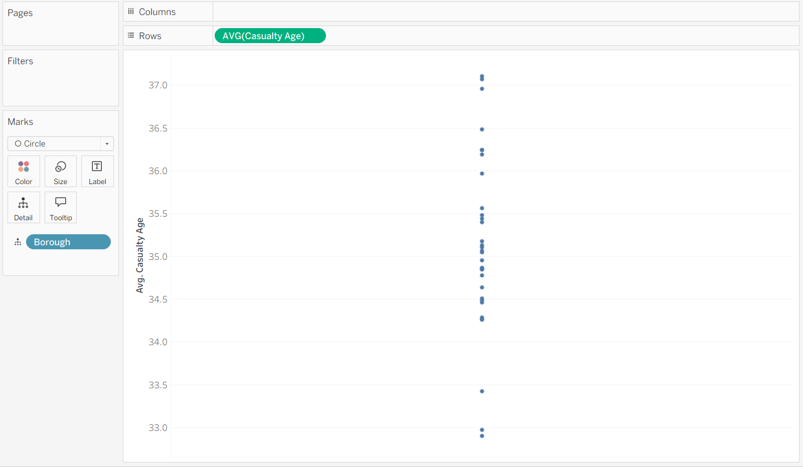
We want to see the average casualty age, and spread, of each borough. First, we need to drag the Casualty Age field to rows and average it. Then, drag the Borough field in to Detail.
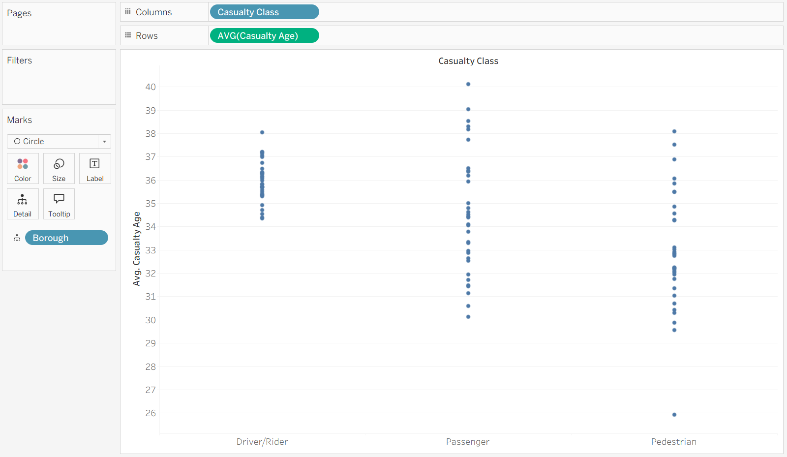
Once we drag the Casualty Class into Columns our data gets separated into the three categories.
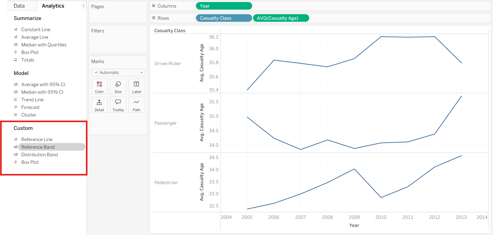
On the left-hand side we can switch to the analytics pane, where the Box Plot option lives.
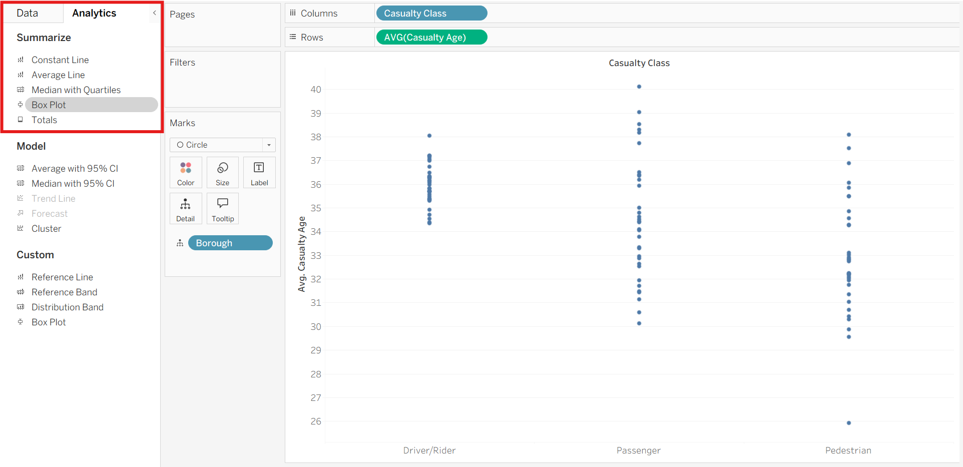
Once we drag that onto our worksheet and drop it on the 'cell' box that pops up, we finally have a boxplot chart.

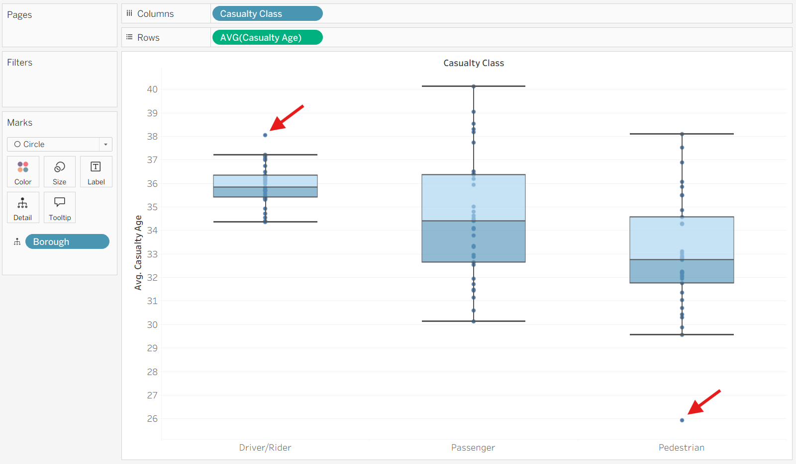
We can format these to make them easier to read, but we can already see different medians and spreads for each Casualty Class. We can also easily find outliers since they live outside the whiskers (marked with a red arrow).
Standard Deviation
Another great way of showing spread is using standard deviation which indicates how far the data points typically are from the mean.
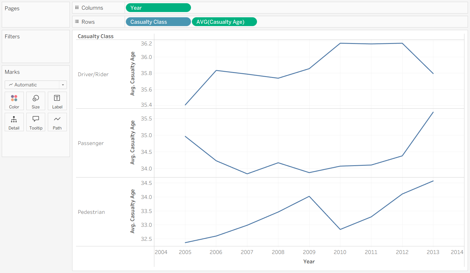
This time we're going to track how the Casualty Age has changed over time, separated by Casualty Class.
This time we will drag a Reference Band from the analytics pane onto the chart.
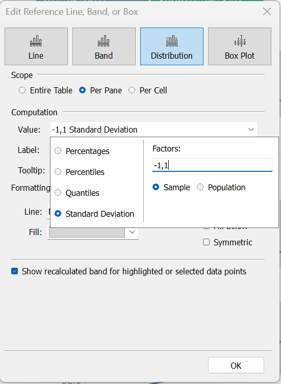
We select the Sample option because our data is not covering every single casualty that has occurred and is therefore a subset of the whole population. If your data represents the whole population, then you can select the Population option.
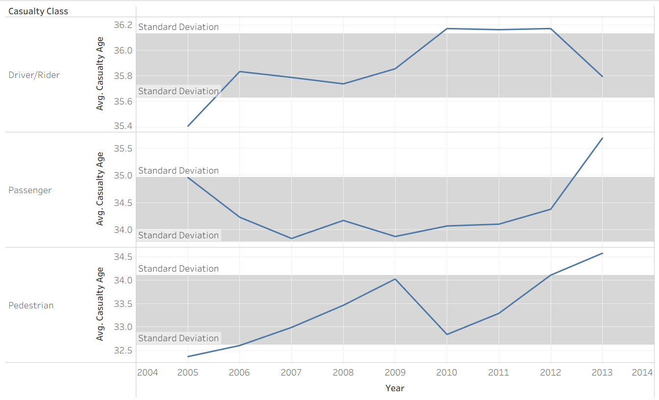
The shaded region represents the range of values that fall within one standard deviation of the mean, making it easy to identify years where casualty age deviated significantly from the average.
Both charts convey useful information, which one you use depends on what your user wants to know. Boxplots tend to be better for comparing distributions across different categories, while standard deviation bands can add context to trends over time. Overall, good statistical visuals will help the user understand variation and outliers at a glance.