


When visualizing data there are some essential practices that once you adopt will make your data not only more visually appealing but way more digestible.
Length/width
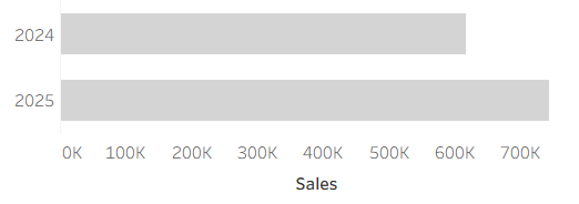
- Length allows the viewer to easily see the highest value.
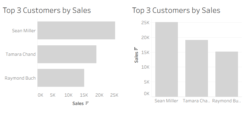
Orientation
Orientation is something to think about when you are making line charts as per the example below.
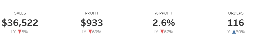
It's also a useful thing to use when showing general increase and decreases in data, for example KPIs shown below.
Shape
Shape helps viewers quickly distinguish between categories. Different marker shapes (circles, squares, triangles) make it easy to identify data groups without relying solely on color.
Size
Size draws attention to importance or magnitude. Larger elements naturally attract the eye first, making this a powerful way to emphasize key values or outliers.

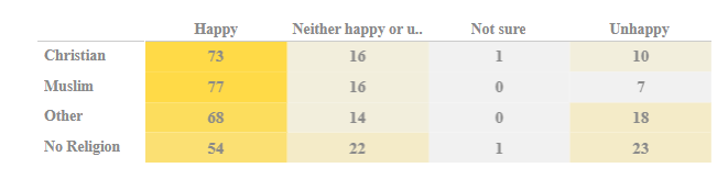
Colour
Colour differentiates categories and adds meaning when used intentionally.
Distinct hues help viewers quickly separate data groups - but it’s important to use color consistently and accessibly.
Hue
Hue can represents differences in value or category by using variations in colour. For example, in heat maps, changes in hue help viewers quickly identify intensity, patterns, and extremes within the data.
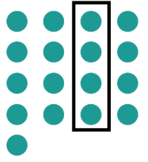
Enclosure
Enclosure uses borders, boxes, or shaded areas to group related information. When elements are visually enclosed together, the brain automatically interprets them as connected.
Note: make sure to be intentional with how you use pre attentive attributes. for example ensure you are not double encoding unless it genuinely improves clarity, your colour choices should be accessible and high contrast, and resist the temptation to overload a visual with too many cues.
When you understand and intentionally use these pre-attentive attributes, your data stops just being seen and starts being understood.