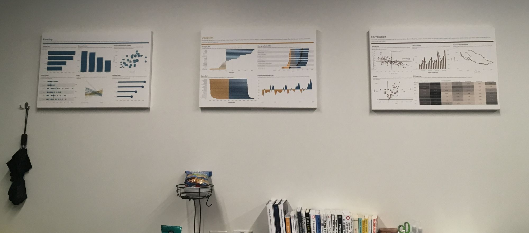
When I do not know how to visualize my data, I like to walk around the room. Andy Kriebel’s Visual Vocabulary is hung on the walls, so I approach each canvas and determine which visualization is best suited. After this decision, I come back to my work with renewed energy. ⚡

Last week, I had agile data of 10 sprints with the following metrics:
- Planning Effectiveness measures how effective a team is at planning, e.g. work they planned for the spring, remains in the sprint. It should ideally be at least 85%.
- Predictability measures how effective a team is at delivering planned work within a sprint.It should ideally be at least 80%.
- Volatility measures how much change occurs once a sprint plan is complete, e.g. work added/or removed from the sprint.It should ideally be 10% or less.
I was perplexed as to how to picture this data until I saw the Circle Timeline in the Changes over Time section. I returned to my seat to sketch in Excalidraw, which I wrote about in a blog post here.
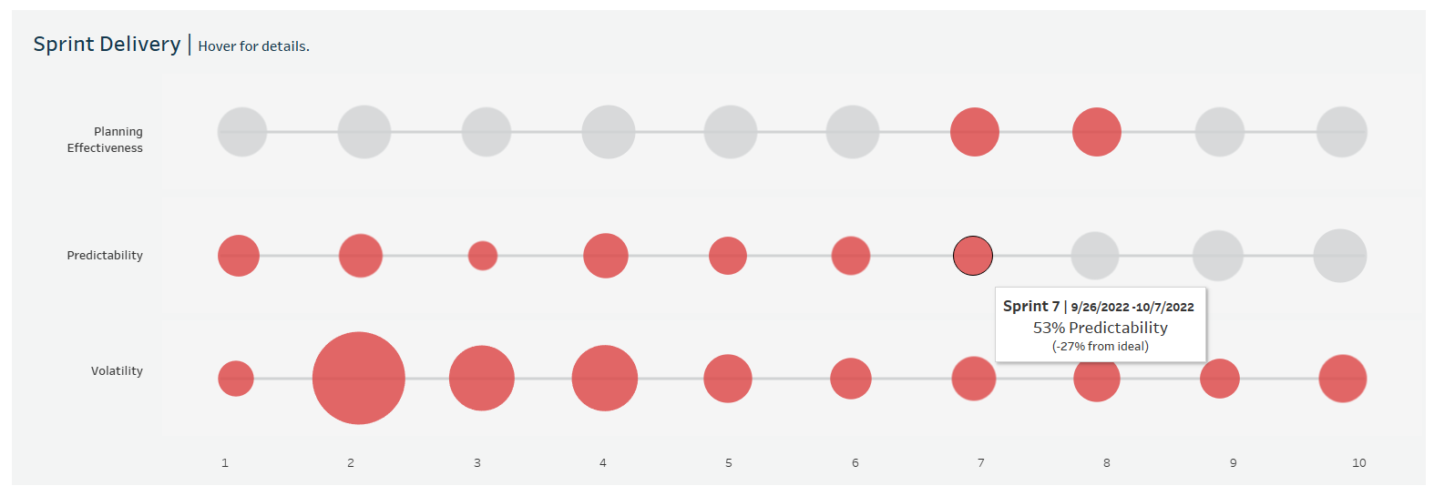
By referencing the Visual Vocabulary workbook, I was able to reproduce the circle timeline easily! It is a dual-axis chart - one axis for the circles and the other for the line. My work originally looked like this:
However, after feedback, I improved my circle timeline to offer more information. For example, I spotlighted poor agile metrics with color and included more detail in the tooltips:

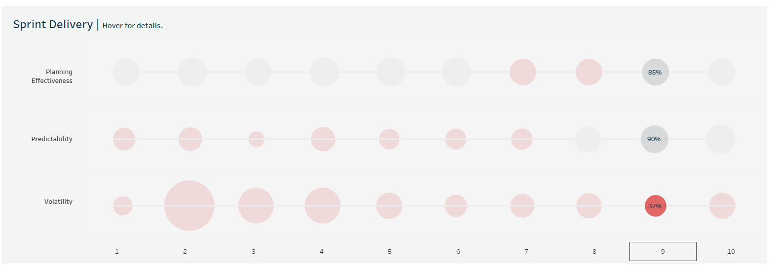
I also added a highlight action based on sprint number:

I never thought I would ever make a circle timeline because it seemed too niche. Nonetheless, I was delighted to adopt it to represent various agile metrics of sprint delivery! It was certainly effective in visualizing the consistency (or inconsistency) of measures across sprints.
