


Dashboard Week begins and day one is focused on accessibility. After today's training led by Collin Smith, Core Consultant and Lead Recruitment, we were given the challenge to create a dashboard on Fix My Street data with accessibility in mind.
This was the accessible dashboard I designed:
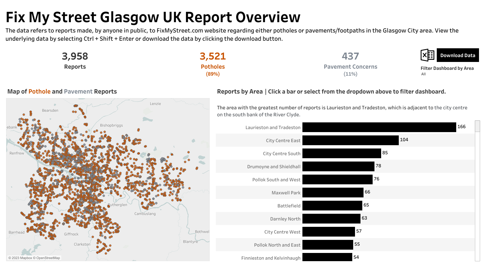
These are some of the considerations I made:
- Sheet titles that can be read by screen readers for the dashboard title and big numbers
- Larger text (at least font size 10!)
- Instructional language
- Usage of Tableau's built-in Color Blind color palette for high contrast
- Ability to download the data to view in Excel, which can be more accessible and definitely more familiar
- Two signals to download said data - one image button and one text button
- Reduction of visual overload in the map by stripping away background layers
- Removal of tooltips and locking the map because they will not be supported by keyboard navigation
- Main takeaway of the bar graph
- Caption underneath each visualization (in the background color of white and font size 1 so it can be read by screen readers, but not seen)
This wraps up the first day of Dashboard Week. 🙌