


I never want to look at candy again after this Dashboard Week Challenge. The data from the The Science Quarterly Review was more sour than expected. There were a lot of humorous questions, nulls, and inconsistencies between the four datasets. For example, two of the surveys asked for the respondent’s favorite font. (Mine is Georgia, if you’re curious.) Additionally, the 2014 data was more aggregated than its successors and included a Net Feelies metric, which is the number of JOY - the number of DESPAIR.
Although I downloaded the four datasets, I wanted to use the most recent data, take a page from Marie Kondo, and examine what "candy" sparks joy. I inputted one dataset, pivoted it, and cleaned it. There were a lot of fun responses in the data, such as Green Party M&M's, Independent M&M's, and Hugs (actual physical hugs), some of which I kept (for fun!!). I also filtered the data to just American responses as I wanted to focus on my fellow American people. Essentially, I made executive decisions to limit my scope.
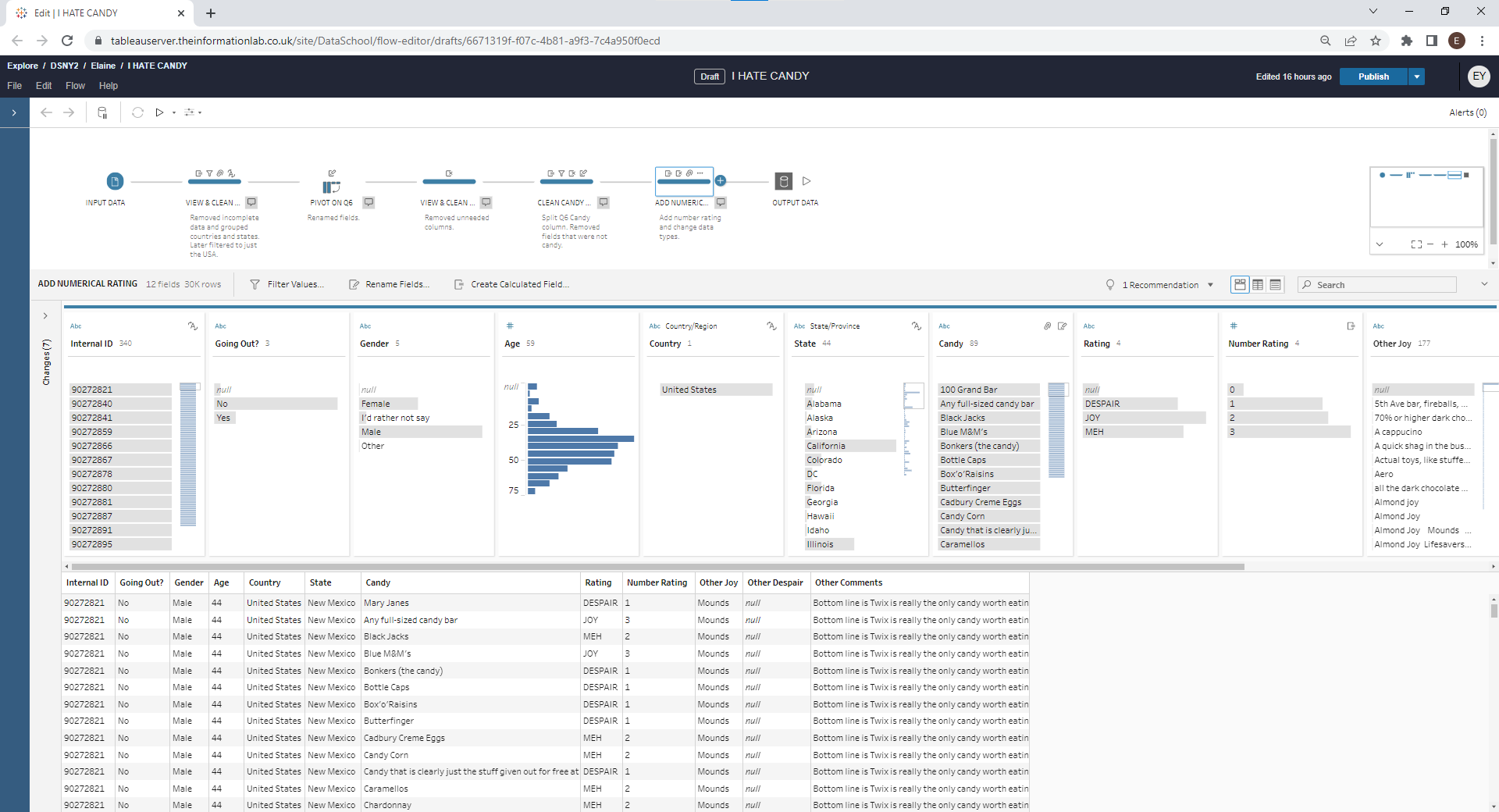
Ultimately, my workflow was rather simple, but it did the job:
The outputted data was transformed into the following dashboard:
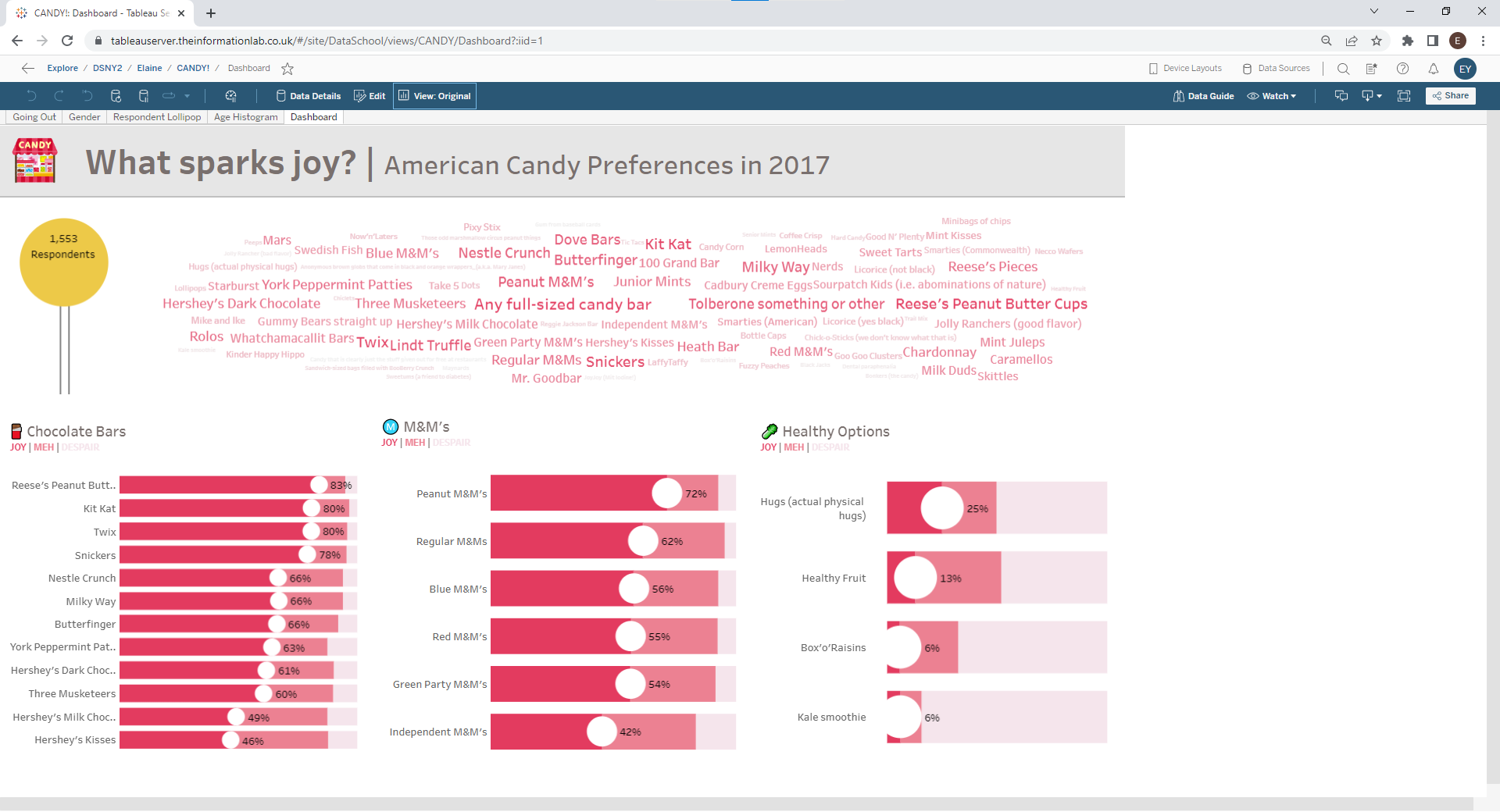
I know I used a controversial yet bold word cloud, but this is survey data with built-in silliness and this dashboard is meant to be amusing! Due to the theme, I also included a lollipop chart showing the number of American respondents to this survey. I further categorized the various candies into three areas of interest, commonly found chocolate bars, M&M's, and healthy options. Unfortunately, kale smoothies do not bring a lot of people joy.
The greatest challenge was cleaning and building on Tableau Server, especially when all of us and others were accessing the Server at the same time. Although I had difficulty on Tableau Server, one good thing about it is the ability to move items within the hierarchy - that flexibility to reorder items came in handy when designing my dashboard.
Lastly, there were formatting limitations in the Tableau browser. If I was on Tableau Desktop, my data labels would be centered inside the lollipop and the circles of the bars. I cannot wait to get into Tableau Desktop in the near future and make the necessary amendments! And if I have time, maybe I'll look at what sparks joy across several years.