


Day 2 of Dashboard Week was focused on effective data visualization and information design. I'm certain many of my colleagues will share what they learned today, which includes:
- Defining the objectives, audience, and context of the project
- Assessing the data you have
- Seven things data viz can do
- Six main relationship types viz can show
- How to organize data in charts
- Chart type guidelines
Afterwards, we played a game; we drew and presented a data visualization to suit a given scenario. It was fun to select from a variety of charts and see the assortment of approaches around the room. I will go over the scenarios and my charts, which are recreated on one of my favorite sites, Excalidraw!
Scenario 1
The first scenario was to show the annual marketing spend over time.
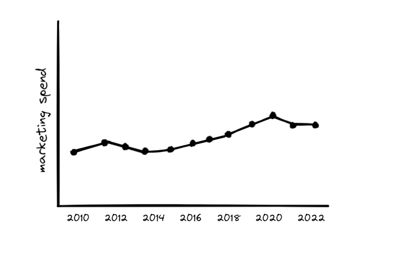
The chart that naturally comes to mind is a line graph because they are best to show trends over time. Although most of my colleagues drew line charts, one outlined a cycle plot.
Scenario 2
The next scenario was that marketing spend increased significantly three years ago and continues to increase since.
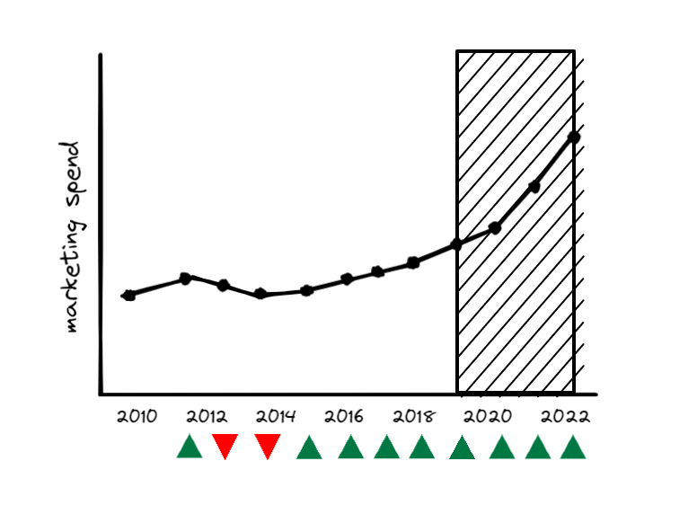
I embellished my previous chart by highlighting the years of interest with banding. I also added a line of indicators at the bottom; when the user hovers over one of the triangles, the percentage change of the corresponding year will appear in the graph.
My colleagues created bar charts or step line graphs to compare the marketing spend of the years of interest. One sketched a slope chart too.
Scenario 3
The reason for this significant increase is a new social media platform.
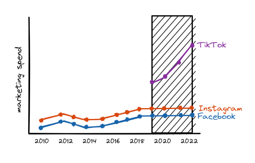
I'm clearly very attached to the line graph and categorized the various marketing platforms by color.
This scenario resulted in the most variation of charts. There was a slope chart, a bar-in-bar graph, a bar chart, and some line graphs with a reference line!
Scenario 4
With this increased annual marketing spend, how would we supplement our data to understand the impact of adding this new social media platform to the business?
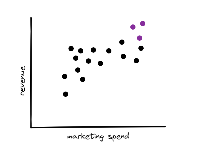
The first KPI that came to mind was revenue. If I received revenue data, I would plot that data against the marketing spend. Each mark would represent each channel in each year. The newest social media platform would be emphasized with another color.
My peers brainstormed a variety of other marketing KPIs, like return on investment, number of orders, and number of customers. There were other scatter plots among our drawings, but there was also a diverging bar graph. a bar-in-bar graph, and more.
Today’s training was clarifying due to the precise language surrounding what I do as a data visualizer and communicator. After absorbing Head Coach Ann’s articulation of effective data communication, I will mindfully take into account the needs of the audience and the context of use when selecting, organizing, and presenting data. Lastly, although there may be 100 chart types, I will rely on a trusty subset of them. 📊📈