


After completing the Dashboard in a Day training, which I wrote about in this blog post, I organized a Dashboard Day for the bench thrivers of DSNY2. In our training, we skipped Dashboard Week: PowerBI day and instead learned about effective data communication. We wrote about that day of learning in the following blogs:
- Chart Choices, by Erlina
- Effective Data Communication, by Annie
- Charty Party, by me, Elaine
- Initial Questions/Asks, by Mohammed
- Effective Data Communication and Chart Comparisons, by Kinley
- Communicating with Your Audience, by Bianca
- Information Design, by Juliet
- Effective Data Communication, by Lyon
(What a throwback.)
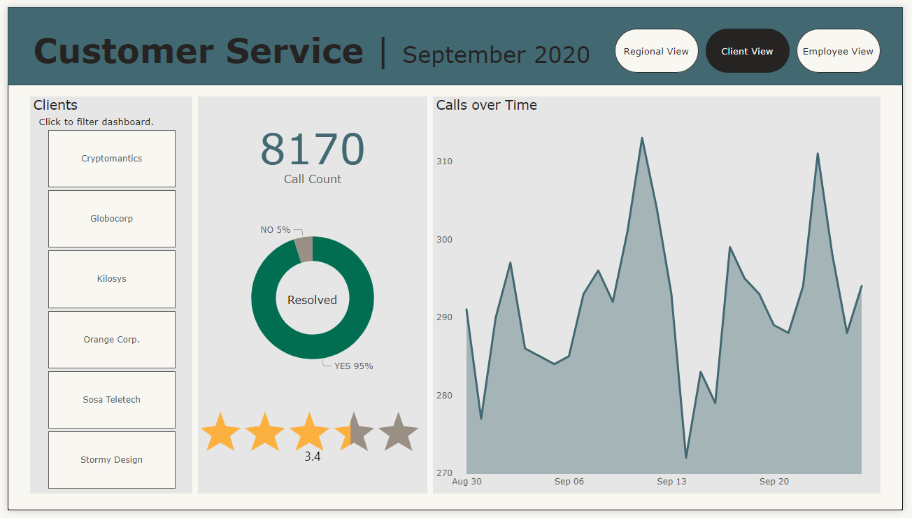
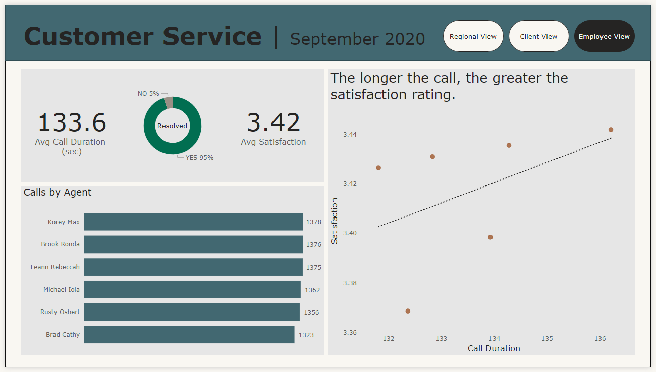
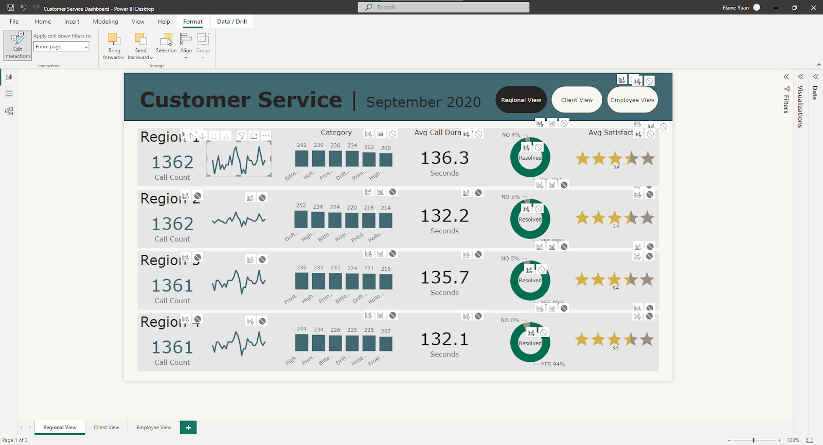
I suggested the Dashboard Week: PowerBI challenge outlined here and among the four datasets, I chose the mock customer service data. After examining the dataset in Excel, I determined that the data was relatively clean and opened PowerBI. By the end of the day, I made three dashboards:

After using PowerBI for an additional day, here are some opportunities and obstacles of using PowerBI as a skilled Tableau user:
OPPORTUNITIES
As I mentioned in my previous blog post about PowerBI, I enjoy being able to round corners; in these dashboards, I rounded the corners of my navigation buttons across the top. Whereas, in a recent Tableau dashboard, I made and brought in images of rounded corner buttons to achieve the same look.
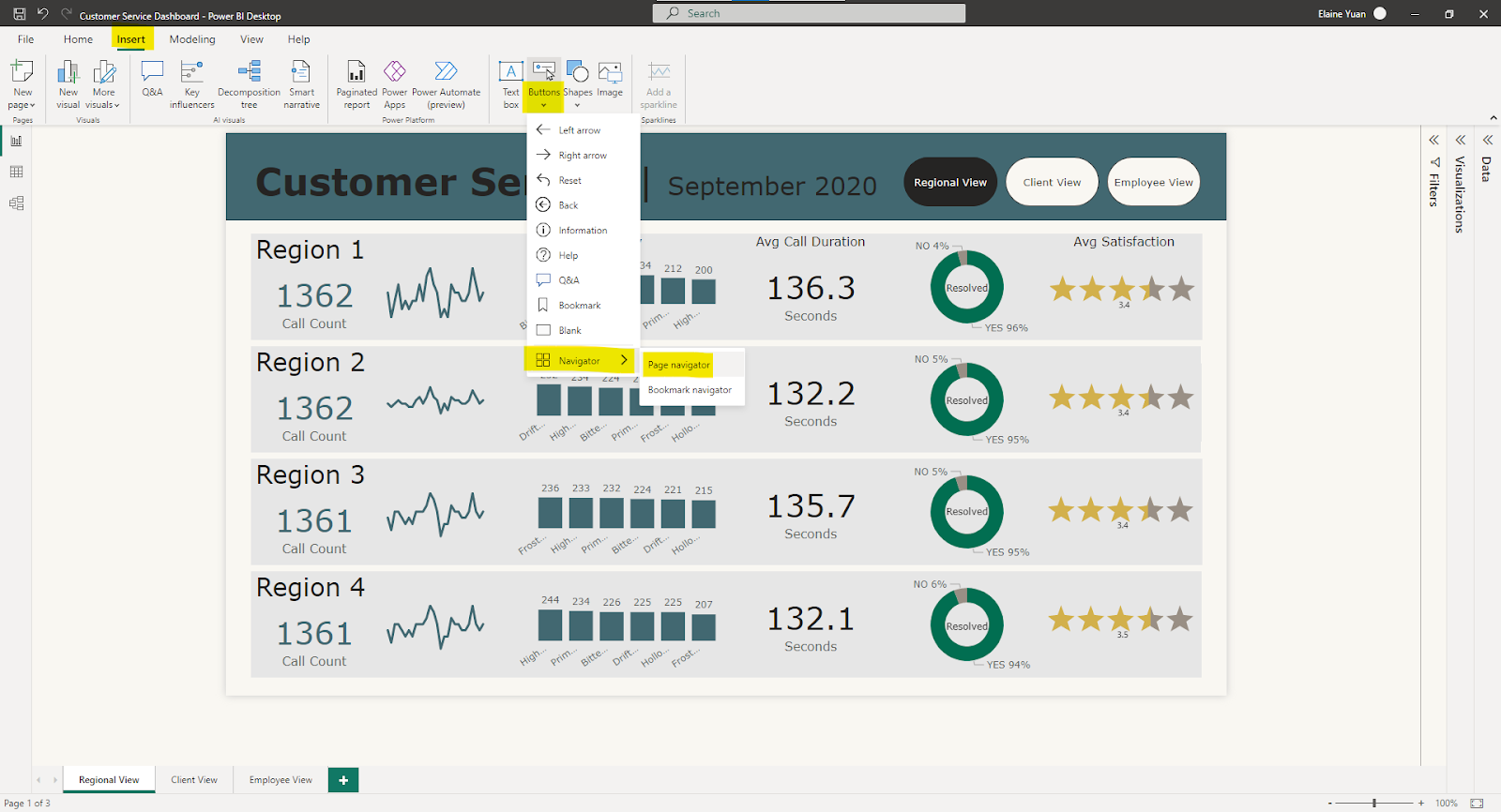
Speaking of the navigation buttons, these were easy to configure by going to Insert > Buttons > Navigator > Page navigator. The navigation buttons conveniently took on the name of the corresponding sheet titles.
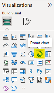
Additionally, it is easy to make a lot of cool charts, such as funnel charts, KPI cards, and more. It takes a number of steps to build a donut in Tableau, as documented in this blog post, but in PowerBI, the donut chart is accessible in the visualizations pane.
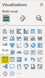
Slicers are also available in PowerBI. Filters and slicers are not the same in PowerBI; filters are determined by the developer and slicers are similar to filters, but they are meant for the user to engage with when using the dashboard. Depending on the field in the slicer, the slicer can appear as a slider, tiles, a dropdown menu, or a checklist.
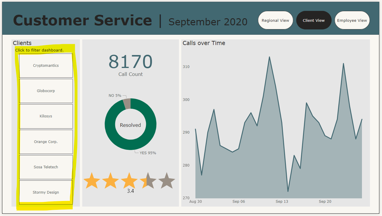
For instance, here is a tiled slicer in the Client View dashboard.:
Furthermore, by selecting the ellipsis (...) in the Visualizations pane, you can access more visuals.
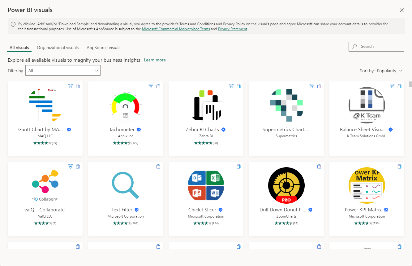
There are a lot of options in this window of Power BI visuals, including radar charts, Sankey diagrams, word clouds, etc. This was where I found the star ratings visual I used in my dashboards! ⭐⭐⭐⭐⭐
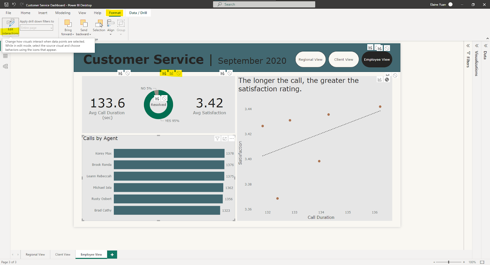
PowerBI has default interactivity built into a dashboard, but interactivity is straightforward to customize by going to Format > Edit Interactions. A set of interaction buttons will appear by each element of the dashboard and you can select the appropriate interaction - filter, highlight, or none.
OBSTACLES
First, there were no containers and no padding. To simulate padding, I needed to get creative with sizes of visualizations and shapes.
In my Regional View dashboard, I created gray rectangular shapes for each region. These were akin to a horizontal layout container in Tableau. My visualizations were floating on the gray shapes and I could adjust the height of each of these visualizations. My sparklines, average call duration KPIs, and star ratings were all reduced in height and vertically centered on each of the gray shapes.
Similarly, there is a lack of flexibility when it comes to text placement. I love donut charts, as you may already know, because I can place additional information in the donut hole. In PowerBI, I could not place text in the donut hole when formatting the donut chart and instead, layered a textbox atop each of my donuts.
Although it is simple to set up interactivity in PowerBI, it is tedious to set up interactivity in a dashboard with many elements. For example, in my Regional View, there are a lot of elements and I wanted the interactivity to happen on a regional basis. I had to click a lot of none buttons to achieve the effect I wanted.
As a Tableau user, I am accustomed to physically dragging fields from the Rows shelf, Columns shelf, or Marks card. I kept on trying to do the same in PowerBI, even when the X to remove the field was present. This was a mistake I kept on making.
Lastly, the PowerBI dashboard is the size of a PowerPoint slide and despite its appropriate size for a dashboard, I want more flexibility in sizing.
This Dashboard Day was challenging in a good way and I look forward to learning more PowerBI in the near future.