My favorite feature of Tableau is undoubtedly the tooltip. My first understanding of the power of the tooltip was the ability to add a visualization in the tooltip. By hovering over a visualization, the user can examine the data with greater detail.
I’m very happy to share my Tableau knowledge with my students as a Data Analytics Mentor at Fullstack Academy.
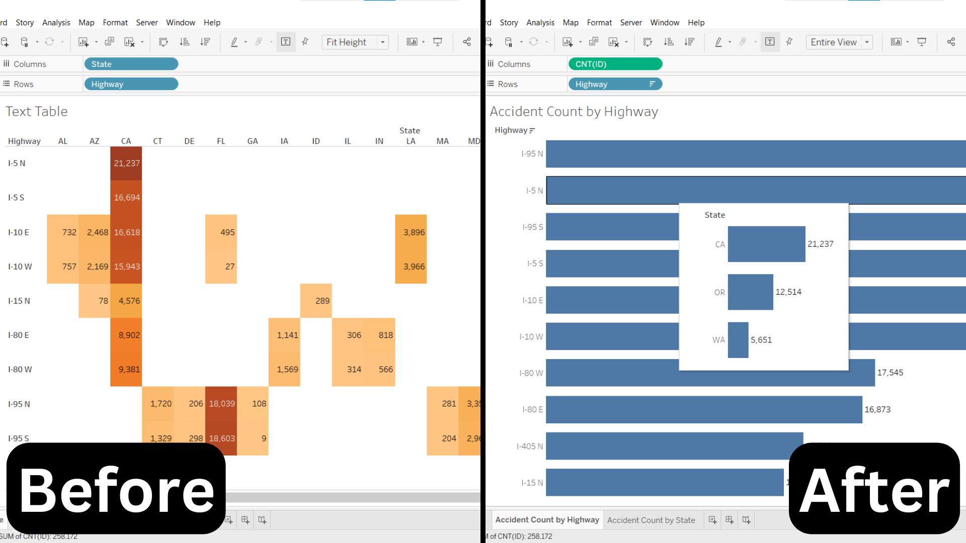
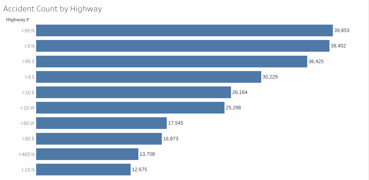
Recently, a student of mine consulted me regarding his capstone project’s visualizations. One of his visualizations looked like this:
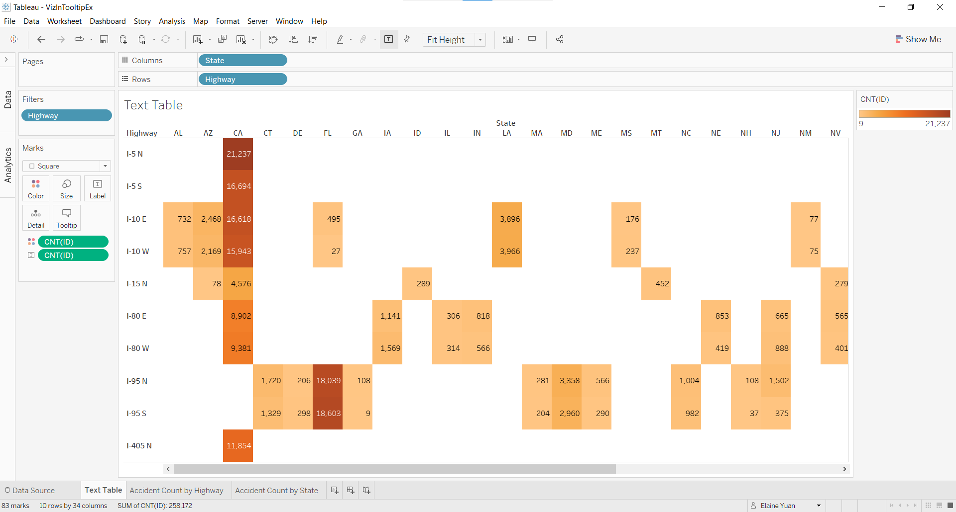
He wanted to show the accident count by both highway and state. Although he explained his findings regarding California and Florida well, he knew his text table was not very digestible. Therefore, I suggested redesigning his visualization with a viz in tooltip and walked him through the process:
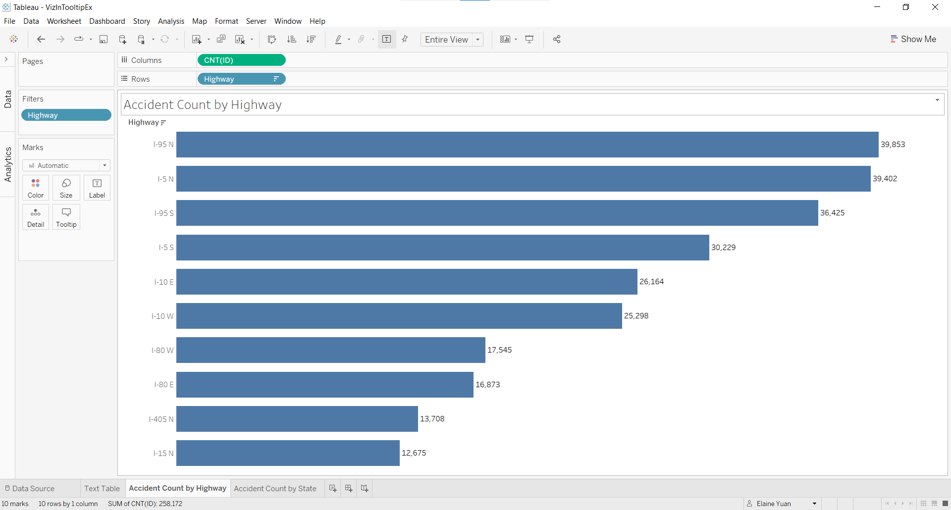
1. Design a bar graph of accident count by highway.
2. Create a new worksheet and design a bar graph of accident count by state.

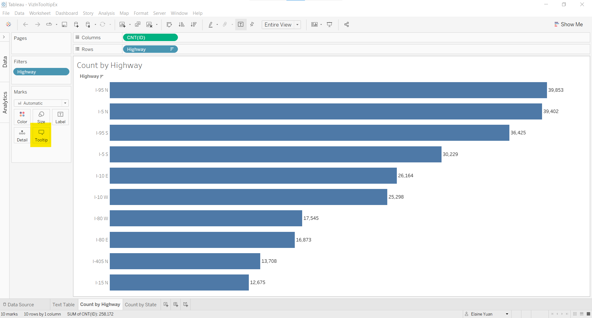
3. Return to the first bar graph and select Tooltip in the Marks card.
4. In the Edit Tooltip window, remove the existing text in the window and select Insert > Sheets > [Second bar graph title]
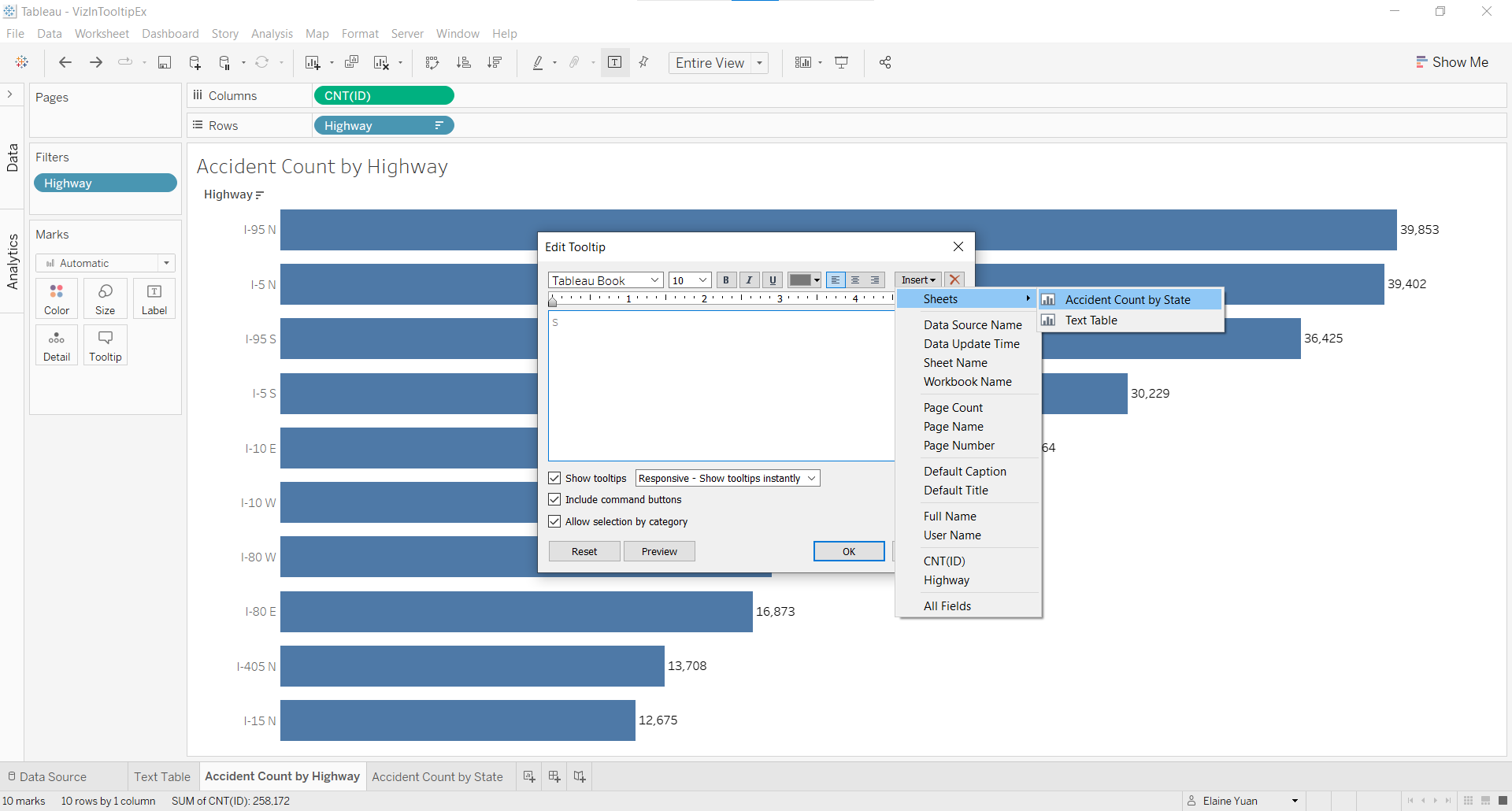
5. Roll over the bars and celebrate your success at adding a viz in the tooltip!
Both my student and I were very pleased with this data visualization transformation from text table to a deceivingly simple horizontal bar graph with a viz in tooltip.