


What is it?
A violin plot is similar to a box plot - but instead of a box and whisker we have a probability density at particular values. Consider a distribution of test scores with mean 70 and standard deviation of 12, we would expect the height of the violin to be most around 70 as the probability that a new random observation is at its highest where the most points in the data are.
In order to form a probability density distribution we need the violin to be smooth ideally. That is where the Kernel function is useful for taking data that might not be smooth and smoothing it out for use in a violin plot.
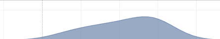
When we smooth the distribution with a kernel function the formula includes a bandwidth parameter that indicates the amount of smoothing - the larger the bandwidth the more smoothed but this introduces the potential for over-smoothing.
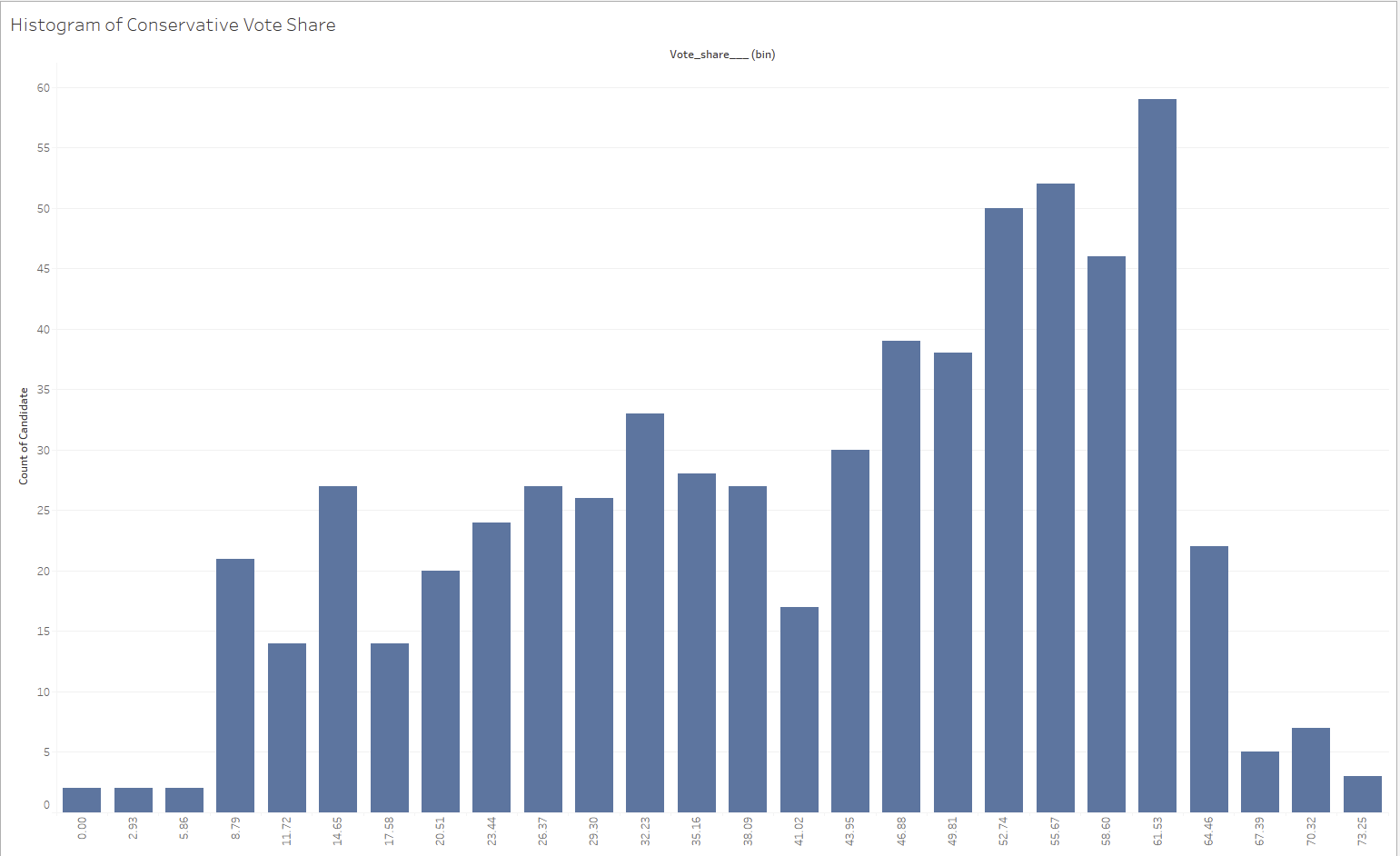
Above I think we see some evidence of over-smoothing potentially but that is why I find it useful to look at a histogram of the original data to consider whether your violin plot is the right visualization.
Finally, in my research of violin plots I thought that the plots that had the probability distribution overlaid on faint points was more informative than just the distribution but to do so you need a fundamentally different approach to the one below were you make the violin plot using the path option on marks for a polygon.
How do I make one in Tableau?
The simplest tutorial I found for making one was Liam's blog. I chose to build my violin plots with election data I scraped from BBC archives.
Step 1 is to scaffold data in, I used Alteryx to quickly generate 1 to 99 with a generate rows tool:

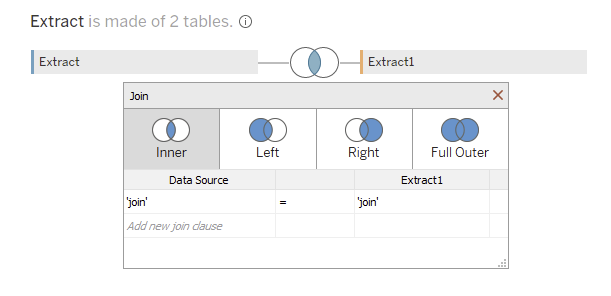
I then appended on the scaffold data to my election data by appending within Tableau. This is achieved by joining the two tables and specifying the join clause as "join" to "join", i.e. join every row with every row.
My understanding of why we do this is that we now get 99 points for each candidates vote share and we can then write a calculated field to distribute them across our expected range. The additional points will give us more leverage to create the smoothness of a violin chart.
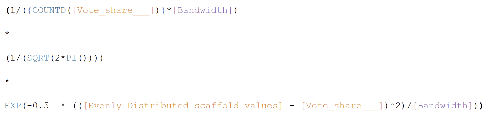
The formula to evenly distribute is:
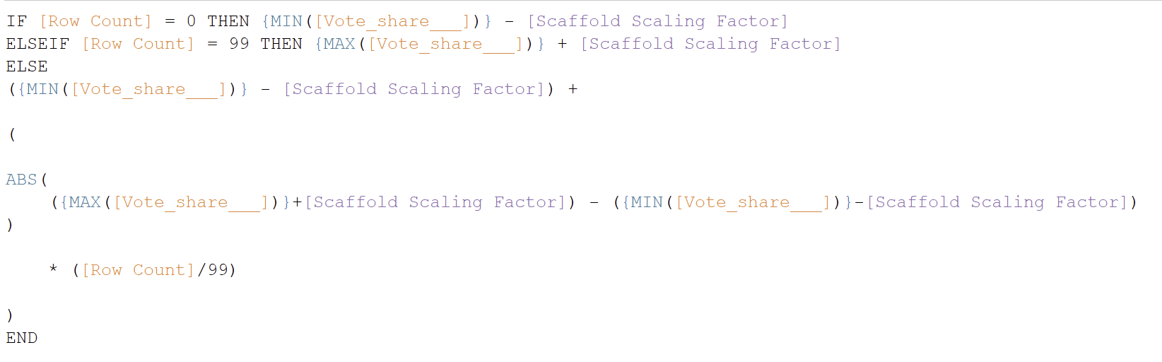
Row count specifies which of the duplicated cases we are referring to. If you want to check your violin plot against a histogram filtering to one of the row counts will return the data to what it looked like before scaffolding.
Vote_share is my measure in this instance whilst the scaling factor is a parameter that can allow me to effectively shift were my values start and end. If I want to stretch out the plots more - I would increase my scaling factor. I will talk more about the parameter at the end of the section where I talk through the screenshot of the finished chart.
The second calculation we need is for our axis to give that Kernel probability distribution score:
Bandwith is a parameter here to again give the user the ability to adjust the violin plot to best reflect the data.
The final line is the key part of the calculation as it determines how sensitive the violin plot is, with a low bandwidth:
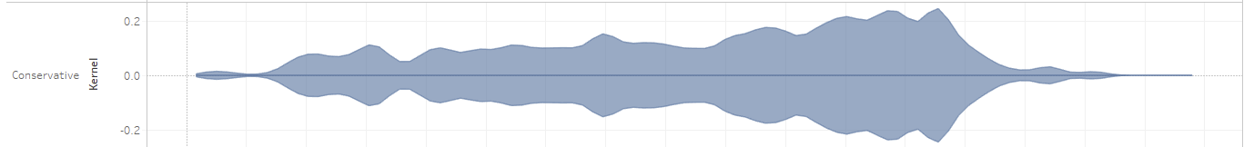
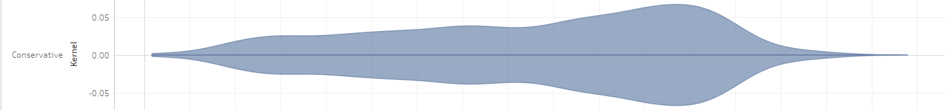
We get a plot with lots of Kernel peaks and troughs. With a higher bandwidth and more smoothing we see wider peaks:
Assembling the Chart
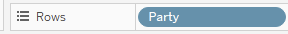
First if you want to break up the data in any way drag a dimension onto rows (split it as you read down the page) or onto columns (split as you read across the page).
Convert your evenly distributed value calculated field into a continuous dimension (with a right click in the data pane), drag that onto the row or column without your dimension.
Now we need our axis for the chart - the Kernel calculation - so we drag that onto the same shelf as our dimension; for each party give me the Kernel distribution of values. Because we want our violin plot to be above and below 0 we duplicate the kernel and turn it negative, dual axis (right click on the negative one and select dual axis) and synchronize (right click the axis header and synchronize axis)

The marks should be set to area and then we can right click both parameters and show them so that they can be adjusted in the view.
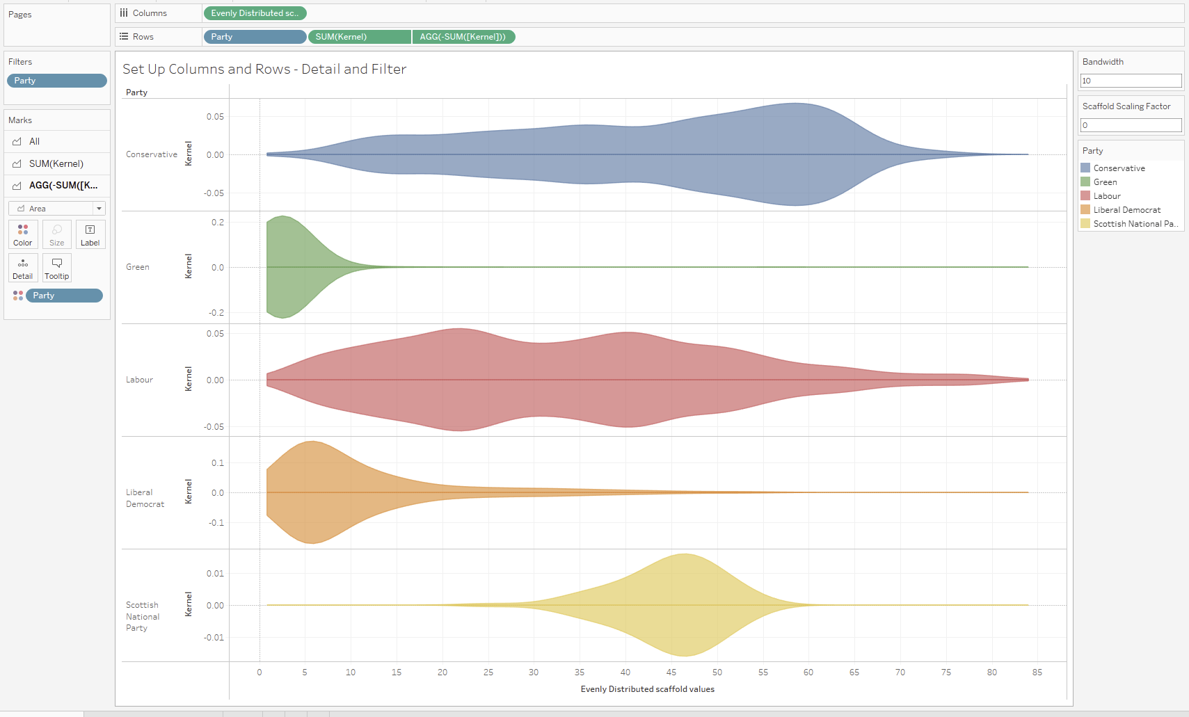
The scaffold factor can be used to stretch the chart out but that would distort our distribution share.
Is it worth it?
Probably not.
I like the chart and in some ways you can see the parties that have a highly concentrated distribution of vote shares in all consitutencies. But the actual values the chart uses limit its accessibility to less stats savvy end users. It does look cool though.